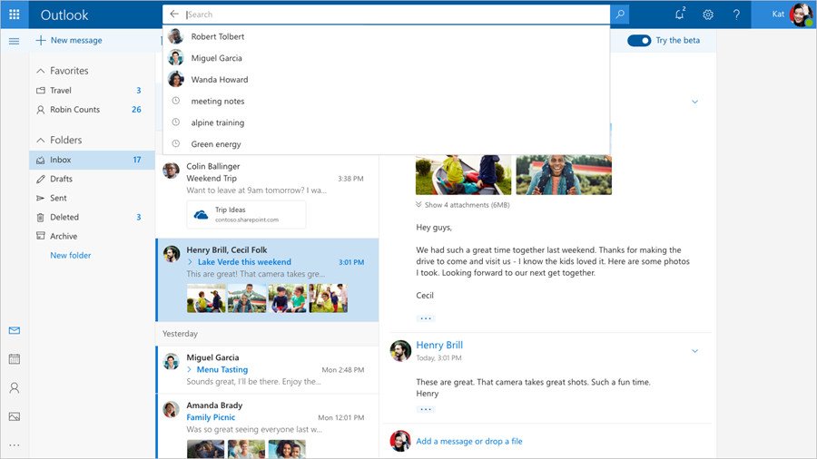
Outlook.com beta is getting a redesigned calendar
The calendar portion of Outlook.com is getting a new look for beta testers.

After launching a new Outlook.com beta inbox experience and design in August, Microsoft is bringing the same treatment to the calendar. The official Microsoft Office Twitter account teased a new UI for the calendar portion of Outlook.com, which is now on its way to beta testers (via OnMSFT).
Calendar is joining the https://t.co/bvoX8XwQjf beta. Keep an eye out for the toggle as we roll it out and let us know what you think: https://t.co/AbpvOweHWi pic.twitter.com/flvPdKF9HwCalendar is joining the https://t.co/bvoX8XwQjf beta. Keep an eye out for the toggle as we roll it out and let us know what you think: https://t.co/AbpvOweHWi pic.twitter.com/flvPdKF9Hw— Microsoft Office News (@OfficeNews) January 5, 2018January 5, 2018
Unless you spend a lot of time in your calendar, this probably isn't the biggest or most exciting change. However, the design tweaks do bring the Outlook.com calendar more in line with the rest of the beta design, with an overall cleaner look taking hold.
If you've opted in to the beta and have access, you should see the new design roll out over the coming days and weeks. Remember: you'll have to flip the experience on by switching the "Try the beta" toggle on in the upper-right portion of Outlook.com.
Get the Windows Central Newsletter
All the latest news, reviews, and guides for Windows and Xbox diehards.
Dan Thorp-Lancaster is the former Editor-in-Chief of Windows Central. He began working with Windows Central, Android Central, and iMore as a news writer in 2014 and is obsessed with tech of all sorts. You can follow Dan on Twitter @DthorpL and Instagram @heyitsdtl.

