Our new forums are here!
We've redesigned our Forums to make them more accessible to more users — all while maintaining what made them great for our seasoned community members to start!

We want more people reading and engaging with the great content that is being produced in our Forums. Here is an overview of some of the biggest changes - a big thank you to Gio Martinez in particular for absolutely crushing it in coding these new designs, and to our community for helping us with feedback throughout - more on that later.
Speed
In our tests we see a 35% boost in how fast the pages load with the new templates. This was one of the most important aspects of the redesign and something we will continue to improve on. Sometimes we still see badly behaving ad units that slow things down and while we try to tackle this they appear — it's often like a game of whack-a-mole, but we're doing everything we can on our end to make our codebase as quick as possible.
Clarity
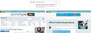
More than 80% of our Forum traffic comes from Google, and to be frank, a user coming into the forums blindly for search wouldn't have a good experience. We saw issues with how far you had to scroll to see the content you came for and a lack of visual queues telling you this was a conversation.

Hierarchy
In the old forums everything had the same 'weight' and demanded the same amount of attention. In our new design we have a clear idea about what we want to stand out and what can be in the background. This means that some actions that were previously exposed and very clear to the experienced VB user are now slightly more hidden.
Our priority — what we want a visitor to immediately grasp — is that they are in the right place (Forum Thread Title) and that this is a conversation (Avatar + Post that looks like a message). Everything else can take a back seat.

Recognition
Our forums are built off of VBulletin, a long-standing software that underpins many other large and popular communities. The problem is that the base styling, which we also had based our old interface on, was also old and long-standing. The old-school style of forums is no longer the only way that people engage in serious conversations online. The kind of discussions we see in our Forums also happen in Facebook comment threads, Quora, Twitter replies, and a host of other group messaging apps. It made sense for us to at least visually move towards the look and feel of these hugely popular platforms — they're not just modern, they're simplified from the masses of forum controls in a very smart way.

By the Community
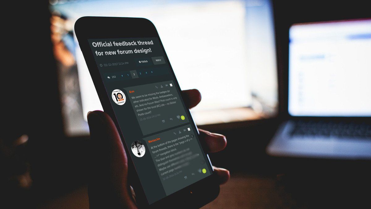
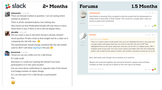
This has been the most extensive user testing we've ever done and we believe it's paid off. Since late November 2016 a group of select Forum users have been giving us nonstop feedback through slack — a BIG thank you to all of you! In late December we also opened up access to volunteers who have been helping us out with additional feedback in this forum thread.
Get the Windows Central Newsletter
All the latest news, reviews, and guides for Windows and Xbox diehards.
I seriously cannot stress enough how important this feedback process has been — it's the best decision we've ever made.

Dark Theme
Sorry it took us so long! Enough said :)

You can find the Dark Theme inside Your Menu at the very bottom right - hidden away behind a moon icon like a little Easter egg.
Mobile with all the Trimmings
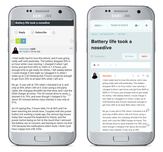
We wanted you to have all the same tools you enjoy on the desktop while using a mobile phone. This also means our Moderators and Ambassadors have the ability to do their work more easily on the go than before.

Small tweaks and Fixes everywhere
In addition to the huge overall changes we've made a bunch of smaller changes throughout the forums. You might not notice them for a while, and many are back-end tools that will make life easier for our volunteer Moderators. It's been a big project for us and we are really happy with the attention to detail it forced upon us. We are suitably humbled by the complexity of doing any changes to a tool many of you spend hours in every day.
Lastly, we fully expect there to be more issues and for our members to have better ideas than we have on how to improve the Forums. Please engage in the conversation over here in this forum thread — we really want your feedback, good and bad, so that we can continue to improve these forums for you.
Thank you!
