OneDrive rolls out revamped and simpler interface for sharing files

All the latest news, reviews, and guides for Windows and Xbox diehards.
You are now subscribed
Your newsletter sign-up was successful
Join the club
Get full access to premium articles, exclusive features and a growing list of member rewards.
Microsoft wants to make sharing files via a OneDrive account easier for its users. The company is rolling out a new interface for the cloud file storage service that cuts down on the number of options and menu choices by default for sharing OneDrive links.
In a blog post, Microsoft stated that the previous setup for sharing files from a OneDrive account got too complex for most of its users:
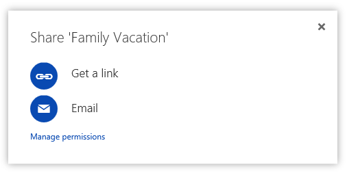
"Previously, when you clicked "Share," we presented you with the option to either "Invite people" or "Get a link." The majority of people just wanted to get a link, but that wasn't the default choice. When you selected "Get a link," we also offered a number of ways to customize that link and restrict access. This resulted in a lot of confusion and broken links, and most of these options were used less than 0.01% of the time. We wanted to do better."

The new share UI is shown above, and it only offers two options for sharing OneDrive content by default. The first is for sending a link and the other for sending an email. Microsoft says:
Article continues below"We use terms that are understandable to a wider range of users. We optimized for the common cases and present the rarely used options in less distracting ways. Basically, it's not as messy."
Microsoft tested this new UI with 28,000 OneDrive testers before its worldwide rollout.
All the latest news, reviews, and guides for Windows and Xbox diehards.

John Callaham was a former contributor for Windows Central, covering Windows Phone, Surface, gaming, and more.
 Join The Club


