OneDrive gets bolder, cleaner design overhaul on iOS
Bold blues and a more fitting aesthetic to match the modern Office ecosystem are on the way.
All the latest news, reviews, and guides for Windows and Xbox diehards.
You are now subscribed
Your newsletter sign-up was successful
Join the club
Get full access to premium articles, exclusive features and a growing list of member rewards.
What you need to know
- Microsoft detailed a fresh design overhaul coming to the OneDrive app for iOS.
- The new appearance follows a similar revamp the Outlook app recently received, complete with a bold, blue header.
- The app looks cleaner overall, fitting in with the modern trend of the rest of the Office suite.
Microsoft has a new design in the works for the OneDrive app on iOS. Teased in a blog post today, the overhaul trends towards a cleaner overall look overall with a greater emphasis on OneDrive's signature blue color.
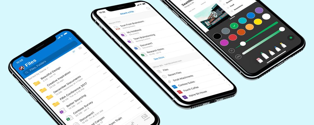
In an effort to unify its experiences across the Office suite on iOS, Microsoft has taken a cue from its work on the Outlook app to add a splash of extra color in the header. "Our bold new header adds a splash of color, more native feel, and alignment with Outlook on iOS. Microsoft Search is now integrated front and center, allowing users to find files faster," Microsoft said in its blog post.
Additionally, Microsoft says it has tweaked the font sizes and colors in the files list, potentially making it easier to browse through your files. That in addition to a revamp of the command sheet that brings a "softer look and a draggable surface."
Article continues below 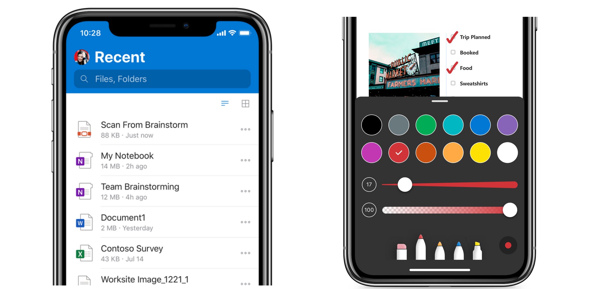
Another major area of focus in this update is the PDF annotation experience. When annotating PDFs, you'll now find all of the touch controls at the bottom of the screen. Likewise, notes are now more "lightweight and reactive" and the color picker now lives on the note's surface.
Finally, the settings menu has seen some tweaks to make it easier to use. All notification settings are now grouped by account in a dedicated "Notifications" page. Camera upload settings are more granular, giving users more control over how videos and photos are treated. A question mark icon has also been added next to some items to help better explain their purpose.
Our favorite computer speakers for less $100
Team Windows Central wholeheartedly recommends each of these computer speaker setups, because they all bring the NOISE and will not wound your wallet.
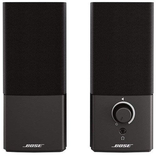
Bose Companion 2 Series III speakers ($99 at Dell)
All the latest news, reviews, and guides for Windows and Xbox diehards.
If you want great sound quality and value, then you want Bose. You too can have room-filling, immersive sound, so Bose says in every advertisement.
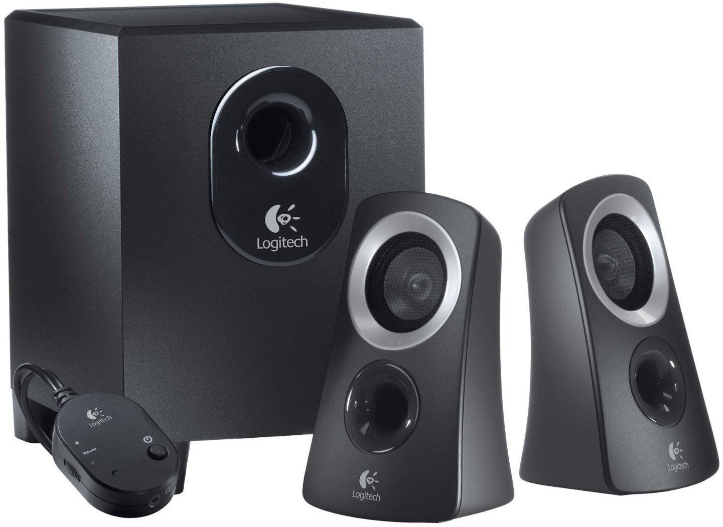
Logitech Z313 speaker system with subwoofer ($49 at Dell)
The Z313 comes with a powered subwoofer and two satellite speakers to deliver 25 watts of total power. That's enough to fill your room and then some.
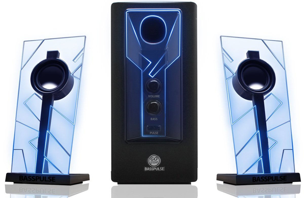
GOgroove BassPULSE ($50 at Dell)
These are clearly the coolest-looking speakers recommended here, but they're not all flash and guile – these speakers can produce amazing highs and lows, for just $50.

Dan Thorp-Lancaster is the former Editor-in-Chief of Windows Central. He began working with Windows Central, Android Central, and iMore as a news writer in 2014 and is obsessed with tech of all sorts. You can follow Dan on Twitter @DthorpL and Instagram @heyitsdtl.
 Join The Club


