OneDrive gets a visual refresh on the web

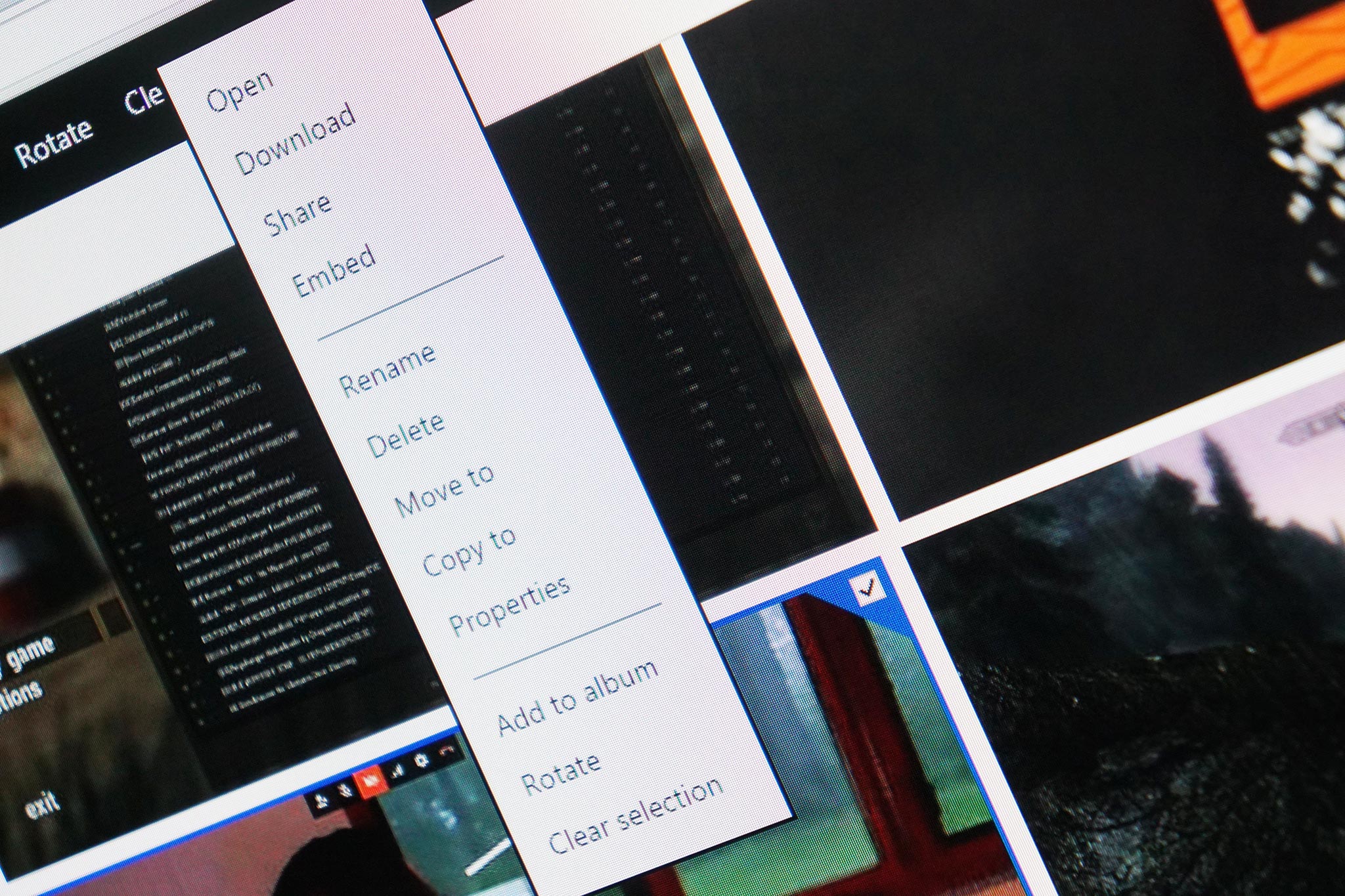
Microsoft has announced that OneDrive on the web is getting a fresh coat of paint. A new design for the web version of the cloud storage service is rolling out to users over the next several days with a refreshed color palette, font, and a new visual feel based off of a 4px grid.
Perhaps one of the most major changes lies in that 4px grid, on which the entire OneDrive web experience is now based. From Microsoft:
"After several rounds of iteration, we landed on a 4px grid, which allowed for enough flexibility in layout, while maintaining the visual density and stability we wanted the experience to achieve. We also wanted to bring a measure of efficiency to our studio processes by creating a single grid that could work across both web and native layouts. The 4px solution accomplished both goals.Every component was reworked to snap to the new visual and responsive grids – panels, dialogs, file list, left navigation, commanding, and even buttons. It was a lot of work, but we're quite pleased with the outcome and hope you are too."

Following up on the grid changes, Microsoft says that it refreshed the color palette of OneDrive on the web. The team started with the already-established dark blue that is typically associated with OneDrive and went on to add accents with a complementary set of grays. Finally, Microsoft highlighted the font used in OneDrive on the web, called Segoe:
Type is about clarity. Keeping it simple improves the way a design communicates. And one of the biggest goals we had when it came to our decisions around type was to create a more legible, readable, and clear experience that celebrates your content, not our UI. For web, we use Segoe, a custom type family that is the core visual identity element throughout Microsoft's product ecosystem. It is used for all digital products and is designed to maintain legibility across sizes and pixel densities.
Microsoft says that the redesign is by no means finished, and this is just the start. It should be rolling out to users over the next few days, but we haven't seen it live on our end just yet.
Source: Microsoft
All the latest news, reviews, and guides for Windows and Xbox diehards.

Dan Thorp-Lancaster is the former Editor-in-Chief of Windows Central. He began working with Windows Central, Android Central, and iMore as a news writer in 2014 and is obsessed with tech of all sorts. You can follow Dan on Twitter @DthorpL and Instagram @heyitsdtl.
