Official Twitter client receives major update, introduces new interface and more

The Twitter team has released an update for the official Twitter app on Windows Phone, pushing the client up to version 2 (app reports v3). We last looked at the app when it was bumped to version 1.4, implementing notifications. So what's new in the latest release? Well, after reading through the changelog and viewing screenshots of the new interface, you may once again wish to check out the official Twitter solution for Windows Phone.
While Windows Phone has an official client, it has regularly been slated for not being as feature rich or well-designed as competing, third-party apps. We strongly believe this to no longer be the case with a complete redesign of the UI in version 2. The team has managed to keep to the Windows Phone design language, while attempting to reach out to consumers not currently using the platform by implementing an intuitive and familiar layout.

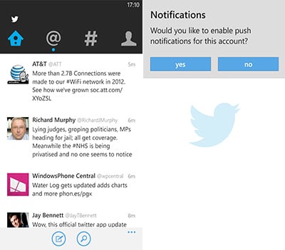
Say hello to the new timeline view
Speaking of a new interface and layout, what's the official changelog for the latest release?
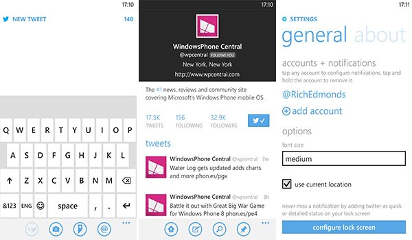
- Integrated right into your Windows Phone with faster performance, lock screen, and custom Live Tile that show your notifications
- Direct access to your favorite profiles and lists optimizing Windows Phone "pinning" functionality
- Streamlined navigation brings you the new Home, Connect, Discover and Me tabs
- Engage with the best Twitter content available in the Discover tab, as well as Trends, browse categories, find friends, and suggestions about Who To Follow
- Enjoy your Retweets, favorites, follows, mentions and replies in the Connect tab, or filter your mentions and replies only
As we mentioned already, it's quite the major upgrade - one that consumers are surely going to appreciate. Working backwards up the list of changes, we have the new "Me" tab, which acts as the connected account's profile page. Users can view personal profile information, recent tweets published by the account, as well as access to messages. It's the profile page in a nutshell.
There's the Discovery tab that helps users discover (oddly enough) new content through trends and categories, not to mention the ability to find friends and read up on suggestions as to who they should stalk next. It's all part of a new streamlined interface that brings together the features and functionality of Twitter into a centralised location that's much easier to navigate.

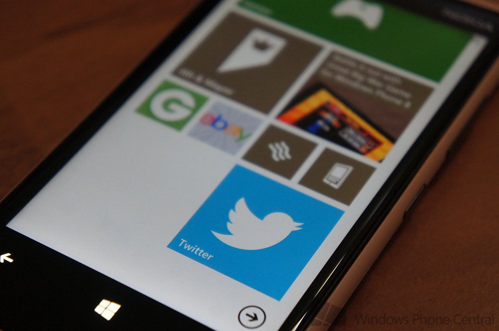
The Twitter team has also taken full advantage of pinning to the home screen in the latest version, providing users the ability to pin profiles and lists to the home screen for more convenient access. If all that wasn't enough, there's a bunch of performance improvements, added lock screen support and more. Like we said, a nice update - there's even 'pull to refresh' the main timeline view.
Get the Windows Central Newsletter
All the latest news, reviews, and guides for Windows and Xbox diehards.
Overall we're impressed with version 2. It's a great upgrade to a client that felt neglected somewhat and we're sure consumers will enjoy the new experience. Does this new release raise the bar for other clients? At the very least, it's certainly on par with what's available on the Windows Phone Store. Our recommendation? Check it out, have a play around and see if the new Twitter app is right for you.
You can download Twitter from the Windows Phone Store.


Rich Edmonds was formerly a Senior Editor of PC hardware at Windows Central, covering everything related to PC components and NAS. He's been involved in technology for more than a decade and knows a thing or two about the magic inside a PC chassis. You can follow him on Twitter at @RichEdmonds.
