The Office.com portal is getting a fresh new look
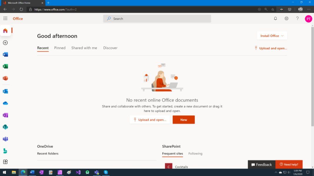
Office on the web is looking pretty snazzy.

What you need to know
- The Office.com portal is getting a new look.
- The interface is cleaner than the previous version, with different icon placement and more.
- The redesign appears to only be rolling out for commercial customer right now. Microsoft has yet to announce the revamp
Microsoft today began rolling out a fresh new look for the Office.com portal for commercial customers. The redesign brings a clean look that also incorporates a bit of Microsoft's Fluent Design language and icons for each service or app flanking the left side.
The redesign was initially discovered by Aggiornamenti Lumia and detailed by Thurrott.com, but Microsoft hasn't formally announced it yet. At least for now, the new design only appears to be rolling out for commercial customers. Presumably, Microsoft 365 personal and family susbscribers will also see the revamp as well. Eventually.

We'll continue to update you on Microsoft's plans for the new look once it's officially announced. In the meantime, what do you think of the revamp? Let us know in the comments.
Get the Windows Central Newsletter
All the latest news, reviews, and guides for Windows and Xbox diehards.
Dan Thorp-Lancaster is the former Editor-in-Chief of Windows Central. He began working with Windows Central, Android Central, and iMore as a news writer in 2014 and is obsessed with tech of all sorts. You can follow Dan on Twitter @DthorpL and Instagram @heyitsdtl.
