Office 365's app launcher is getting an overhaul on the web
If you use Office 365 on the web, a new, simplified app launcher experience is on the way.

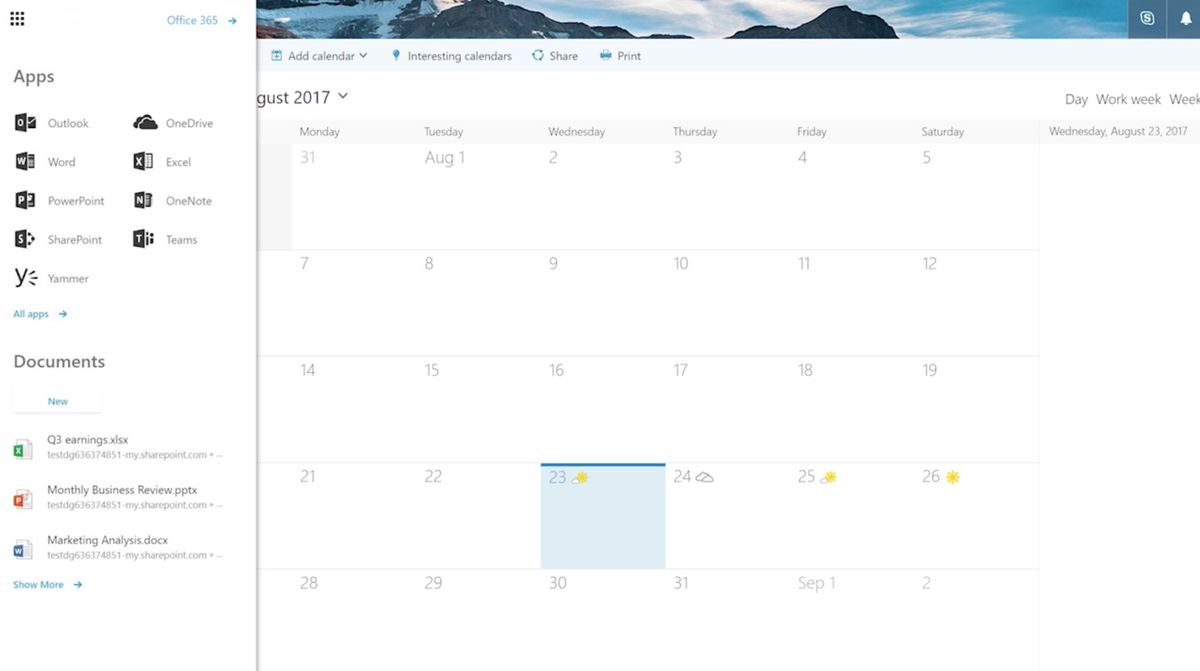
Microsoft is gearing up to overhaul the app launcher{.nofollow} for Office 365 on the web. Based on feedback from Office 365 users, Microsoft says it will ditch the current tiled interface in favor of a more compact visual look that should be less of a hassle to navigate (via OnMSFT).
The new app launcher is made up of two primary sections: Apps and Documents. Apps will still show your most used Office 365 apps along with apps chosen based on types of users (like teachers and students). All apps can be accessed with a click to the "All Apps" section, which can be searched from a dedicated search bar at the top of the launcher.
Similar to the Apps section, the new Documents section shows recent Office documents you've worked on. Clicking "Show More" will take users to Office.com to see all of their recent documents.
Microsoft says this overhauled experience is now available as part of the early First Release program. It will roll out from there to all users in the coming months.
Get the Windows Central Newsletter
All the latest news, reviews, and guides for Windows and Xbox diehards.
Dan Thorp-Lancaster is the former Editor-in-Chief of Windows Central. He began working with Windows Central, Android Central, and iMore as a news writer in 2014 and is obsessed with tech of all sorts. You can follow Dan on Twitter @DthorpL and Instagram @heyitsdtl.


