Nyko Media Remote review – a better, less expensive remote for Xbox One
With gaming consoles, first-party accessories are often much nicer than their third-party equivalents. We've all had a poor experience with a third-party controllers at some point, but recent evidence suggests that third-parties are getting better at the accessory game. For example, Power A's recent Xbox One Mini Series controller is a pretty sweet (though not entirely superior) low-priced alternative to official controllers.
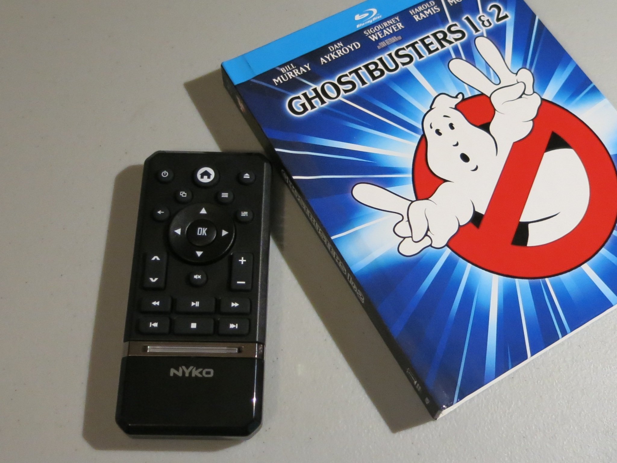
It certainly helps a third party's case when the first-party item wasn't really exceptional. The Xbox One Media Remote is a fine accessory, but was designed more for style than substance. Accessory manufacturer Nyko has taken the opposite approach with its own media remote. The Nyko Media Remote for Xbox One is a better remote control than the official model, and it costs ten dollars less to boot.
Flat or round?
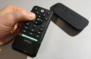
The Nyko Media Remote has a rectangular shape with recessed corners. It measures approximately 4.5 x 2.15 x .6 inches (120 x 55 x 15 mm). That makes it a tad shorter than the Microsoft remote's 125 mm length, but wider than its 50 mm.
The height of both remotes is where their shapes really differ. Microsoft's remote has a round back that measures about 22 mm at its thickest. Nyko's remote is shorter on that plane, and more importantly, flatter. That round back provides the Microsoft remote with better ergonomics when gripped in the hand, but also a pronounced wobble when placed on a flat surface. If you don't want it to wobble around, you have to place it face down on the button side. No such issue with Nyko's model.
Batteries not included
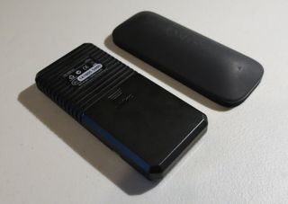
The Microsoft remote, like nearly all remotes since the days of Lincoln's assassination, is powered by two AA batteries. Nyko's remote has to forego the AA route due to the aforementioned thinness. Instead, it draws power from two AAA batteries, the underachievers of the A battery family (nobody knows what happened to Papa Single A).
In all seriousness, AAAs are no big deal except you're less likely to have a spare set sitting around. Some battery rechargers can't do AAA either, which would be inconvenient for people who buy crappy chargers.
Speaking of batteries, the battery compartment takes up a hair over half of the Nyko remote's underbelly. It's easier to remove than the Microsoft remote's battery door, and bears an engraved Nyko logo. The other portion of the underside has a series of ridges cut into the plastic. These ridges might be to improve grip, though they're more likely just for looks. They don't really add any visual appeal, but I don't mind them.
Get the Windows Central Newsletter
All the latest news, reviews, and guides for Windows and Xbox diehards.

Aesthetics
Looks are probably the Nyko remote's weakest area. I speak mainly of the top/front of the remote. The area with the buttons has a nice matte finish. Below that, a silver stripe houses a green LED. The LED lights up when a button is pressed or held, and it actually looks pretty cool.
The area below the silver stripe houses a silver Nyko logo. Inexplicably, that area is made of glossy black plastic instead of the matte style that comprises the rest of the remote's surface. Glossy plastic shows fingerprints and smudges much more than matte plastic, making it a lesser choice for handheld electronics. It also looks weird, just having that one shiny area.
The buttons
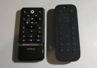
My final visual complaint about the Nyko Media Remote is the Home (Guide) button has a little house symbol printed on it instead of an Xbox logo. That's a little odd and maybe indicates that the remote is not licensed by Microsoft (which would also help explain its affordability).
Otherwise, buttons are really the Nyko Media Remote's strongest feature. The button labels have a bright white color that is easy to see, even in dim settings. In contrast, the Microsoft remote's buttons have a much more dull color. They light up when you move the remote, but I still find Nyko's buttons have better visibility overall.
Nyko's buttons also extend farther from the remote, making them easier to find by touch. And they are positioned more closely together. I can touch any button on the Nyko remote with my thumb without moving my hand, but I can't do that with the Microsoft remote.
The Nyko Media Remote has the same twenty buttons as the Microsoft remote, plus two more: Power and Eject. The Power button is great. You just tap it to turn the console on or off – no need to hold the button down or confirm that you want to power down.
As for the eject button, it will make the Xbox One spit a disc out like so much black licorice. Both of these functions were missed on the official remote.
As for the buttons we haven't mentioned yet, you get View and Menu, Back, and that damn OneGuide button, all surrounding the top of the arrow buttons. Below it, the Mute button extrudes from the remote like the other buttons, so it can be found by touch. The Microsoft remote has a non-extrusive Mute button for no reason that I can think of.
The Channel and Volume buttons are swapped on the Nyko remote. Channel up and down site on the left, with Volume up and down on the right. I barely use the channel buttons and don't use volume at all, so the swap doesn't affect me much.
Finally, the six standard Playback buttons occupy the bottom of the button area, just above the LED bar.
Using a Media Remote with Xbox One
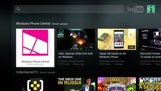
Since we reviewed Microsoft's Xbox One Media Remotein March, the Xbox One has seen a few improvements to its UI and video playback apps. Navigating the dashboard with a remote control remains the same. The Channel buttons still act like page up and down buttons on some menus but not others, reducing their utility. And much to my chagrin, the View button continues to do nothing on the actual dashboard. No sane person can explain why View doesn't control the snap feature.
Still, two important video apps work much better with remotes now: the Blu-ray player and YouTube. When the Xbox One Media Remote launched, the remote's Menu button did nothing. That made no sense because Blu-ray and DVD menus are pretty important. Nowadays, the Menu button actually activates a disc's menus, thank goodness. The View button now has a function as well. It opens the general video playback menu.
Initially, the YouTube app was incompatible with media remotes. It has since graduated to partial compatibility. You can use the remote to browse a selection of your subscription's recent videos, search for videos, and access the app settings. What you can't do is view your entire subscription list or access other menu functions. Those features are activated by the X button on a controller, and (shamefully) have not been mapped to a media remote button. But hey, at least the app kind of supports remotes now!
Overall Impression
The Nyko Media Remote is not much of a looker. That should surprise nobody, considering the remote costs ten dollars less than the Microsoft version. What's surprising is how the Nyko remote exceeds Microsoft's remote in the areas that really count. The buttons are easier to see and easier to press, and you even get two buttons that Microsoft left out of its own remote.
If I had to choose between Microsoft's prettier remote for $25 and Nyko's more useful remote for $15, I'd go with the Nyko every time. (If you're looking for a cheaper alternative in the UK, the Protek Media Remote fits the bill but isn't as nice as Nyko's version.)
- Nyko Media Remote for Xbox One – $14.99 – Amazon Link
Paul Acevedo is the Games Editor at Windows Central. A lifelong gamer, he has written about videogames for over 15 years and reviewed over 350 games for our site. Follow him on Twitter @PaulRAcevedo. Don’t hate. Appreciate!


