Nokia’s head of design tells you why the Lumia 620 is a great phone

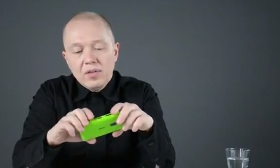
Marko Ahtisaari. You should know that name by now, if not, add to your memory (we’ll wait). He’s the head of Nokia’s product and user experience design, which means he oversees how our Lumia Windows Phones ultimately look. From changing the chrome buttons to black ceramic, to the battery casing, to the overall feel of the device Marko and his team are the one’s doing it at Nokia.
In this latest clip, the designer takes a look at the Lumia 620, one of our favorite phones in a similar manner to the Lumia 920 video. In it Marko details what the goal of the 620 design was and how Nokia achieved it. While not much new information is revealed, you do get the sense once again of purpose in design here.
Warning: if you want a Lumia 620, watching this video will only make you want it more.
Watch the YouTube clip above or the high resolution version from Vimeo embedded. Thanks, @mohammadmsft, for the link
All the latest news, reviews, and guides for Windows and Xbox diehards.

Daniel Rubino is the Editor-in-chief of Windows Central. He is also the head reviewer, podcast co-host, and analyst. He has been covering Microsoft since 2007 when this site was called WMExperts (and later Windows Phone Central). His interests include Windows, laptops, next-gen computing, and wearable tech. He has reviewed laptops for over 10 years and is particularly fond of 2-in-1 convertibles, Arm64 processors, new form factors, and thin-and-light PCs. Before all this tech stuff, he worked on a Ph.D. in linguistics, performed polysomnographs in NYC, and was a motion-picture operator for 17 years.
