Fully Exposed: Unreleased Nokia 'McLaren' Windows phone with 3D Touch [Exclusive]
The Nokia McLaren has never had a full analysis by anyone in the press. That all changes today as three veteran tech reporters fully detail the 3D Touch-enabled Nokia McLaren from 2014.
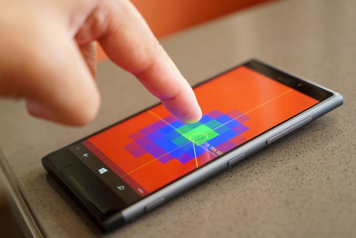
Back in 2013, rumors began circulating that Nokia was working on a very top secret project called 'Goldfinger.' The flagship phone was supposed to feature revolutionary 3D Touch-like navigation using projected capacitive display technology.
The phone, later referred to as 'McLaren' during development, was abruptly canceled in July 2014 just months before its release.
Exactly two years later, we managed to get our hands on the phone. We have been pouring over it, testing it, and prodding it for weeks trying to figure out this phone. This is its story.
Join Zac Bowden, Michael Fisher (MrMobile), and me as we each share our thoughts on the tale of the ill-fated Nokia McLaren. Never before has this phone been as detailed and exposed as what you will read here. From my post-mortem review to a full 13-minute walk-through of McLaren, you'll see this phone like you never have before.
We also have a full gallery of high-quality photos, screen captures of the various 3D tools, and even samples from that PureView camera.
Finally, watch Michael Fisher (MrMobile) as he gives his engaging and thoughtful take on what could have been with this now legendary phone.
This is the Nokia McLaren fully exposed.
Get the Windows Central Newsletter
All the latest news, reviews, and guides for Windows and Xbox diehards.
Daniel Rubino, Editor in Chief, Windows Central
Specifications
| Category | Nokia McLaren |
|---|---|
| OS | Windows Phone 8.1 Update 1 (8.10.14128.140) |
| Body | Metal (Grey) with plastic bottom (antenna) |
| Processor | Qualcomm Snapdragon 800 (MSM8974) Quad Core Processor2.3Ghz |
| Memory | RAM: 2GB |
| Mass memory | 32GB storagemicroSD memory slot up to 128GB (SDXC compatible) |
| Display | 5.5" LCD Full HD (1920 x 1080)Projected-Capacitive Touch Technology (unconfirmed) |
| Battery | Unknown sizeNon-replaceable |
| Camera | Rear camera: 20MP PureView ZEISS, OIS, Dual LED flashFront-facing camera: 2MP, fixed focusDedicated camera buttonHAAC microphones |
| SIM | Single nanoSIM tray |
| Charging | micro USB |
| Wireless charging | No |
| Sensors | Light sensorG sensorE-CompassProximity sensorGyro SensorGPS/AGPS |
The Review
Daniel Rubino finally catches his White Whale with the mysterious Nokia McLaren and 3D Touch.
Rumors of a Nokia phone featuring 3D Touch navigation and gesture support go back to November 2013. Back then, the secret phone project went by the name Goldfinger, but at some point, it was changed to McLaren during development.
McLaren supposedly utilized hardware sensors to enable you to manipulate things on-screen through gestures, and we saw early signs of this with Nokia Glance using proximity sensors. We also documented internal reports [of exploding Live Tiles dubbed MixView that had a striking resemblance to earlier UI designs in the Zune music software.
Unfortunately, the McLaren project was nixed in July 2014 a mere four months before its launch. The decision sealed the fate of Windows Phone as there would not be another flagship device from the Nokia/Microsoft portfolio until November 2015.
We'll take a look at all of those rumors, but first, let's break down the hardware.
Hardware
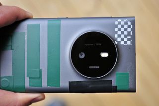
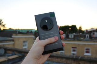
The McLaren prototype in our possession is considered the final build and we have been told it was one of the few versions reserved for Microsoft employees during its development. Although we cannot show you the security markings, it does say 'Microsoft Mobile' across the device, which demonstrates how closely Nokia and Microsoft were working on this technology.
The overall design of the phone is very familiar, and it looks like a cross between the Lumia 1020 and Lumia 925. The body of the phone is a gray metal although the bottom is polycarbonate likely for the radio antennas. The feel in the hand is fantastic, and while it is not light, it is not too heavy, either.
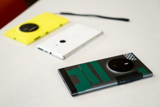
The buttons on the side include volume up and down rockers, power, and a dedicated camera button. On the opposite side is a port door for a microSD card and nano SIM tray. The bottom features a micro-USB port, and the 3.5mm headphone jack is placed at the top. And due to the massive camera hump and being metal, there is no Qi wireless charging.
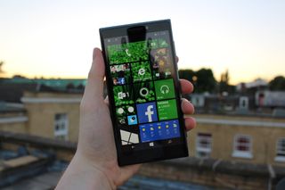
The phone features a 5.5-inch Full HD LCD, which is one of the first times we have seen that display size from Nokia.
For storage, the phone features 32GB of internal memory and supports microSD for expansion.
Regarding the processor, we can confirm the McLaren has a Snapdragon 800 CPU clocked at 2.3Ghz, along with 2GB of RAM.
Let's talk about that massive camera hump: It's immense and roughly the same size and design as the one found on the Lumia 1020. However, the camera is only in the 20MP range, and not 41MP or higher. Most of that hump is for the proprietary optical image stabilization, which was later improved and shrunk down for the Lumia 950 and 950 XL.
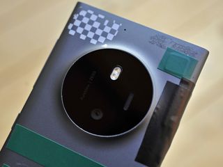
Unfortunately, much of the camera software was never finalized for this prototype, so it only shoots at 8MP with no auxiliary options. However, I did confirm with people familiar with this project that the camera was supposed to be 20 megapixels. Zac Bowden was able to confirm this later when he had a chance to use the phone.
Despite the unfinished state of this prototype and our tape hiding sensitive information, the phone feels fantastic. The curved edges and metal body represent the flagship quality that Lumia fans expect. While much of the technology in McLaren was dated – even for 2014 – there is little doubt Microsoft should have borrowed from this design for the Lumia 950 and Lumia 950 XL, which are underwhelming, to say the least.
3D Touch
Let's get to the good stuff: 3D Touch. It exists, it's here, and it works. Everything we reported on back in 2014 was spot on. There are Live Tiles that 'explode', and you can interact with the phone merely by hovering your hand over it.
3D Touch works with various sensors in the display and even on the sides of the McLaren. As your finger approaches the screen all the Tiles begin to move in a wave-like fashion as visual feedback. Hovering above the Internet Explorer and Phone reveal the 'exploding' Live Tile MixView feature. The concept here was to give developers freedom to show more information on the Live Tile. Instead of just two sides, you could have up to eight smaller tiles. When you hover, the Tile explodes and moves to the center of the display where you can act on the smaller tiles. It is a little awkward, but it works.
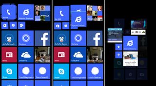
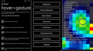
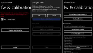
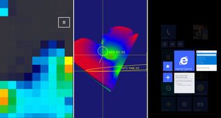
Under Settings, we can see the Hover + Gestures options. Using the phone's 3D sensors users can enable:
- Hover on Start screen
- Keep the screen on when holding the phone
- Lock the screen orientation when holding the phone
- Silence the phone by gripping it when a call comes or by hovering your hand over the display
- Answer incoming calls by waving your hand
- Mute the speaker phone by hovering your hand over the lower half of the display
And it all works! I have to admit, many of these features, while not revolutionary, are an excellent evolution of the touch interaction model for modern smartphones. Things like keeping the display on while holding the phone were later replicated by Samsung and others using the front-facing camera, but the tech here is used for much more. Being able to lock the phone's orientation while gripping the device is a much better solution than toggling the feature on or off.
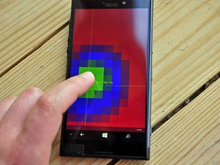
To get a real idea of the technology here, you can see it in action using one of the 3D Touch testing apps. The display can track multiple fingers hovering over the screen, and you can even see it react to me gripping the phone. Needless to say, it is all very impressive looking technology, and it looks like something from the future, not two years ago.
Later, in 2016, Microsoft filed an application to patent Mix View with the USPTO.
So what went wrong in July 2014?
Good, but not good enough
I have been researching this topic since we reported on the phone's demise in July 2014. Back then, I cited Microsoft being unable to move beyond the proposal stage for interactive usages with the technology. Some developers under NDA were building apps with MixView, and there were some big plans. For instance, the camera would have no UI visible until your finger approached the display or being able to zoom in by sliding your finger on the edge of the phone.
In 2016, I am still hearing from people familiar with the project that users simply did not get the concepts of 3D Touch. This criticism counts for beta testers as well as developers. It may seem crazy, but perhaps this technology was just too new and too different for users. I can see the argument for the exploding Live Tiles, which is a very different interaction model. However, things like hovering or keeping the phone's display on while holding the phone seem like extensions of user features, not a redefinition.
Nonetheless, McLaren suffered from many of the problems that other Lumias had at the time. The Snapdragon 800 was already a year old; the camera hump looks more impressive than it was, and besides 3D touch, the McLaren was just a small evolution. I also heard that the 3D Touch technology used was problematic. Indeed, I attest that this prototype is very buggy, and you would not want to use it for daily use. Is that because it was still in development or underlying problems? We may never know.
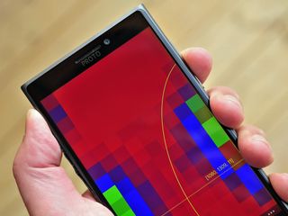
I will say that by canceling McLaren, Microsoft and Nokia sealed the fate of Windows Phone. When you write off a flagship, you don't have a Plan B phone ready to go. That's it. This reason may be why just a month later HTC – seemingly out of nowhere – announced the One M8 with Windows Phone 8.1. At the very least, McLaren would have done one thing: generate hype. Like the Lumia 1020, McLaren did something new and ground-breaking. I don't think it would have saved Windows Phone 8.1 from declining sales, but it may have kept market share from nosediving. Without McLaren, Nokia had to rely on the Lumia 930, itself based on the 2013-era Lumia Icon, through November 2015. That is a lot of time in the desert.
At least we can now finally close the door on McLaren and what could have been. Then again, Microsoft Research is still actively working on 3D touch, so who knows. Maybe someday.
The Video Review
If the Nokia McLaren were to come out, this would be our video review. See the unique phone in action as Daniel Rubino tells the history of the Nokia McLaren.
'It could have changed the game'
Zac Bowden tries out the Lumia McLaren and wonders how Microsoft lost its way after its cancellation.
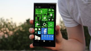
For my coverage, I thought it would be cool to give the McLaren a mini-review as if the device had actually launched to the public. Ignoring all the usability bugs that come with using the pre-release software on prototype hardware, I decided to try to use the phone as my daily driver for a few days, just to get a feel for what it would have been like to own and use a McLaren day-to-day.
Hardware
Let's start by talking about the hardware; in short, it's fantastic. It's thin, it's got a little bit of weight behind it which I love, it's metal, and it's sexy. I'm a sucker for metal phones, so using the McLaren, even without all the cool 3D touch features, is a pleasure in itself. It is a device from 2014 however, so the specs inside aren't all that jazzy for 2016, but since it's running Windows Phone 8.1, that's absolutely fine.
The handset is about as heavy as a Lumia 930, except with the McLaren, the whole body is metal rather than just the sides. The volume, power and camera buttons on the right-hand side of the device feel fantastic, they click-in really well and are overall very robust and premium feeling. In fact, the entire device is just one big premium handset, and I absolutely love it.
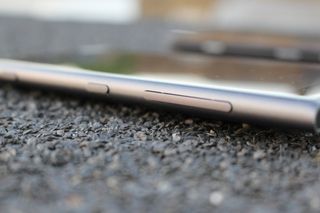
It makes using my Lumia 950 rather upsetting to use, actually. Comparing both the 950 and McLaren, the 950 feels flimsy, light and just cheap, which is heavier, metal, and overall audacious. It is using the whole wrap-around design style the Lumia 920 and 1020 used, which I think is great. It's an old call-back to when Lumia was bold, except with the McLaren there are only two known colors; white and black. Our model is the black one, which looks pretty ace if I do say so myself.
The McLaren is rocking a 5.5-inch 1080p LCD panel, which is pretty great. It's bright, and colors seems to pop well even on an LCD panel. So much so, I had to double check to make sure this really was an LCD, as blacks are really deep on this screen. It's a super high-quality display and one that I've had a blast using. It does sport on-screen buttons however, which isn't so bad now I've gotten used to them on the 950 over the last several months. For a long time now I've always preferred physical capacitive buttons over on-screen navigation, but I do like the convenience of swiping the keys away when not needed.
Usage
Let's talk about actually using the device, which in itself is a unique experience. With 3D touch, things like MixView are kind of cool, but as the software was never finished only two apps actually utilize the MixView functionality. Phone and Internet Explorer, providing shortcuts to recent contacts and open tabs. To me, however, that's not the wow factor of this device; it's the subtle things the 3D sensors can do surrounding the handset that blow me away.
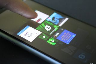
For example, the McLaren knows when to turn on/off Rotation Lock depending on how I'm holding the device. Yes, the McLaren knows how I'm holding it, and will make a (usually accurate) judgment whether I want the orientation locked. So when I go to lay down, my screen won't fumble and try to rotate even though I want to continue using the phone in portrait mode on my side.
Another great subtle feature is the phone's screen won't timeout when I'm holding it. I can be reading a long document and not have to keep tapping on the screen every minute to keep it from going to sleep automatically, as the sensors around the handset can tell I'm actively holding it. There are also some cool gestures you can do with phone calls, such as covering the lower half of the screen when on a call to mute the microphone, much like you did in the old days on a landline phone.
You can also do things like automatically answer a call in speaker mode by waving your hand over the screen, which is perfect for moments in which you just can't be bothered to pick the device up from the table. Yeah, we've all been there.
The device is smart enough to know how you're holding it, too. There's a test app that spits out logs that you can read, and it gives you an accurate description of what hand you're holding the phone with, what orientation, whether you're holding it at the top, bottom or middle, and a whole lot more. Just imagine what developers could have done with this technology.
All these gestures can be turned off if you wish too, so if some of them get in the way or are just annoying to you, you don't have to use them at all.
I noticed that the gestures work regardless of whether you're using your finger, a pen, or anything really. That could be one of the reasons why this phone is so buggy. Holding the handset is always activating the sensors around the device, sometimes causing the Start Screen to think you're hovering your finger over it and creating a multitude of touch issues.
Since this is a prototype, however, that's to be expected. In fact, I encountered many problems using this handset, so much so I couldn't use it as a daily driver for too long without it impacting my productivity. Of course, since this is a mini-review of a product that's never coming out, that's absolutely fine. The handset reboots several times a day, which is probably for the best considering the touch sensors often stop taking input from my fingers. Other than the touch/scroll issues and rebooting, the handset works pretty well.
Camera
Again, jumping back to the fact that this is prototype hardware, the camera software was never finished for this shooter. Therefore we were unable to utilize fully the raw 20 megapixels this device is supposed to rock. I was, however, able to get it to shoot some high-res, 19MP shots at 4:3, which in my book is good enough.
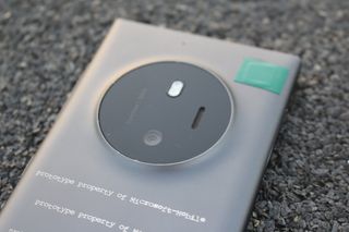
I've taken a few sample shots for you to view below, again since this is prototype stuff you can't exactly take these shots for what the final product would've been capable of, but at least it's something:


I was also able to get the camera to record at 1080p/30fps. However, there were some problems with audio being choppy, jumpy and cutting out.
Conclusion
The Lumia McLaren is a bold Nokia/Microsoft attempt at trying to change how we interact with our smartphones. With 3D touch and surrounding sensors, I think the McLaren was ahead of the game when it was being developed. Before using the McLaren myself, I had always wondered whether the 3D touch and sensors would have been useful in day-to-day life, but now that I've had the chance to use one, I can't help but think Microsoft missed out on something big here.
The reason why this device was canceled was reportedly due to many issues regarding the 3D touch and sensors (as well as testers simply not getting it), which I can understand as after using the handset for a few days, the sensors are a little finicky. Perhaps they were just never able to perfect it, or maybe developers didn't want to develop for it? For this hardware to truly shine, developers would have had to have been on board with MixView, which on a platform that had 4% market share at the time, wasn't going to happen.
The McLaren would've been the only kind of Windows Phone on the market to sport this functionality too, meaning developers would simply be developing 3D touch capabilities for one device that not very many people would buy. But besides all that, in a world in which the McLaren did get released, and developers did code for it, I think it could have changed the smartphone game. With Apples take on 3D Touch, the McLaren does it the opposite way, instead of pushing harder on the screen like on an iPhone, you hover your finger above the display for additional context menus on the McLaren.
And then there is the sensors that surround the handset, which in my eyes would've been the thing people appreciated far more. Even with the basic functionality Microsoft had already built into the operating system, these sensors could do so many things, even without you noticing. One can only wonder what developers could've done with them.
That's one of the biggest things I think I like about the McLaren, the fact that it knows when you're holding it and knows when to keep the screen orientation locked and screen on, just stuff like that that in 2016 should already be automated but aren't.
In the end, McLaren is a handset that tried to change things, and it just never came to be. I've had a blast using this device, and even after using it for over a week, I'm still amazed by how well built the handset is. After you get used to the 3D touch, sensors, and all that jazz, you're still left looking at that body and wondering "damn, how did Microsoft get it so wrong with the Lumia 950?"
Photo Gallery
Want to just see the Nokia McLaren? Here is our full gallery of photos of the device from every angle. Check out that huge Lumia 1020-like camera, or the metal body of this wild phone.


MrMobile's take
The McLaren is a landmark to a once great phone manufacturer and an echo of a Microsoft that once embraced doing things differently.
...the last remnant of that exciting era.
MrMobile aka Michael Fisher tells the tale of the Nokia McLaren like no other. Sit back and watch as his video skills and narration gives this phone the respect — and awe — it deserves.
Follow MrMobile for the rest of his thoughts on all aspects of technology.
13 minutes of McLaren
Forget edits, let's show you what using McLaren is really like
Often in reviews, you get to see the polished b-roll filled videos and prepped voice narration. While it presents the material in a professional fashion, sometimes you just want to see a more real-world demonstration.
Watch as Daniel Rubino gives a 13-minute walkthrough of the Nokia McLaren from booting it up to showing off those 3D sensors all in one take.
Podcast

A very special, rare, prototype version of the Windows Central Podcast: All About McLaren Edition
Join host Daniel Bader as he talks to Daniel, Michael and Zac all about the Lumia 1030 "McLaren" that never was.
Subscribe to the podcast
- Download directly: Audio
- Listen via: Windows Central app Windows 10 | Android
- Subscribe via iTunes
- Subscribe via RSS
- Subscribe via Google Play Music
- Subscribe via Pocket Casts
Hosts
Find the rest of our pocasts on the main Windows Central Podcast page.
The Future?
Is there a future for 3D Touch Navigation? A lot has changed since 2014. Nokia Mobile as it once was is no more. Microsoft has essentially pulled the plug on Windows Phone hardware – but not the OS. Leadership and philosophy have also shifted with a new truly universal approach to Windows 10.
Microsoft Research, itself a separate division within the company, is still working on alternative computational interaction models. Just a few months ago, 3D 'pre-touch' was demoed on what looks like the McLaren prototype.
Could we see this technology still come to consumer devices? Will the rumored "Surface Phone" under Panos Panay's leadership borrow anything from McLaren? Or maybe the technology is just too ahead of its time.
But if there is one lesson we can take from the McLaren project is that there are still new and bold technologies for smartphones that can transform how we use them. Microsoft has the capability – we know that – so let's hope we see some of it soon.
On behalf of the Windows Central team, we hope you enjoyed this deep dive into this one-of-a-kind device.
Special thanks to Zac Bowden, Michael Fisher, and Mark Guim, for putting this project together.

Daniel Rubino is the Editor-in-chief of Windows Central. He is also the head reviewer, podcast co-host, and analyst. He has been covering Microsoft since 2007 when this site was called WMExperts (and later Windows Phone Central). His interests include Windows, laptops, next-gen computing, and wearable tech. He has reviewed laptops for over 10 years and is particularly fond of 2-in-1 convertibles, Arm64 processors, new form factors, and thin-and-light PCs. Before all this tech stuff, he worked on a Ph.D. in linguistics, performed polysomnographs in NYC, and was a motion-picture operator for 17 years.