Nokia Lumia 720 Review
Windows Phone Central's review of the entry level, but feature packed, Nokia Lumia 720
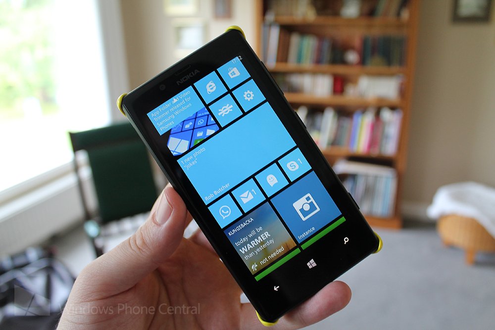
We know this review is late. The Nokia Lumia 720 has been available in several markets for some time now but was slightly buried behind the insanely low-priced Nokia Lumia 520 and its rise as the king of value for money smartphones.
As a result many have already been out and purchased the 720 and will have already formed their own opinions, and will no doubt offer them in our comments section below. But if for any reason you’re looking at picking up your first Windows Phone device and the Lumia 720 is on your radar, allow us to tell you why you should give it some serious consideration.
| Purest expression of the Nokia Lumia design, absolutely beautiful phone. Battery life is outstanding, the screen has excellent colours and viewing angles. Camera performs admirably in normal conditions. Solid Nokia software support. | A little too much time spent looking at "loading..." screens. Camera low light performance is noisy. Low memory device means app selection is limited, and low storage means you will need to be constrained with app choices. |
| For anyone who doesn't mind the slightly limited app and games selection, or doesn't need to fill their phone with apps, the Nokia Lumia 720 is a hands down winner. The battery life alone makes it worth your time to explore and the overall experience is excellent. The camera performs well enough for the money and the lack of a HD display doesn't really hurt the experience. However if you plan on anything more than casual gaming, want the fastest possible Windows Phone experience, or to feel unlimited by your device, the Lumia 720 may represent too many compromises. |
Hardware
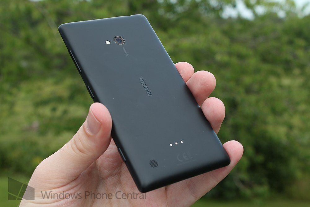
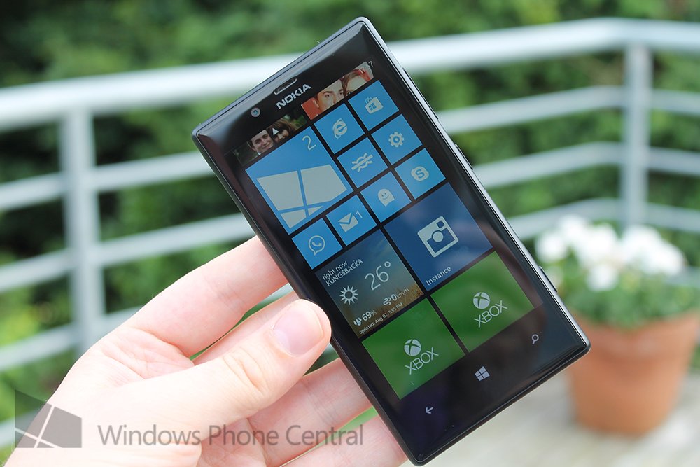
Before we go any further let’s take a moment to appreciate the design of the Nokia Lumia 720. It is in this humble reviewer’s opinion the purest, most refined expression of the Lumia design language that Nokia has developed.
At a mere 9mm thin, 67.5mm wide and just 127.9mm tall, it’s not hard to imagine that this phone is only 128g. Made of a unibody polycarbonate shell I can honestly say that this phone fits perfectly into almost every hand, makes barely an impression in any pocket, and feels built to last. In fact, whilst many will find the very simple design to be perfect, there is some argument to say that it’s verging on being a little mundane. Unlike HTC’s very expressive 8S low memory device the Lumia 720 can be look a little plain. Of course, that’s easily remedied by choosing one of Nokia’s distinctive colour options, or by picking up a case, and it’s good to have the black and white option for those who simply want to body to melt away during their experience.
There are no creaks to be heard, no unwelcome flexibility to be found around the shell, and the beautiful 4.3” IPS LCD screen sits behind Corning’s Gorilla Glass 2 which has the slightest of curve to it. Your gestures will be unimpeded as you swipe to the edges of your device, which considering just how often Windows Phone will have you swiping, feels almost necessary at this point. I’ve forgotten using Windows Phones which didn’t have curved glass until I went back to one of my old Windows Phone 7 devices, at which point you realise just how important the curve is to the experience.
Many will look at the resolution of this screen and scoff at the lack of HD, dismissing it instantly. If you’re coming from a 720p or similar device I can’t tell you that you won’t notice it initially. Because 4.3 inches is starting to push the WVGA resolution in my opinion. But I can say you forget about it in almost no time. It helps that the Metro UI’s minimalist straight line approach doesn’t really require more pixels than your eyes can perceive, so most of your interaction with the phone looks fantastic. It’s only on pictures or zooming into text that you will notice that you’re not in a HD world. Viewing angles are fantastic, the display is bright and thanks to Nokia’s tireless engineering everything is visible outdoors in bright sunlight so this screen is by no means a slouch (and is magnitudes superior to the Lumia 520 for those keeping score).
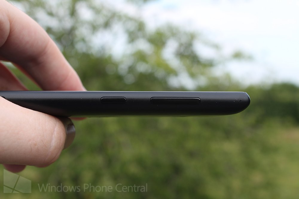
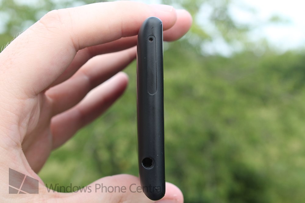
Nokia break their flawless unibody design only for the hardware buttons (which have an excellent, if slightly soft feel to each click), the micro USB & 3.5mm headphone jack, and finally two separate eject-able trays. One for the micro SD card and one for the micro SIM (everything on this device is ‘micro’). I do have some reservations about the SIM tray though, being one of those lucky guys who swaps SIM between multiple phones I’ve noticed that the polycarbonate part of the Lumia 720’s tray is very flexible and it’s perfectly possible to accidently bend it as you re-insert the SIM. It feels like without care both of these trays could break, something I never think when I use the Lumia 920. I wouldn’t go so far as to consider this a negative point as it’s not the typical use case, but you should take a little care if you plan on constantly accessing the SIM or micro SD cards.
Get the Windows Central Newsletter
All the latest news, reviews, and guides for Windows and Xbox diehards.
Performance
So, we know the outside is phenomenal, what can we find wrapped inside the delicious polycarbonate shell?
Well, this is a low end Windows Phone 8 device, so that means a dual core 1 GHz Snapdragon processor couple with 512MB of RAM, plus 8GB of inbuilt storage which you can of course expand with that micro SD card (just remember that’s only for media files, so your app storage will be limited). That 8GB storage presents an issue for many people, as the device will happily hold 5-10 games, a multitude of apps and some offline map data, but then suddenly its run out of storage. The ‘other’ storage problems, wherein space appears to be lost as it’s taken by offline SkyDrive caches and other information that is copied locally to ensure a fast experience, is well documented in the world of Windows Phone, and it will rear its head here if you’re a heavy app user.
For the most part you won’t notice the reduced internals in day to day operation, however if you’ve put in some hours with a higher spec’d Windows Phone 8 device it does become clear you’re spending a little more time looking at “loading…” screens than you otherwise might.
In of itself, a little waiting time isn’t going to upset anyone, but of course that isn’t telling the whole story. 512 megabytes of RAM means that this device is limited in terms of the apps and games it is able to run. Mostly this only affects higher end games (and if you want to do more than casual gaming on a Windows Phone you need to buy a phone with 1GB of RAM, end of story), but there are also a few apps that either won’t install, or will have to run with a few concessions due to the limitation.
Just to explain this limitation in more detail. Under 1GB RAM devices, most apps are permitted up to 300MB of memory during runtime, and can request an additional 80MB (so totalling 380MB) by requesting it in the app’s manifest file. For lower memory devices, that limit is 150MB at runtime with the option to request only an additional 30MB (totalling 180MB) through the manifest file. There’s a lot that can be done in a possible additional 200MB of memory so it’s understandable that some apps simply cannot support the lower memory functions. Of course, many developers will spend the extra time optimising their code and caching procedures to try and keep that memory usage light. If you want to read more about the memory limitations there’s an excellent MSDN article that might be worth your time here.
Cameras
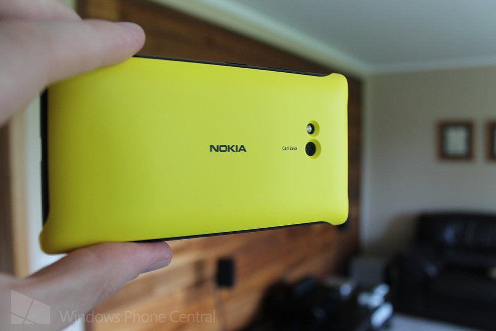
When Nokia first announced the Lumia 720 they were quite keen to emphasise that it would come with some fairly serious photography chops, so how does the final product measure up? On the rear you’ll find a 6.7MP f/1.9 camera with a single LED flash. Up front is a 1.3MP wide angle camera suitable for video calling or capturing the occasional selfie (if you’re into that).
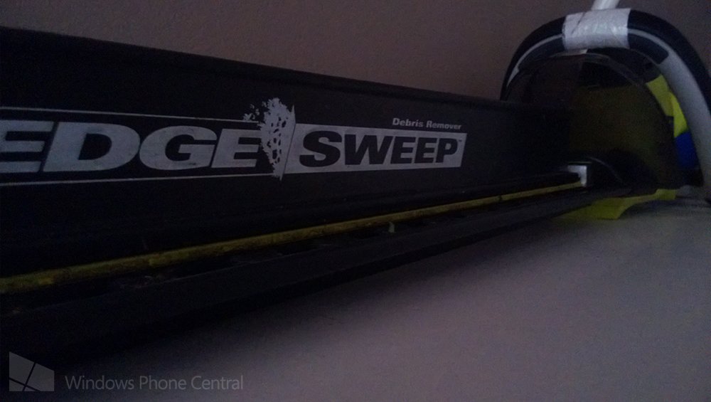
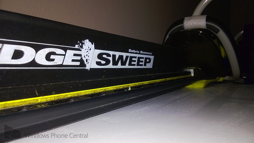
That low aperture rear lens is impressive, but it’s not backed up by the optical image stabilisation you’ll find on Nokia’s 92x and 102x series devices. That means that if you’ve got a steady hand you’ll still get some decent low light shots when your subjects are standing still, but a little shake and everything blurs up nicely. It's worth noting though that the lower light images can end up being pretty noisy, the software seems to naturally switch up to a high ISO and it definitely shows. Of course you could fall back on that single LED flash, but as anyone will tell you, LEDs are fairly horrific for an even spread of light. Dual LEDs can compensate for that a little whilst providing more light, so single LED flashes are just, well, alright.


6.7 megapixels is fairly reasonable when you’re composing a shot in good light, just don’t try and zoom in on anything, Applying digital zoom to this device just results in lacklustre, poorly detailed shots and is something best left to a dedicated point and shoot, DSLR, or that magical new Lumia 1020 Nokia released last week.
In daylight though, this camera performs admirably, colours are vivid and noise is all but non-existent. Of course if we measured cameras all in perfect conditions I’d tell you that they’re almost all the same.
Still, provided you’re not planning on taking too many photos at night time you’re getting a solid camera here, it performs well in good light and packs the images into enough pixels to give you decent detail from the full frame shots. Of course being a Nokia device you also get the fantastic Nokia imaging apps such as Panorama, Creative Studio and Cinemagraph. Creative Studio is absolutely fantastic now but if you want to capture panoramas use Microsoft’s Photosynth instead: it’s easier to use, gives better results, and is able to capture more information.


Battery life
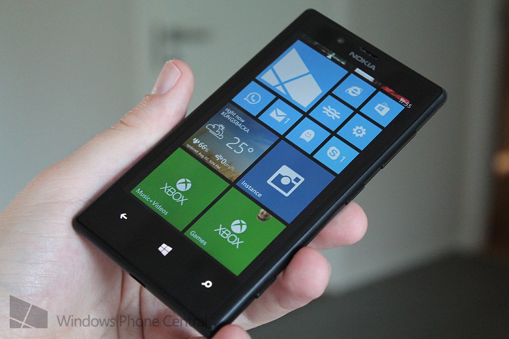
I’m rating the battery life under a dedicated header for a very simple reason. It is the best on any Windows Phone to date. Thanks to the lower end specification and the WVGA screen there’s not an awful lot to sap juice on this phone. You might think that Nokia would therefore put in the bare minimum battery and call it a day. However in a stroke of manufacturing sensibleness, they threw the same 2000MaH battery that you’ll find in the Lumia 920. Yes, that’s the same pack as the Lumia 920 with far more modest components to gently sip away at it. If you or the person you’re recommending a device to has any concern over battery life, then the Lumia 720 is going to be a strong contender. With active use you’ll see close to 2 days, whereas moderate use will stretch to three, and if you were to turn off mobile data whilst taking the 720 on holiday or similar, I think you could get almost a week out of this device.
On the subject of power, it’s a shame that the Lumia 720 doesn’t come with wireless charging built into the device, but at least the snap on cover is reasonably priced and lets you chose a nice eye popping colour. Also I honestly think I prefer holding the phone when it has the cover on, it fits perfectly in your hand then thanks to having that little bit more of a rear curve.
Software
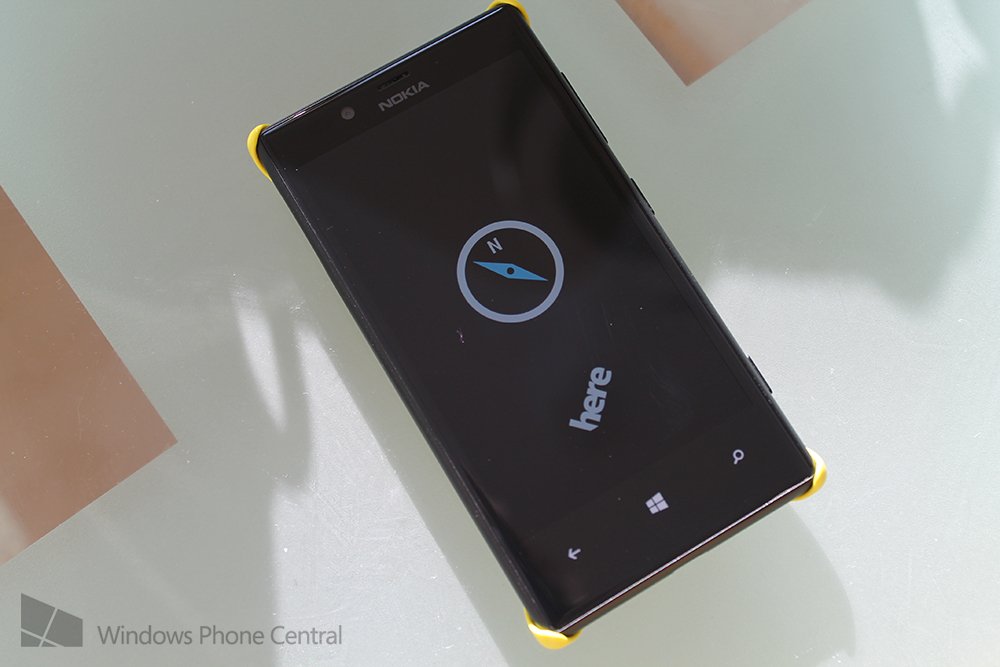
I’ve talked you through the performance of Windows Phone on this device, and there’s no need to re-hash that section. However, it is worth noting that as with all Nokia’s hardware you’ll get access to exclusive apps both created by Nokia to utilise specific functionality for their phones, and also from some third party developers where Nokia has aided in development.
Whilst Samsung, HTC and the other OEMs occasionally show some life and produce new unique apps for their devices it’s almost universally agreed at this point that Nokia are leading the pack for Windows Phone devices, so if you’re looking at hardware from another manufacturer for the same price point, it’s tough to recommend anything but the Nokia. We’re at the stage now where some of the key apps like Nokia Drive are now on the competing OEM’s devices, and yet still Nokia are including new features in their firmware. We know that the upcoming Amber firmware update will be coming to the Lumia 720 and you should definitely check out what that will bring.
Conclusion
When the Lumia 720 was first announced at mobile world congress, Daniel and I were a little unsure who it was for considering that it had a price point only a little under the Lumia 820 and was a lower spec device. It’s a question I’ve been trying to answer all through my time with the device. Who is this phone for, when you could be unlimited using the Lumia 820 with its awesome AMOLED screen and completely changeable covers?
I think I can maybe answer that question now. The Lumia 720 is for anyone who has a mind-set of “games aren’t that important to me, and I don’t need the most demanding apps”. Because apart from that memory limitation, I think that the Lumia 720 is a better phone than the 820 in every single way. Its light, the design looks much better than the 820 and the battery life is worth the price of admission alone. I’ve started using the Lumia 720 as my daily driver because it is simply that good a phone and I love not having to worry whether or not the battery will last me through the day.
Yet, I can’t help but wish the internals had been bumped. Maybe it’s because I’m used to no compromises, maybe it’s because I would like to run apps like Hipstamatic Oggl and snap useless photos to upload to Instagram. Yet maybe it’s because if this phone didn’t have this compromise, I could recommend it to anyone in a heartbeat. Of course, then the battery life wouldn’t be what it is, and maybe we wouldn’t have fallen in love in the first place.

