Nokia fans dream up some Windows Phone concepts

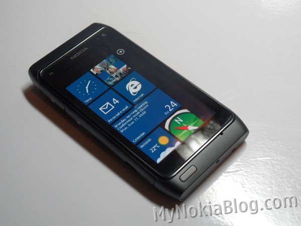
While we've seen those renderings of what Nokia may be thinking in regards to their Windows Phones, the Nokia/Symbian community too have been busy pondering what it means to them and how it may look.
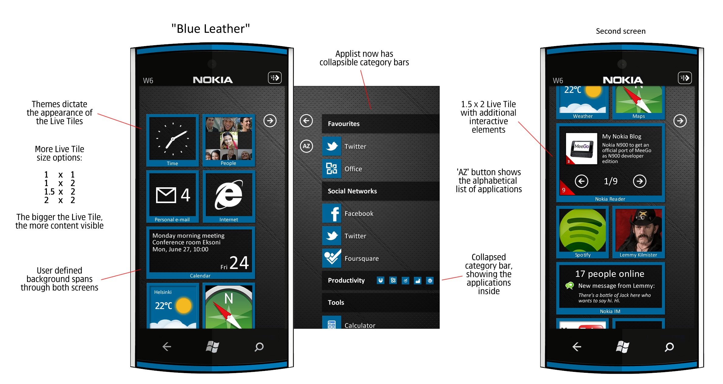
Enthusiast Peter Lackman emailed some concepts to My Nokia Blog showing what Nokia may have in mind. He understands that although Nokia can change the UI drastically, they most likely won't. Going with that, he has made two themes (Blue Leather and Summer) and has made the following changes:
- custom background wallpapers and
- revamped, theme style dictated live tiles in homescreen view with more live tile size options
- a reorganized App view with what looks to be
- a very helpful AZ for easy finding of apps (at the moment all you can do is scroll. I don’t know why you can’t “search” like you can with contacts).
- Collapsible category bars – with icons showing content of this category

The result is above. Our thoughts? Bring it. This looks really sharp and it's kind of fun seeing " it for real" on a Nokia phone. Makes this whole partnership seem that much more real, doesn't it?
Read more at My Nokia Blog. Thanks, Just Visiting, for the tip
Get the Windows Central Newsletter
All the latest news, reviews, and guides for Windows and Xbox diehards.

Daniel Rubino is the Editor-in-chief of Windows Central. He is also the head reviewer, podcast co-host, and analyst. He has been covering Microsoft since 2007 when this site was called WMExperts (and later Windows Phone Central). His interests include Windows, laptops, next-gen computing, and wearable tech. He has reviewed laptops for over 10 years and is particularly fond of 2-in-1 convertibles, Arm64 processors, new form factors, and thin-and-light PCs. Before all this tech stuff, he worked on a Ph.D. in linguistics, performed polysomnographs in NYC, and was a motion-picture operator for 17 years.
