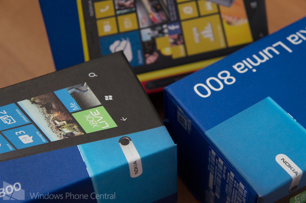
Nokia explains how the company approaches its attractive packaging

All the latest news, reviews, and guides for Windows and Xbox diehards.
You are now subscribed
Your newsletter sign-up was successful
Join the club
Get full access to premium articles, exclusive features and a growing list of member rewards.
Nokia has published a post over on its Conversations blog, going into some detail about its packaging used for numerous products. Not only does Nokia package and fire out Windows Phones (and Asha handsets), but accessories too. The post notes the company sells over 250 different products around the world.
Chris Merrick from Nokia explains how accessories pose a difficult challenge to the teams and why the design of packaging is important:
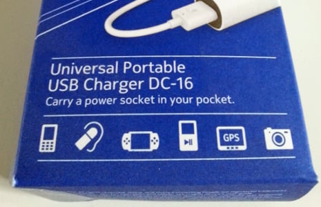
"Accessories packaging has a difficult challenge, because the packaging really has to sell the product. It has to stand out, and it has to differentiate and communicate all by itself. We have to decide what it is we want to inform the customer about, why this is the best product for you. If we look at many of our competitors and ourselves in the past, packaging design has looked super busy: banners, stickers, icons, flags, you name it, completely un-coordinated."
Merrick continues to explain how the team had to come up with something simpler, while still being able to communicate particular information. Short, descriptive headlines are used to explain the product and its features, while a category label on the side panel helps identify the segment that particular product is within (a dock, charger, headset, etc.).
Article continues below 
Materials and design processes
It's easy to tell when a product is by Nokia. You have the brand name and distinctive colour scheme with familiar shapes. As well as the looks, the Nokia teams have also had to alter the materials used to create more effective packaging, as Ulla Uimonen explains:
"We previously used 3D vacuum formed plastic parts that created the windows for our packages. We now use die cut foldable plastic parts, which enables us to create windows that go around the corners of the package. The bigger windows bring much more light to the product and allows narrower packaging. We can showcase the product better. There’s a nice detail where we’ve used curved white cardboard underneath the product, so the card actually deflects light, creating a backlit effect. It’s only possible with a particular design."
There's also the environment to consider and Nokia isn't newcomer when it comes to caring for the planet. All materials used for Nokia packaging are recyclable, which is a rather impressive feat. It's good to see a well-known brand taking measures to reduce its impact on the environment, while producing some iconic protection for products. Be sure to read the article for more information over on Nokia's blog.
Source: Nokia Conversations
All the latest news, reviews, and guides for Windows and Xbox diehards.

Rich Edmonds was formerly a Senior Editor of PC hardware at Windows Central, covering everything related to PC components and NAS. He's been involved in technology for more than a decade and knows a thing or two about the magic inside a PC chassis. You can follow him on Twitter at @RichEdmonds.
 Join The Club


