Nokia and Bing Maps get visual makeovers

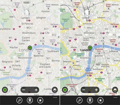
Nokia has updated the colour palette for their mapping service and this change has been reflected through Microsoft's Bing with the partnership between the two companies. The alterations are to make the browsing experience easier and more aesthetically pleasing with improved typography, colours and less obstructive icons. The above image illustrates the change with the new version of Bing Maps on the left.
While these changes are present on the web versions of both Nokia and Bing Maps, Windows Phone owners will be able to witness the improvements in the official apps. Note that Nokia Drive wont be updated with the new look for a week or two.
What do you make of said changes?
Source: Nokia Conversations
Get the Windows Central Newsletter
All the latest news, reviews, and guides for Windows and Xbox diehards.

Rich Edmonds was formerly a Senior Editor of PC hardware at Windows Central, covering everything related to PC components and NAS. He's been involved in technology for more than a decade and knows a thing or two about the magic inside a PC chassis. You can follow him on Twitter at @RichEdmonds.
