No more Metro for Microsoft – What do you think they should use instead?

All the latest news, reviews, and guides for Windows and Xbox diehards.
You are now subscribed
Your newsletter sign-up was successful
Join the club
Get full access to premium articles, exclusive features and a growing list of member rewards.
Now that the dust has settled, the previously rumored story that Microsoft was ditching the term ‘Metro’ seems to be holding true.
The claim was that the German company Metro AG made a complaint to Microsoft over the term and while it seems specious to us it was evidently enough to get Microsoft to immediately cease all usage of the name.
Ed Bott over at ZDNet has a good article articulating the point that Microsoft was not using ‘Metro’ as a code-name but instead used it dozens of times in press conferences, keynotes and developer documentation thereby making it official. In turn, he finds their public reasoning for abandoning the term ludicrous. We agree.
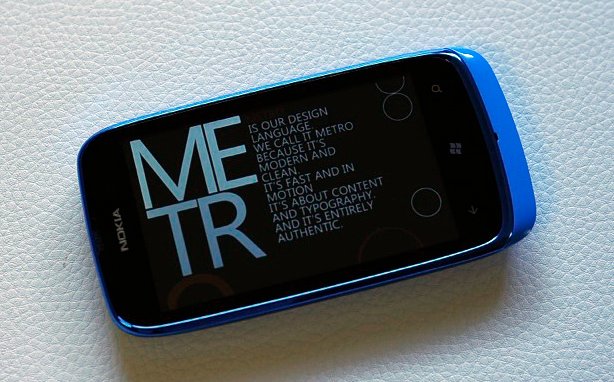
Article continues belowMicrosoft is expected to reveal a follow-up name to Metro, used to describe their minimalist design principle based off of metro (airport, subway) signage, sometime in the next week. While we wait for that name to drop, we want to know what you think it should be called?

When you think about it, branding is something that is very difficult to do which is why ‘Metro’ was so great—it flowed, it was descriptive, it was a single term, it evoked a modern feel.
So if you had a choice to name Microsoft’s new design language, what would you call it? According to Microsoft, these are the principles behind the-design-language-formerly-known-as-Metro:
- Typography. Type is beautiful. Not only is it attractive to the eye, but it can also be functional. The right balance of weight and positioning can create a visual hierarchy. Additionally, well-placed type can help lead you to more content.
- Motion is what brings the interface to life. Transitions are just as important as graphical design. By developing a consistent set of motions or animations, a system is created that provides context for usability, extra dimension and depth and improves the perceived performance of the whole interface.
- Content not Chrome is one of the more unique principles of Metro. By removing all notions of extra chrome in the UI, the content becomes the main focus. This is especially relevant due to the smaller screen size and gesture-based interactions.
- Honesty. Design explicitly for the form factor of a handheld device using touch, a high-resolution screen and simplified and expedited forms of interaction. In other words, be “authentically digital”.
With those descriptors in place, do you have a good replacement?
All the latest news, reviews, and guides for Windows and Xbox diehards.
If so, sound off in comments.
We'll pick the top 5 names and run them in a poll for you folks. The winner will get a $50 gift certificate to our store (which now has international shipping). Cool?

Daniel Rubino is the Editor-in-Chief of Windows Central. He is also the head reviewer, podcast co-host, and lead analyst. He has been covering Microsoft since 2007, when this site was called WMExperts (and later Windows Phone Central). His interests include Windows, laptops, next-gen computing, and wearable tech. He has reviewed laptops for over 10 years and is particularly fond of Qualcomm processors, new form factors, and thin-and-light PCs. Before all this tech stuff, he worked on a Ph.D. in linguistics studying brain and syntax, performed polysomnographs in NYC, and was a motion-picture operator for 17 years.
 Join The Club


