Take a peek at the clean, new look of the Windows 10 store

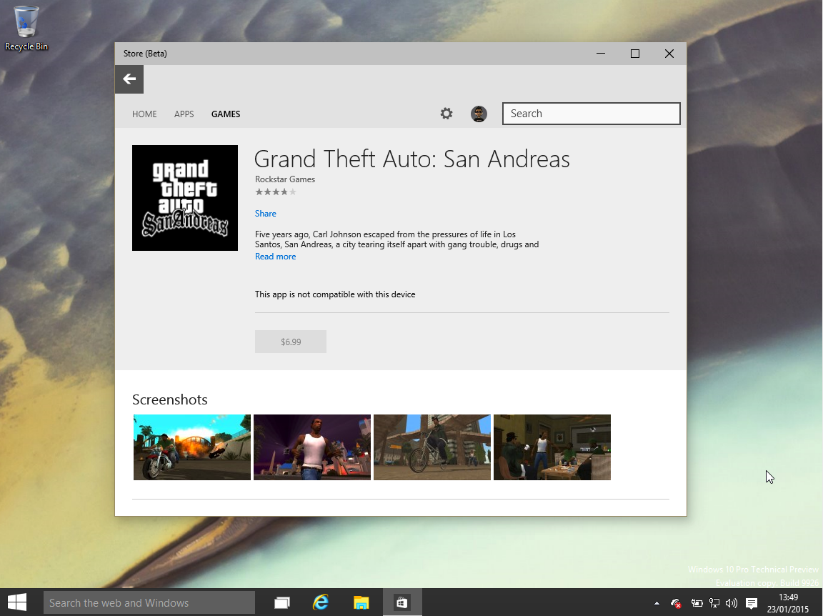
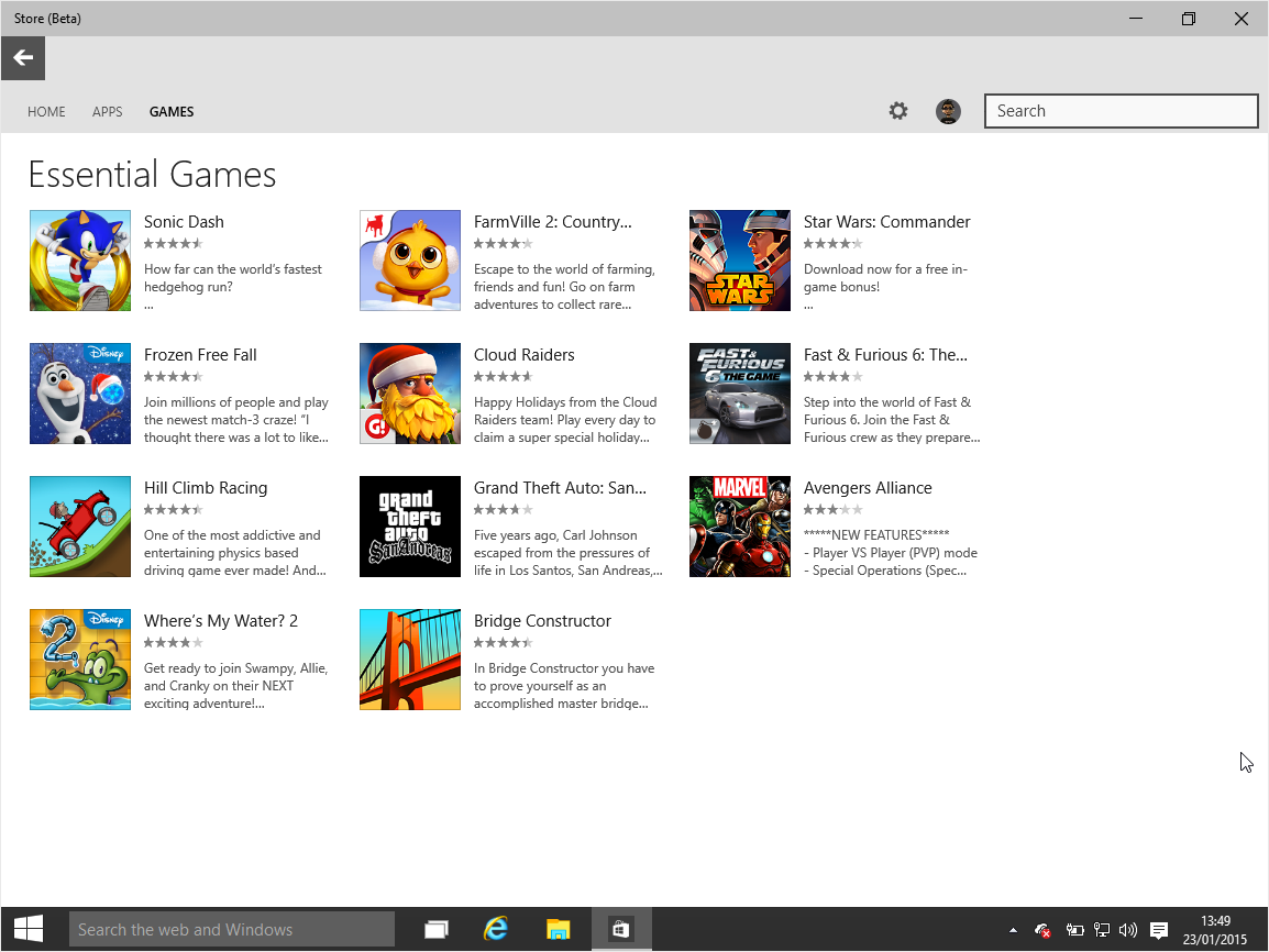
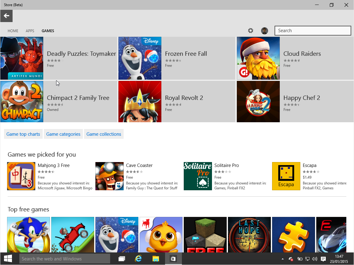
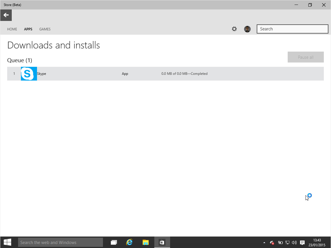
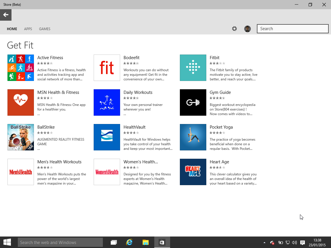
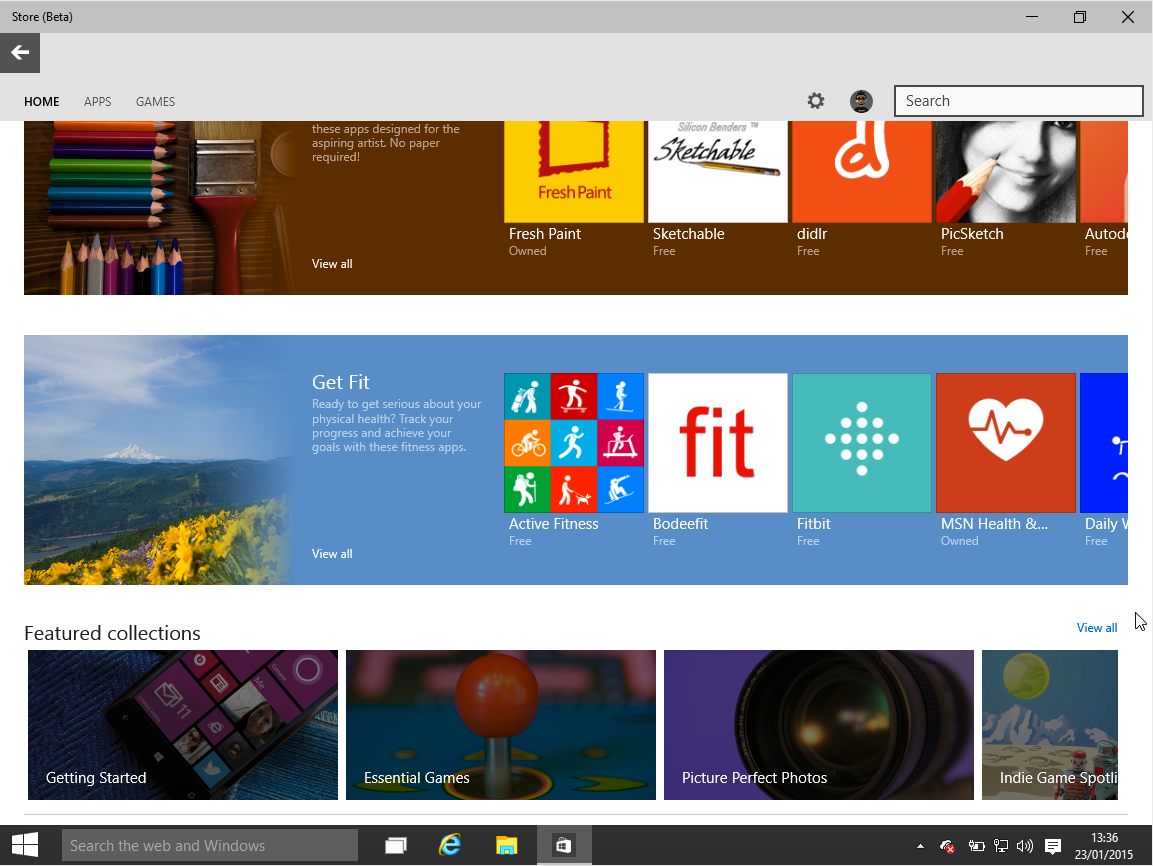
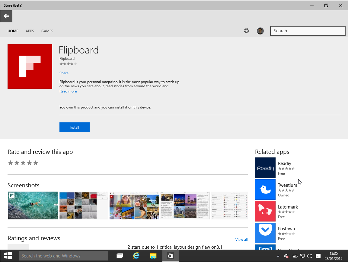
One of the many new parts to Windows 10 is the Store. In the latest Technical Preview we get a first look at the redesign. Functionally it's basically the same as the existing Windows 8.1 Store at the moment but with a substantial visual overhaul. Gone is the green and in its place comes flat gray tones.
It's still in beta – as is pretty much everything in Windows 10 right now – so anything and everything is still subject to change. But here's how it looks right now.
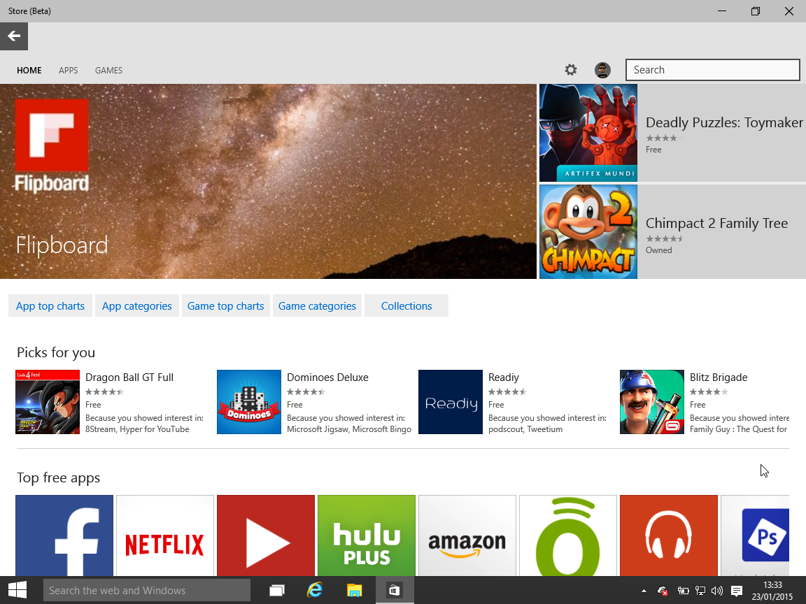
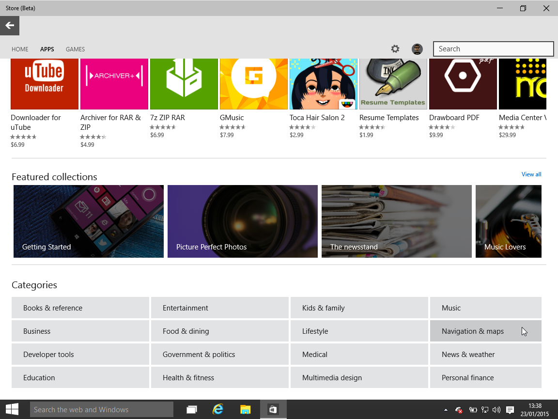
Besides the new, more subtle gray look, the biggest thing you notice immediately is that the sideways scrolling is gone. It's all vertical, all the time in the new Store app, but at least how apps and games are grouped together remains largely familiar. There's now a large feature block front and center, with the charts, collections, suggested picks and so on all below.
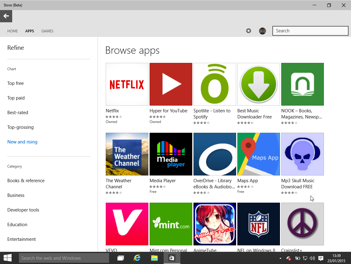
Collections also get a nice visual upgrade, with a big, bright band traversing the width of the screen highlighting them now. When you're looking at a chart or a category, the options are now clearly displayed down the left hand side with a grid of icons to the right. And of course you can use it just as well in a window as you can in full screen.
There's definitely going to be more to come as we get closer to launch in both appearance and features, but for now gorge yourselves on the plethora of images we've got for you below.

Get the Windows Central Newsletter
All the latest news, reviews, and guides for Windows and Xbox diehards.

Richard Devine is a Managing Editor at Windows Central with over a decade of experience. A former Project Manager and long-term tech addict, he joined Mobile Nations in 2011 and has been found on Android Central and iMore as well as Windows Central. Currently, you'll find him steering the site's coverage of all manner of PC hardware and reviews. Find him on Mastodon at mstdn.social/@richdevine
