Music Info for Windows 8 brings your collection to life
Microsoft have just launched their Windows 8 operating system and with it bundled in Xbox Music which gives users paid and free ways to stream tunes and play local tracks too. At present though the app has a few shortcomings so it’s through this lens we’re going to review Music Info by Johnny Westlake.
By the same developer who brought us Artist Info for Windows Phone, we take a look at this highly visual music playback and discovery app and even catch up with the developer for a short Q&A at the end.
Xbox Music for Windows 8 generally does an okay job of playing back music in our collection and providing a Store front for buying more content or grabbing more tracks as part of your subscription plan. There are problems with the app, however. On the Surface tablet it performs pretty badly, so much so in fact that it affects the overall performance of the whole system at times. There are some musical discovery features and ways to drill into your collection but they are currently limited or feel half baked. Thankfully there is an alternative.
Artist Info on Windows Phone is an excellent app, bringing with it fantastic user interface design and otherwise missing features to the platform. Like Artist Info, Music Info brings some much needed features and performance to Windows 8. It has done so with a degree of visual flare and attention to detail that Microsoft themselves have been unable to capture in their home grown Xbox music app.
Get into the groove
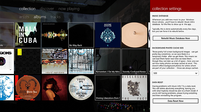
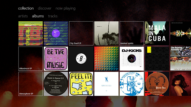
The app is designed to work with local content, there are no streaming options and so it needs to build a database of your tracks. It’s simple enough, go to the collection settings option within the app and hit the rebuild music database now button. The app will periodically scan you collection for new additions every few days. Once this is done you’ll be presented with a beautiful rendition of your collection which you can view by Album, Artist or by Track.
In Use
Get the Windows Central Newsletter
All the latest news, reviews, and guides for Windows and Xbox diehards.
On the Surface tablet, the app moves along with a purpose, swiping through the albums or drilling into information about the artist is silky smooth. If you’re using it on a traditional PC then it takes advantage of the extra screen real estate to show you more of everything and performance is even quicker generally. From the main collection screen you can click on an Album to start playing or you can swipe up from the bottom or down from the top to reveal the play controls. You have the choice of Shuffle All tracks and the usual back and forward options. If you click on an album or Artist you’ll be able to play everything by them or start drilling into that all important Music Info.
Music Discovery
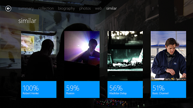
As well as being able to play everything by an artist you’ll be presented with options to read their biography, check out photos, see their other albums and even check to see how comes up as similar to them. Beyond that you can see their top tracks, albums, tour dates, shouts and tags that are associated with them.
Clicking on the discover section will give you access to charts, search and nearby options. The nearby option used your location and throws up a map with a neat listing of upcoming events, allowing you to click on them and drill into who’s playing and so on.
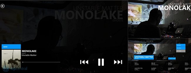
Now Playing
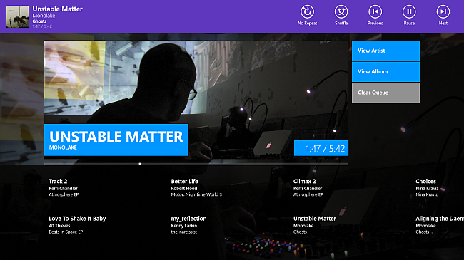
When you kick off the music playback you’ll be thrown into a highly visual series of playback screens, the first of which shows you what’s playing with time remaining, upcoming track in the playlist and options to get back into finding out more about your music. Sticking with just playback though if you tap the now playing screen you’ll be pushed into a full screen view where it will throw up the playback controls with a further tap. Switching in and out of different views is fast and fluid and above all else visually pleasing in a way that will make you want to engage with the app rather than fight with it for control.
If I was being picky I’d have liked the playback controls to be present on the main playback screen rather than having to swipe up or down to reveal the controls. Clicking the volume rocker, swiping up or pressing on the screen will bring up the controls so maybe I’m being picky. I’d also like to see the playback screen get the wonderful typography based screen saver option of Artist Info on Windows Phone.
Sounding off
If you have a Surface tablet then you need to get this app right away, it will dramatically improve your music playback experience. As well as providing much needed performance the app also does a better job of showing your own collection and brings with it discovery tools for the curious. There are places that the app still needs some work, I’d like to see some sharing options for Windows 8 charms and a few tweaks here and there. Even with a few gaps the app is still a must have addition to your Windows 8 machine. You can try it for free and it only costs £0.99p UK or $1.49 US should you want to treat yourself to the full app.
Wait up! By way of his toaster I caught up with Johnny and asked him a few questions about the app…
What made you develop an App for Windows 8?
Back at University earlier this year I was studying a HCI (Human Computer Interaction) module, and was doing some research into the usability of user interfaces. Windows 8 had just come out in it's consumer preview form and offered a radically different approach to user interaction, so it felt like a great place to start my research. During the research we tested a lot of designs and interaction models and ended up coming out with some hypothesis of how developers could try and improve the usability of their Windows 8 applications, whilst still sticking to some of the key guidelines Microsoft suggested. There's a lot of merit to what Microsoft are trying to do, but there are some key failings.
Fast forward to late July this year, and Microsoft UK were running a program to get students developers to come down to their campus in Reading, UK during August to try and develop some applications for the Windows 8 launch, and so I jumped at the chance to try and put some of the ideas to test, and just generally make something really nice! And so during August, myself and my design partner Lydia worked away on it, and got the first version finished in time to be up on the store in August, thanks to some generous help and tips from the people at Microsoft UK.
Obviously a very similar concept to Artist Info on WP7 - were you able to reuse any code?
For these two applications - no, not really. Obviously Windows 8 applications generally have a different UI layout, so you couldn't really re-use any of that. And then key things like how media playing and getting the music library on both differs so much (Window Phone has lovely system provided API's to do it for you - Windows 8 does not). Pinning is different, live tiles are different, there's different UI controls to make use of, and so on.
And then of course there's the new async programming style introduced in .NET 4.5 / WinRT that makes asynchronous programming so much easier, so it gave me the opportunity just to start from scratch and create cleaner, more efficient code. I suppose it's worth noting I think I start Artist Info 2 years ago - and I've learnt a lot since then - so the opportunity to rewrite it was a welcome one. I've ended up with a better internal architecture, cleaner code and libraries that I can easily move between projects.
I could have reused some of the older code, but I think code re-use will be a lot easier between Windows Phone 8 and Windows 8, rather than WP7 and Win8. It's still not close to the point of "write one application, run it anywhere" - but the best thing is that the languages and the frameworks are largely the same. So even if you have to write things differently for one platform than the other, the general ideas and techniques you've learnt can still be applied between platforms, which makes working on both extremely easy.
Are you still developing for Windows Phone 7/8 - tell us what's going on
In regards to Windows Phone 7, I've pretty much finished there now. As it stands, my applications work great on it, and there's little point in investing more time into a platform that'll be dying out.
Going ahead, I'll definitely be porting applications forwards to Windows Phone 8 though, taking advantage of the new API's and the new features offered by the platform - like integrating speech API's and custom lock screen backgrounds. I'm planning to re-write Artist Info for WP8 rather than just updating the WP7 project, borrowing a lot of the backend code from newer Music Info base now rather than Artist Info (and it'll take on the name of Music Info like its bigger brother)
Will you be bringing the same Zune style ‘now playing’ screens to Windows 8 app?
I'm planning on doing so at some point. It took quite a bit of time to get it to work on Windows Phone, and it was one of the last major additions I added to the program (and never actually properly finished). But, it was easier to get it working because there was only one screen resolution to work with. Windows 8 on the other hand has a whole heap of sizes to take into account - but on the other and there's generally far more processing power available and more opportunity for animated effects, so it's definitely something I'm looking into.
However, it'll have to wait until after I've added in the rest of the other major features. I've got things like live tiles already finished, and others like lyrics, playlists, videos and a metadata editor on the cards. And then pipe dreams like adding in DRM protected music support and additional codecs, before I try my hand at the now playing screen.
What are your thoughts on developing WinRT apps, do you test on the ARM also?
I haven't had the opportunity to test on an ARM device myself (I don't have the money for one), but if I did want to, Microsoft UK do offer developers the opportunity to come to them and test their applications on a whole range of Windows 8 hardware, ARM tablets included.
But, I hear good things about its performance on ARM devices! I never really intended Music Info to be used as a music player - rather that functionality was initially very basic and complimentary to the music discovery / information feature (I focus far more on music discovery in the marketplace description rather than music playing). But it got to a point where I found out people were really unhappy with how badly Xbox Music was performing on their tablets, and they were grateful that Music Info performed so much better - even if it didn't have all the features. So since then, I've focused some more effort in trying to beef up and improve the base music playing functionality of the program. It doesn't have all the bells and whistles, but it should be good enough for most people I hope.
In general, developing WinRT apps I'm okay with. On the one hand, I'm happy because I have so much experience with WPF and Silverlight development, that jumping into WinRT development is extremely painless. On the other hand, I find the XAML side of it bulky, slow and underpowered compared to the XAML platforms beforehand. You can look at something like desktop OneNote vs WinRT OneNote - by desktop one has a notebook open, using about 25MB of RAM. The same notebook on the WinRT version - about 55MB. And the WinRT version has less features! Not to mention the desktop version pretty much opens instantly for me. Some people might put that down to it being early days for OneNote RT, but coming from a developer’s point of view... you realise that it's the limitation of the framework itself.
The same arguments were said about WPF at its release too, and they still apply here. The XAML model is great for allowing you to create some fantastic looking UI's really easily, but it's just so resource heavy - and I'd love to see Microsoft just go nuts on trying to optimise it. Unfortunately with all the "rumours" you hear from inside Microsoft, it's beginning to sound like XAML is a second class citizen to HTML+CSS/JS powered UI's so there might not be much chance of that happening, which is a real shame.
Tell us your thoughts on Windows Phone 8/ Windows 8 and the three screens thing...
It's a nice idea I suppose, and it's something Microsoft have been trying to accomplish for over a decade. They're in a better place than anyone to accomplish it, but it's not something that excites me greatly. I'm more excited about creating experiences that leave the confines of screens and NUI’s, rather than just being shared between a bunch of them.
Official Website here
Download the Windows 8 app here

