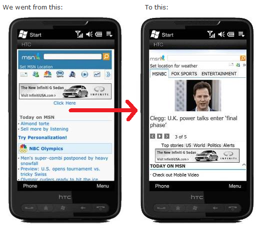
MSN Mobile gets a face-lift, looks slick

For those of you who still like the idea of "web portals" (which to us seems as dated as an AOL CD) you'll be pleased to know that Microsoft has taken the time to give a nice overhaul to their MSN Mobile website.
The new homepage now matches the recently re-launched desktop version, features ease of access to email, more minimalist graphics and faster downloads.
Overall, we have to give credit as it does look quite nice and were we not to rely on our native Bing, MSN Messenger or ability to push Hotmail, we suppose this would be our next best thing. (Speaking of Hotmail, login to the new revamped "preview" edition here)
Navigate to https://www.msn.com/ on your device to check it out, as it should be live. Unfortunately for us, at this time on our TP2/eXpo we were still with the old layout. Guess these things take time.
Read more on the MSN Blog: Behind the Butterfly (awesome name, by the way).
Get the Windows Central Newsletter
All the latest news, reviews, and guides for Windows and Xbox diehards.

Daniel Rubino is the Editor-in-chief of Windows Central. He is also the head reviewer, podcast co-host, and analyst. He has been covering Microsoft since 2007 when this site was called WMExperts (and later Windows Phone Central). His interests include Windows, laptops, next-gen computing, and wearable tech. He has reviewed laptops for over 10 years and is particularly fond of 2-in-1 convertibles, Arm64 processors, new form factors, and thin-and-light PCs. Before all this tech stuff, he worked on a Ph.D. in linguistics, performed polysomnographs in NYC, and was a motion-picture operator for 17 years.