Microsoft's Your Phone app gets new compose button, slight dark mode tweaks
A few little tweaks can go a long way.

All the latest news, reviews, and guides for Windows and Xbox diehards.
You are now subscribed
Your newsletter sign-up was successful
What you need to know
- Slow ring Windows Insiders were treated to some UI tweaks in the Your Phone app this week.
- There's a new button for composing new messages, and the app's dark mode is now a tad lighter.
- This update is available now as version 1.20032.104.0.
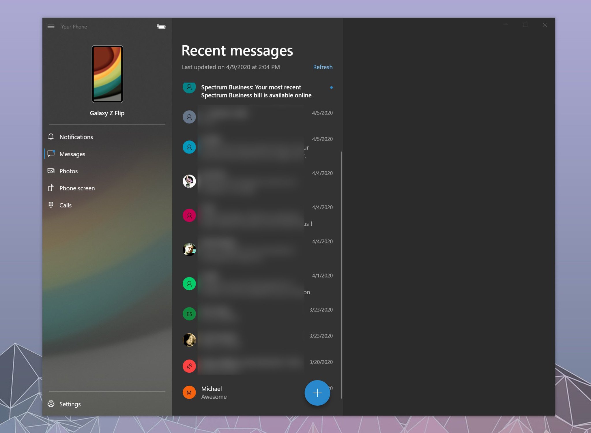
Microsoft pusehd out an update for the Your Phone app on Windows 10 this week that brings some notable little design tweaks. The biggest noticeable change is the new button for composing a message, which replaces the "New Message" button previously found at the top of your texts. There's also been a slight change to dark mode to make the app a little lighter.
The new compose button mimicks what you see on Android. It's now a blue circle with a "+" inside of it that sits at the bottom of your messages. It replaces the wider, rectangular "New Message" button that was previously placed above your messages.
It's a small change, but it's interesting to see Microsoft go in a more Android-like direction here.
Article continues belowThe tweaks to dark mode are a little more subtle. As pointed out by Aggiornamenti Lumia on Twitter, the dark mode is now more of a gray across the app. Previously, Your Phone had a stark black background.
Both changes are small in the grand scheme of things, but they add to a pile of a lot of smaller tweaks Microsoft has added to Your Phone over the past several months. If you're enrolled in the Windows 10 Slow ring, you can pick up these features now by updating Your Phone through the Microsoft Store.
All the latest news, reviews, and guides for Windows and Xbox diehards.

Dan Thorp-Lancaster is the former Editor-in-Chief of Windows Central. He began working with Windows Central, Android Central, and iMore as a news writer in 2014 and is obsessed with tech of all sorts. You can follow Dan on Twitter @DthorpL and Instagram @heyitsdtl.

