Microsoft's refreshed mobile apps extend Fluent Design across platforms
Microsoft discussed the designs of its flagship mobile apps today.

All the latest news, reviews, and guides for Windows and Xbox diehards.
You are now subscribed
Your newsletter sign-up was successful
What you need to know
- Microsoft discussed designs for its flagship mobile apps on iOS and Android.
- The apps incorporate Fluent Design language.
- Microsoft also redesigned the apps to facilitate quick productivity.
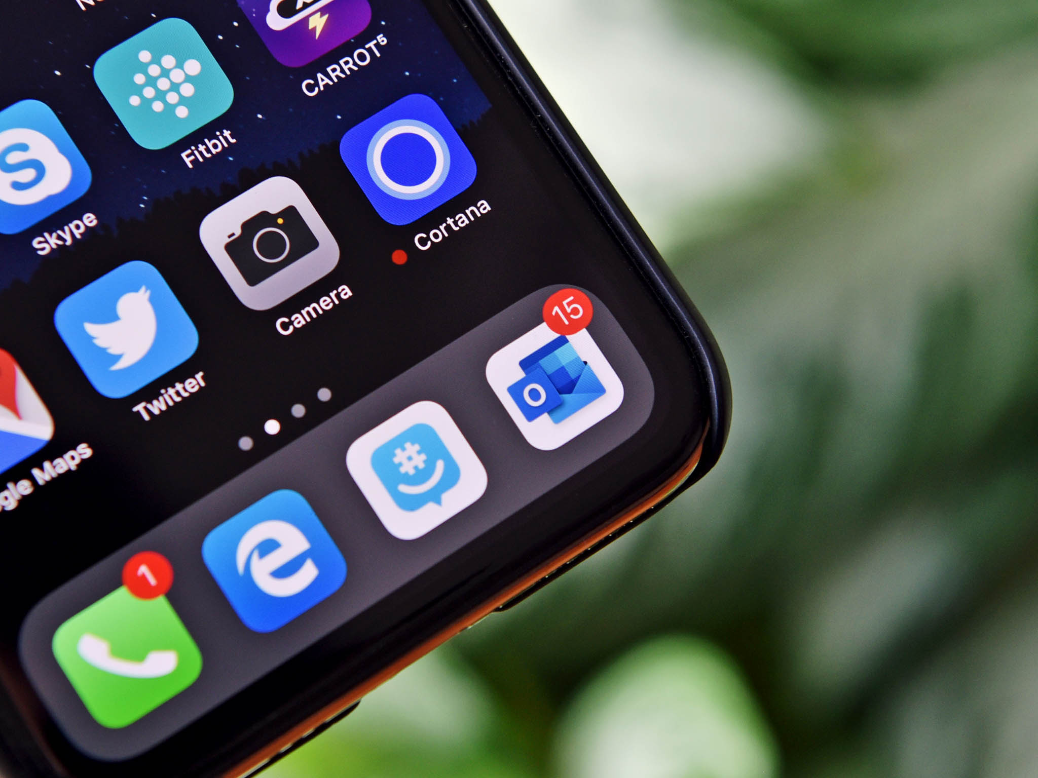
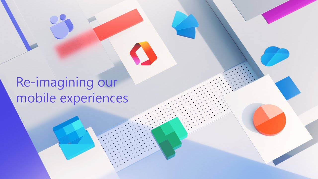
Microsoft's Jon Friedman discussed the redesigns to Microsoft's flagship mobile apps on iOS and Android in a Medium post. Fried said that Outlook, OneDrive, Word, Excel, and PowerPoint have already been redesigned and that new versions of Teams, Yammer, and Planner are on the way. The redesigns show a continued effort by Microsoft to bring its productivity services and apps to the mobile space regardless of platform.
The redesigns of the apps accomplish two major goals, bringing Fluent Design to mobile apps and enabling quick productivity for people on the go. Friedman breaks down the design process and the research that went into it. One of the insights that came from Microsoft's research is that even though people spend hours on their phones every day, individual actions often take just 20 to 30 seconds of people's time. To improve these bursts of productivity, Microsoft geared its mobile apps towards completing what microtasks.
Several features and changes aim to make tasks easier when on the go, including Play My Emails on Outlook and Read Aloud on Word and other Office apps. Microsoft also added features like document and table scanning to Office and OneDrive to improve productivity.
Article continues belowFluent Design is a framework of principles that guide app design. Initially part of a push by Microsoft for Windows 10, Fluent Design now extends to Microsoft's mobile apps. The redesigned Office apps implement Fluent Design elements throughout the app experience, including the app icon, splash screen, cells, cards, typography, people, and file lists.
When creating the redesigned mobile apps, Microsoft had a team of 40 designers create a mobile UI toolkit that makes it easier for developers to use the same components across apps. These toolkits are also available to external designers that would like to build apps that align with Microsoft's mobile efforts.
Microsoft's mobile applications on iOS and Android have continued to grow in usage numbers, and Friedman discussed how mobile applications sharing a design language helps people be more productive. "When mobile apps seamlessly connect and feel similar, it reduces cognitive burden by eliminating the need to re-learn app patterns and navigation. This is especially important to us as we're investing in side-by-side productivity scenarios on iPad and Surface Duo."
All the latest news, reviews, and guides for Windows and Xbox diehards.

Sean Endicott is a news writer and apps editor for Windows Central with 11+ years of experience. A Nottingham Trent journalism graduate, Sean has covered the industry’s arc from the Lumia era to the launch of Windows 11 and generative AI. Having started at Thrifter, he uses his expertise in price tracking to help readers find genuine hardware value.
Beyond tech news, Sean is a UK sports media pioneer. In 2017, he became one of the first to stream via smartphone and is an expert in AP Capture systems. A tech-forward coach, he was named 2024 BAFA Youth Coach of the Year. He is focused on using technology—from AI to Clipchamp—to gain a practical edge.

