Microsoft's OneNote team hints at new and 'more accessible' UI coming 'very soon'

All the latest news, reviews, and guides for Windows and Xbox diehards.
You are now subscribed
Your newsletter sign-up was successful
Join the club
Get full access to premium articles, exclusive features and a growing list of member rewards.
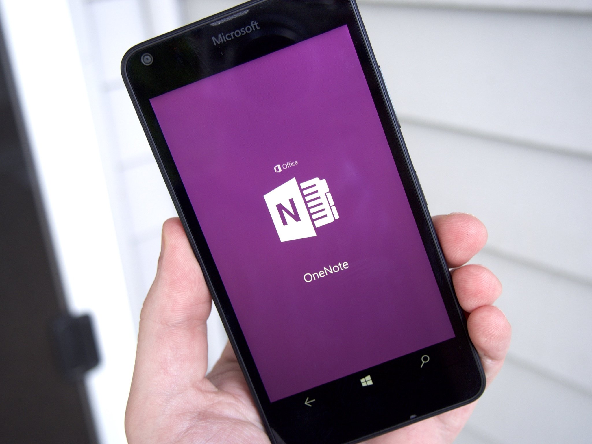
Microsoft's OneNote team held an AMA chat on Reddit today, and talked about their plans for the note-taking app. The team stated that it was working on a new user interface for the app that will be revealed soon.
The Reddit AMA session included this response to a question about if the team was working on something major that it could hint about. The answer was very interesting:
We're working on a ton of great features, including a brand-new UI which is more accessible and consistent across platforms. We think you'll really like it, and you'll be able to try it for yourself very soon!
The OneNote team also discussed the differences between the desktop OneNote app and the Windows 10 version in response to one user who felt that having two separate Windows apps was confusing:
Article continues belowWe know that having two versions of OneNote on Windows is confusing, and we're working on some things which should clear up this confusion.The bigger answer to your question is that OneNote 2016 has been a great app that we've been developing for over 13 years. As the app continued to grow we started to identify areas that our customers and business mutually benefitted from. As we pivot to a more modern code base, we're prioritizing Windows 10's capabilities to let us ship faster, build things more easily, and create deeper integrations into the operating system, such as the ability to launch OneNote above lock on Surface with the click of a pen. We recently added new ink features to the Windows 10 app and made it much simpler to use. We hope these will delight our users, even those who previously embraced the desktop app. Stay tuned for more features we think you will love!
The AMA session was both informative and enteraining and you can check out all of it at Reddit's site.
Download OneNote from the Windows Store

All the latest news, reviews, and guides for Windows and Xbox diehards.

John Callaham was a former contributor for Windows Central, covering Windows Phone, Surface, gaming, and more.
 Windows Central Insider


