The Microsoft Lumia 435 is a device that likely doesn't stick in anyone's mind. It's a nice but lackluster low-end phone. There was nothing significant about its design, price, or feature-set, which is par for the course when it comes to low-end phones. But that wasn't always going to be the case for the Lumia 435. In fact, Microsoft had something very special planned for its second low-end Lumia.
Codenamed "Vela" during development, the Lumia 435 was going to be a very different low-end handset. Instead of being a simple, boring and forgetful smartphone, Microsoft was planning to make the Lumia 435 the first ever "all-screen" Windows phone, and it would cost less than $200. This idea for the Lumia 435 was canceled in late 2014 and replaced with what was eventually released, a Lumia 532 copycat.
However, Microsoft made several prototypes, and we just acquired one. So, in traditional Windows Central fashion, here is our review of another unreleased Lumia.

Lumia 'all screen' specifications
| Category | Specification |
|---|---|
| OS | Windows Phone 8.1 |
| Display | Five inches1280 x 720 resolution |
| Rear camera | 5MP |
| Front camera | 720p |
| Processors | Qualcomm Snapdragon 200 |
| Storage and RAM | Internal storage: 4GB (expandable up to 200GB)RAM: 1GB |
| Dimensions | 126.72 mm x 67.78 mm x 9.25 mm |
| Battery | 1800mAh |
Lumia 'all screen' design

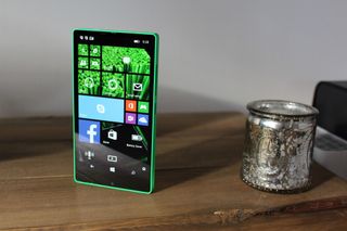
The standout feature of this device is easily its design. Featuring an almost "all-screen" front, this Lumia is a stunner. It's a super clean, minimalist and futuristic design that definitely doesn't belong on a sub-$200 Windows phone in 2014. Holding this device feels like you're holding nothing but a screen, and that's what makes this Lumia different from all the rest.
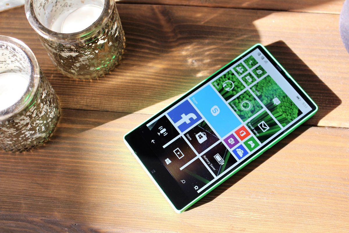
Of course, when I say "all screen," I'm being a little overzealous. It's almost all screen, except for the bottom bezel, which is pretty large. This phone has a big "chin," which is a pretty standout defect in this phone's design. Even with the chin, it would've been considered "all screen" in 2014.
There's a reason for the larger-than-usual bottom bezel, however: it's where the front-facing camera sits. Yes, this phone has a front-facing camera on the bottom bezel. There's no room for it at the top, and pretty much every phone these days comes with a front camera of some sort.

It has a speaker grill in the top bezel like normal, but it's difficult to see given how thin the top bezel is. There's nothing else up there, but that's likely because the Windows Phone OS doesn't support things like LED lights for notifications.
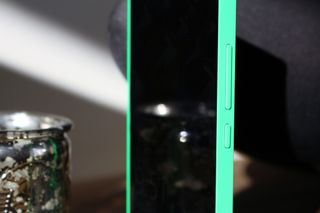
The rest of the phone's design is also nice. Our prototype is rocking a green shell with a removable back cover that we, unfortunately, don't have. It has only two buttons along the right side of the phone: a volume rocker and a power button. Both buttons are clicky and fit nicely with the rest of the phone.
It's a very blocky design, which I really like. It's very clean-cut, which I think would look better in white. Still, as a prototype, this phone has a good design and build going for it, which just makes the fact that it was never released hurt a little bit more.
Lumia 'all screen' hardware

This is a low-end phone, and as such it's packing low-end specifications. This is also a phone that was going to be released in 2014, which means it's rocking relatively old tech at this point. On the inside, there's a Snapdragon 200 with 1GB RAM and just 4GB internal storage. That storage is expandable with a microSD card, however.
It's a dual-sim phone, too, meaning you can stick two sims in for home and work. In regards to cameras, you get a 5MP rear-facing shooter with a single LED flash and a 720p front-facing shooter for selfies. You also get a single rear-facing speaker, which is loud, but nothing special.
The hardware on the front is where things are most interesting. There's a five-inch 1280 x 720 LCD on a body that measures 126.7 mm by 67.78 mm. The two bezels on either side of the display are just 3 mm thick, with the top bezel being 4.4 mm. That gives this phone a screen-to-body ratio of 79 percent; the most of any Windows phone and indeed the most of any phone altogether in 2014. It even beats out the Sharp Aqous Crystal.

The display itself is pretty nice. It can get very bright, which is good for outdoor viewing, and although it's a 720p display, text, and images look sharp enough for a Windows phone. The only real complaint I have about the screen is that it's an LCD panel instead of OLED. An OLED screen would've made the "bezel-less-ness" feel a whole lot more edge to edge. Viewing angles are also pretty good, way better than on any other low-end Windows phone from Nokia or Microsoft.
Lumia 'all screen' camera
The camera on this device isn't spectacular. It's barely OK at most, which is to be expected given the fact that this is a low-end phone. The addition of a flash is nice, something that was omitted from the final Lumia 435. This camera performs best in well-lit scenarios, and night shots are bad.


Since this is a prototype, the software was never finished. As such, I can't show you how the front-facing camera performs because the Camera app doesn't know it has a front-facing camera.
Final thoughts on the Lumia 'all screen' prototype

I can't help but wonder why this Lumia was killed. It's a unique take on a low-end device, which I'm sure would've gained media attention. People in the market for a low-end device would've loved this, even with it running Windows Phone 8.1. In 2014, Windows Phone was doing OK, and as such people weren't so skeptical about buying one, especially for $200.
It has good battery life, a great screen, and a unique design but is still distinctively Lumia. Outside of the internal storage and cameras, this phone would have been a no-brainer for anyone looking to spend less on a phone. It's stylish, sleek and super fast with Windows Phone 8.1 out of the box. So, what happened? Why did the Lumia 435 turn into the boring, forgettable phone we got? We'll likely never know. But Microsoft missed out on a unique opportunity to be first to the market with an incredibly affordable "all-screen" phone, and that's a shame.
I like this Lumia. I like its design, and I like what it could have stood for. Unfortunately, the Lumia "all-screen" Windows phone joins the Lumia McLaren, Lumia 2020 and I'm sure many other Lumias that never saw the light of day.
Pros:
- Great design.
- Almost bezel-less.
- Crisp, clear display.
Cons:
- Was never released.
- Low-end internals.4 out of 5

