Microsoft testing refreshed Skype design on iOS
Microsoft is Skype app another refresh on iOS, bringing back the bottom navigation bar and other tweaks.


Microsoft received quite a bit of backlash surrounding the major redesign of the Skype mobile app on Android and iOS that rolled out over the summer. Now, iOS users are poised for an update meant to address some of that feedback.
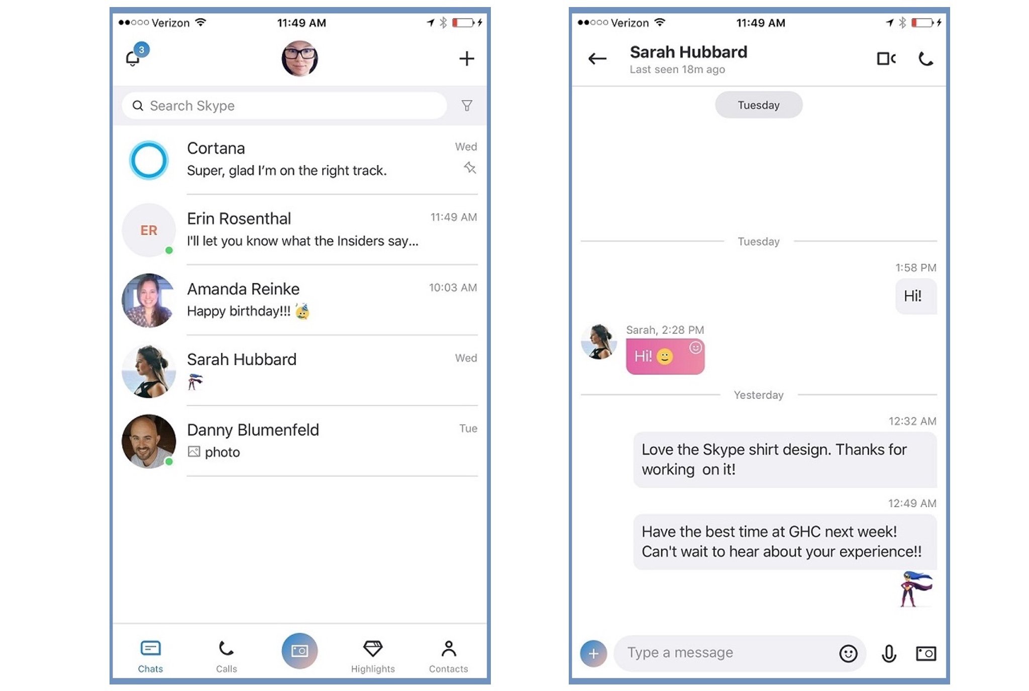
In a new post on the Microsoft Answers forum, Microsoft Support Engineer Ellen Kilbourne announced that the Skype team is testing out a UX refresh that implements some fundamental changes to the way the app looks and works. One of the bigger changes is that the navigation bar is back once again, but there are a number of other little changes meant to make using the Skype app on iOS a little more pleasant as well. Here's a look:
Changes to the primary navigation
- We brought back the navigation bar which will include an easy way to access the most important functionalities of the app – chats, calls, capture, highlights and contacts
- We added numeric badges in the navigation bar for chats, calls, and highlights
- Your selected color directly affects the navigation bar
- We separated the notification screen which can be accessed by tapping the bell icon on the chats, calls, highlights, and contacts screens
- Tapping your avatar on the top bar opens your profile directly
- Settings can be found in the profile screen on the top right
- We reduced the size of the search bar to increase the number of message you can see at once
Changes to the chat screen & message composer
- Chat headers are reduced in size to increase the number of messages you can see at once
- Chat headers have presence indicators
- The compose bar was redesigned
- You can use the plus button on the bottom left to easily add things to your chat like photos, your location, money, and one of the many add-ins
- Emoticons and emojis are combined for easier access
The UX refresh is currently in testing with Skype Insiders with app version 8.7.76.54000 or higher. It isn't clear if any of these changes are going to roll out to other platforms, but it wouldn't be out of the realm of possibility to expect similar tweaks to the Android app at the very least.
Get the Windows Central Newsletter
All the latest news, reviews, and guides for Windows and Xbox diehards.
Dan Thorp-Lancaster is the former Editor-in-Chief of Windows Central. He began working with Windows Central, Android Central, and iMore as a news writer in 2014 and is obsessed with tech of all sorts. You can follow Dan on Twitter @DthorpL and Instagram @heyitsdtl.

