Microsoft testing more design tweaks for Skype on Android
The Skype team is testing yet another set of design tweaks for its Android app.

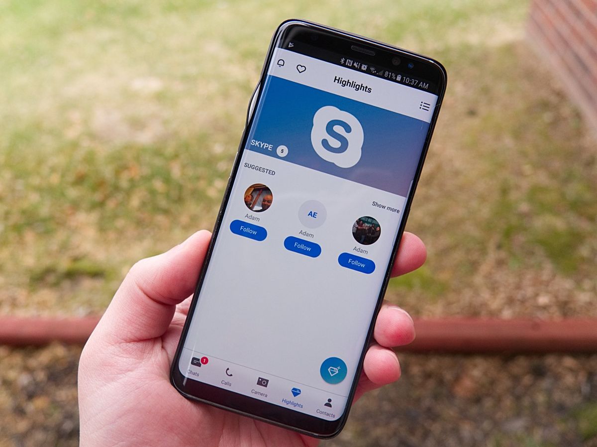
Microsoft recently rolled out a revamped design for its iOS app, and now it's looking to bring some of the same tweaks to Android. Available for testing in the Skype Preview app, the revamp sees the same bottom navigation bar added to the Android app, along with some other UI tweaks.
In addition to the bottom navigation bar, the pivot navigation originally found at the top of the app is now gone. The app's header has also seen a revamp, placing notification access on the left and a search option on the right. The changes are rounded out by a floating action button that changes depending on context.
Here's an official look at what's new, according to Microsoft:
- Adheres to Google's Material Design guidelines for bottom bar navigation
- Brings back a contextual FAB for quick access to key actions
- Has an updated header & search icon to feel more at home on Android
Microsoft is also introducing what it calls "SuperComposer" on both iOS and Android. The experience is called up as a new screen when you tap the compose button, bringing up handy actions, including your "recent contact list, as well as easy access to actions including new group, search bots, add contact, invite to Skype, and make a call" Microsoft says.

If you want to give the revamp a shot before it rolls out to everyone, you can see all of what's new by grabbing the Skype Preview app on Google Play. Assuming testing goes well, the release version of the Skype app should see the changes soon as well.
Get the Windows Central Newsletter
All the latest news, reviews, and guides for Windows and Xbox diehards.
Dan Thorp-Lancaster is the former Editor-in-Chief of Windows Central. He began working with Windows Central, Android Central, and iMore as a news writer in 2014 and is obsessed with tech of all sorts. You can follow Dan on Twitter @DthorpL and Instagram @heyitsdtl.
