Microsoft teases new Windows 10 UI in video celebrating 1 billion users
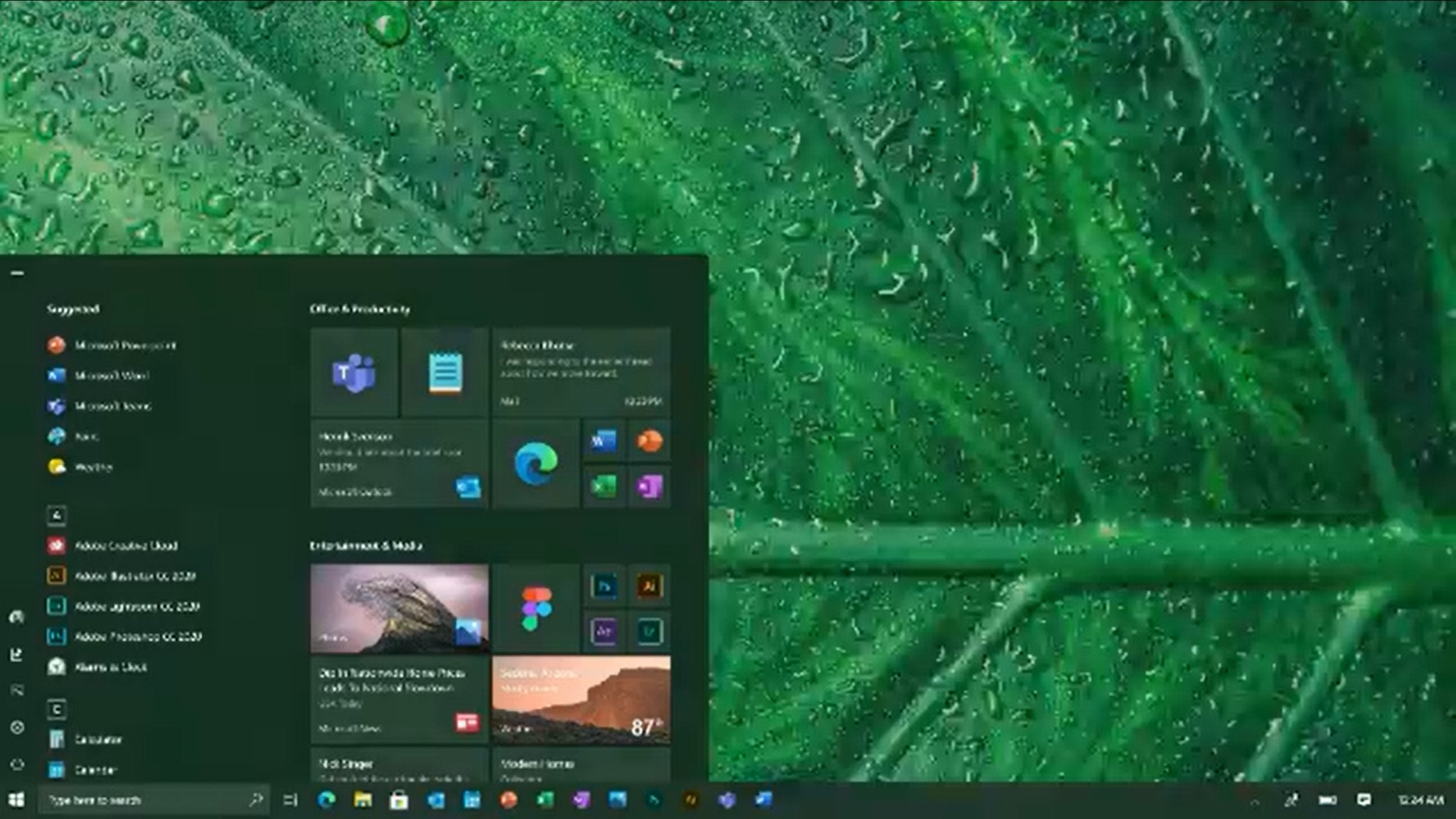
A new design for Windows 10 has been revealed in video celebrating one billion users.

Microsoft's Chief Product Officer, Panos Panay, has today shared a video celebrating one billion users on Windows 10 that gives us an interesting look into what Microsoft is thinking about when it comes to UI design on Windows 10. Panos Panay recently took charge of the Windows user experience, and in this video, we see a number of new user interface designs that may hint at where Microsoft is taking the Windows 10 UI in the future.
The video opens with a brief history of Windows' boot screens, dating back as far as Windows 1.01. From there, it cycles through all the different Start button designs, before showing us what Windows 10 looked like when it first launched. The video then begins transforming those Windows 10 intefaces with more modern design, simplifying things like the System Tray, and showcasing a number of new app designs including a new File Explorer, Photos app, and Calculator.
It also gives us a look at an updated Start menu with new icons and less color in the live tile interface, which makes it look cleaner and less noisy. None of the designs seen in this video are working code, and aren't currently available on Windows 10. But this does give us a good idea at where Microsoft is headed when it comes to the UI on Windows 10.
Windows 10 has often been criticized for its inconsistent UI, which is plagued with legacy UI components that date back as far as Windows 95. With Windows 10X on the horizon, Microsoft appears to be taking another look at the interface on WIndows 10 and updating it with a more modern look and feel, inspired by the Fluent Design System which itself has evolved quite a bit since it was first unveiled.
What are your thoughts on these designs? Let us know in the comments.
Get the Windows Central Newsletter
All the latest news, reviews, and guides for Windows and Xbox diehards.

