Microsoft Store on Windows 10 testing new filtering system
The experience moves filters from the main content area to the sidebar.

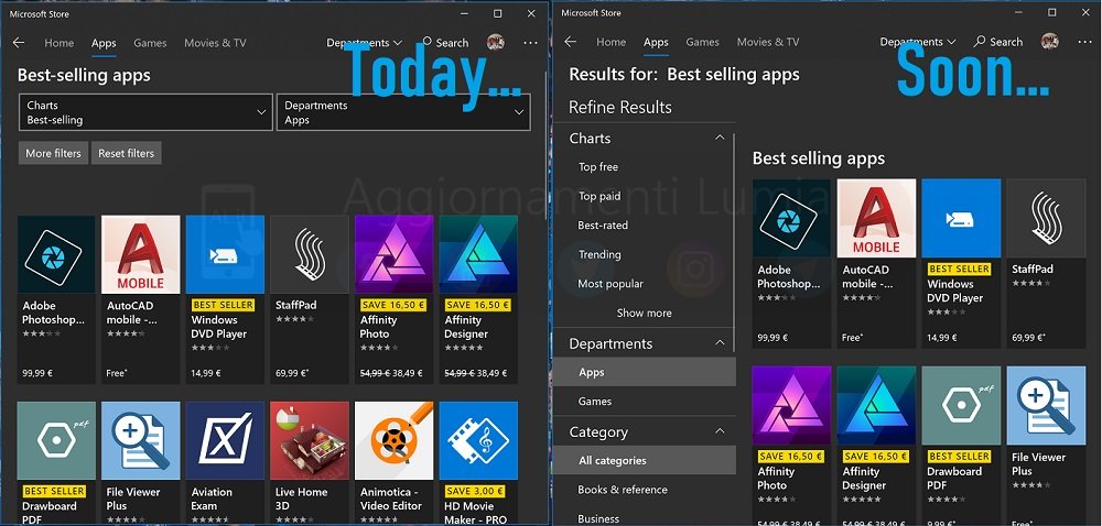
Microsoft continues to gradually iterate on its Store design for Windows 10, most recently rolling out a whole new look for app and game pages. However, it looks like filters will be the next area to get a revamp, at least according to a design reportedly being tested internally.
As first reported by Italian blog Aggiornamenti Lumia, Microsoft this week began rolling out a refreshed filter experience for internal testing. The revamp moves the filters that are currently available in the Microsoft Store app from the main content area to the sidebar. Instead of dealing with dropdown menus, you'll now see a list on the left-hand side of the app, offering options to refine your results by charts, departments, category, and more.

Because the new filters are only available internally at the moment, it's unclear when or if they'll be making their way out to the general public. However, it's likely that, should testing go well, Insiders will start to see the new experience in a future update.
All the latest news, reviews, and guides for Windows and Xbox diehards.

Dan Thorp-Lancaster is the former Editor-in-Chief of Windows Central. He began working with Windows Central, Android Central, and iMore as a news writer in 2014 and is obsessed with tech of all sorts. You can follow Dan on Twitter @DthorpL and Instagram @heyitsdtl.
