Microsoft shows off Fluent Design coming to Edge with the Fall Creators Update
Microsoft Edge is to receive some awesome Fluent Design improvements with Redstone 3, and here's an early look at what they've got planned.

Microsoft's newly announced Fluent Design System is coming to all Windows 10 apps, and eventually the system. Up until now however, we haven't really seen what the Edge team has planned for Fluid Design. Since it's coming to basically everywhere else, it'd make sense for it to come to Edge too.
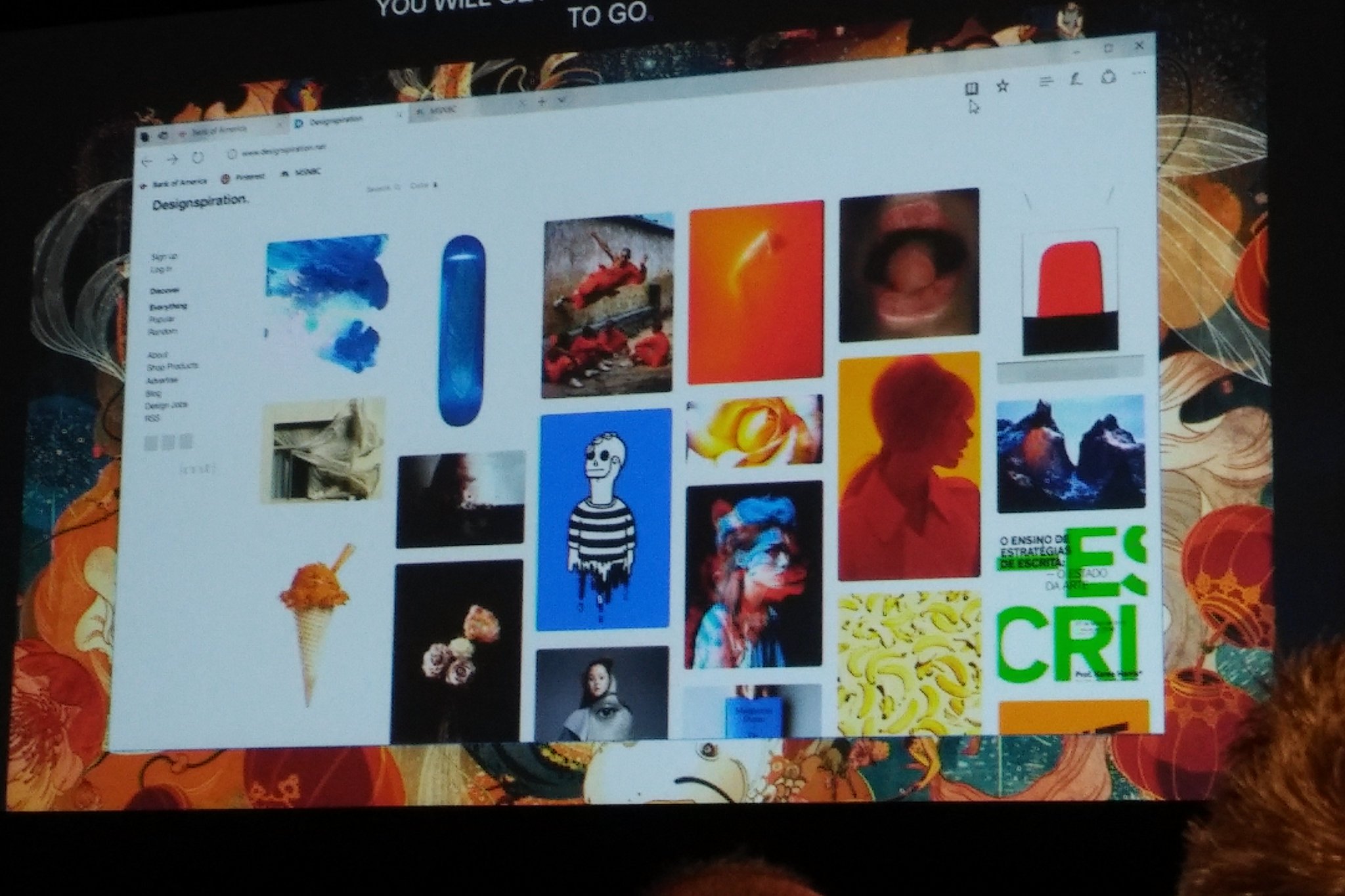
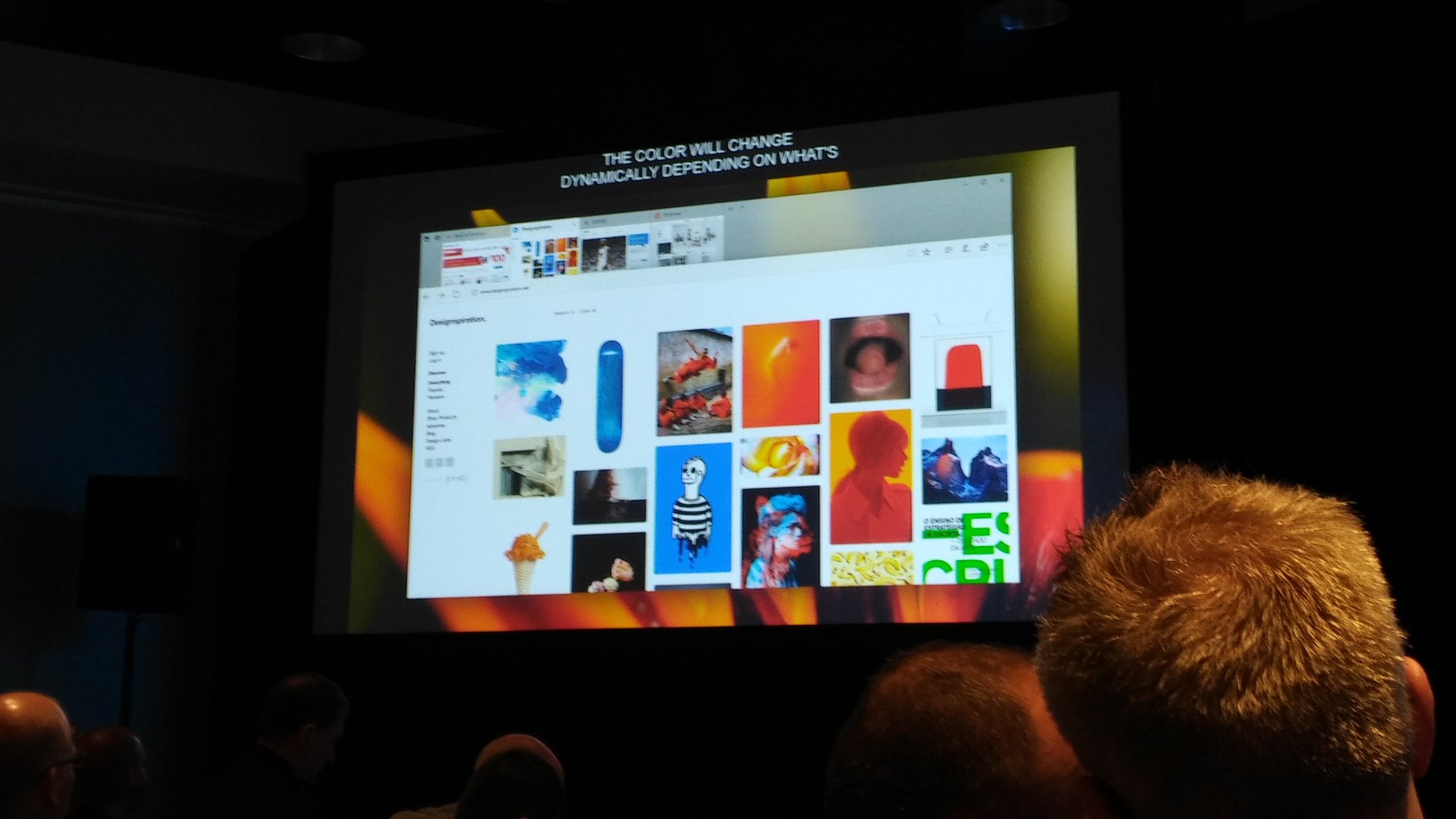
At a breakout session during Build, Microsoft did showcase what they've got planned for Edge with the Fluent Design System. Unlike other apps, the Edge team are adding Fluent Design in more subtle ways, making the overall user-interface and experience far more enjoyable than currently, moving away from its very flat user-interface.
For example, the Acryilic material (blur) will only be applied to the titlebar and tabs user-interface, giving the app window a slight-transparent effect. Most of the Fluent Design changes coming are more to do with Motion, bringing super smooth animations to things like dropdown menus, opening a new tab, and more.

Another Fluent Design element being added is depth, which can be seen mostly when showing tab previews. You can see a shadow that makes the user-interface look slightly further back than the address bar, again making for a much nicer and clean interface utilizing all of the Fluent Design System.
We're expecting Microsoft Edge's Fluent Design features to show up with Redstone 3, also known as the Fall Creators Update, later this year. Stay tuned to Windows Central for more.
Get the Windows Central Newsletter
All the latest news, reviews, and guides for Windows and Xbox diehards.

