Microsoft serious about design continuity

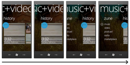
One of the things that's new (and long overdue) in the new Windows Phone is better control over how apps look and feel. By now we have a pretty good look at the whole "panoramic" theme going on, as content flows easily from east to west and back again.
How's that all being done? Microsoft spells it out in its Windows Phone Design and UI Interaction Guide. Think of it as a "how-to" for application developers. [pdf link]
Get the Windows Central Newsletter
All the latest news, reviews, and guides for Windows and Xbox diehards.
Phil is the father of two beautiful girls and is the Dad behind Modern Dad. Before that he spent seven years at the helm of Android Central. Before that he spent a decade in a newsroom of a two-time Pulitzer Prize-finalist newspaper. Before that — well, we don't talk much about those days. Subscribe to the Modern Dad newsletter!
