Microsoft Selfie for iOS review: An abysmal app that's not worth your time
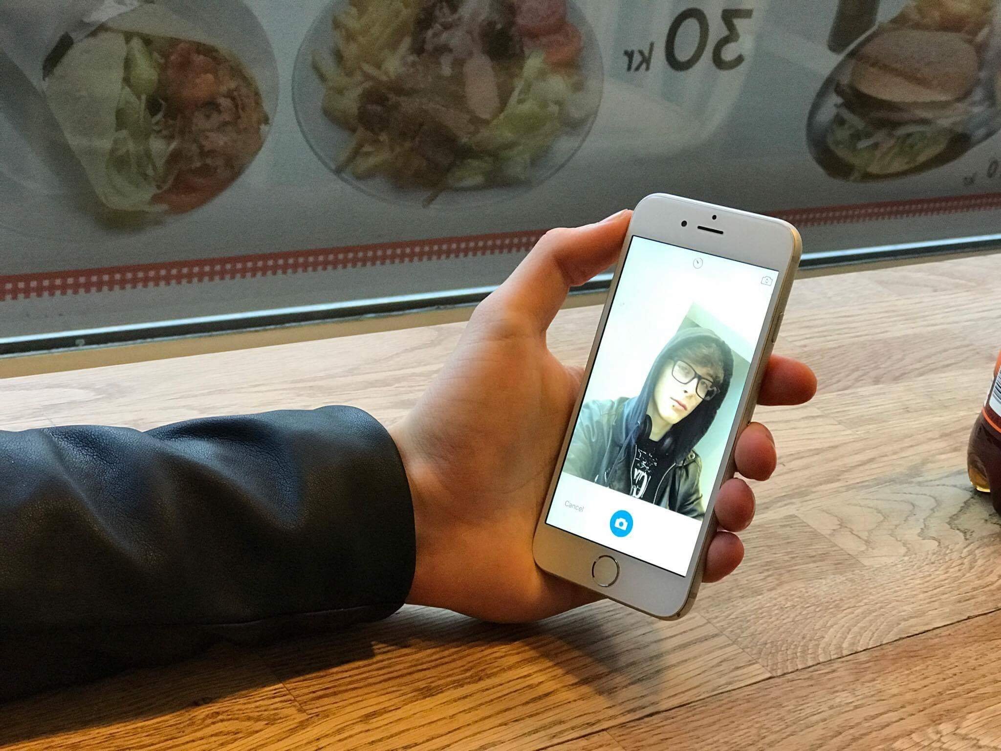
Apps such as Snapchat and Instagram have created a sort of selfie craze. Now, Microsoft has joined the fun by bringing the Lumia Selfie app from Windows to iOS, under the new name of Microsoft Selfie.

Selfies aren't usually that interesting, and the apps we use to take them are usually boring. However, Microsoft has managed to bring a new camera app that not only captures selfies but does it well ... at least if you listen to Microsoft. The camera uses some fancy picture merges to enhance the outcome. Some may argue that this is exactly what High Dynamic Range (HDR) does, however, Microsoft Selfie doesn't combine three different light settings into one, but instead combines two very similar pictures with the same settings to merge them and get the best possible result out of your photos.
Ironically, the Lumia Selfie app has been discontinued, leaving Microsoft's own platform without any alternatives for a good selfie camera experiences, except for the default camera app that is not optimized for selfies. This is yet another punch in the face towards Windows 10 Mobile users, especially Nokia fans, because the app originated from the now-defunct Nokia division.
Getting started with Microsoft Selfie
You just open the app and start taking selfies. The app features a simple and, mostly easy-to-use interface with only two buttons on launch: "Take picture" and "Use existing photo." They are nothing out of the ordinary, but it's definitely nice to see that the option to use existing photos has not been omitted.
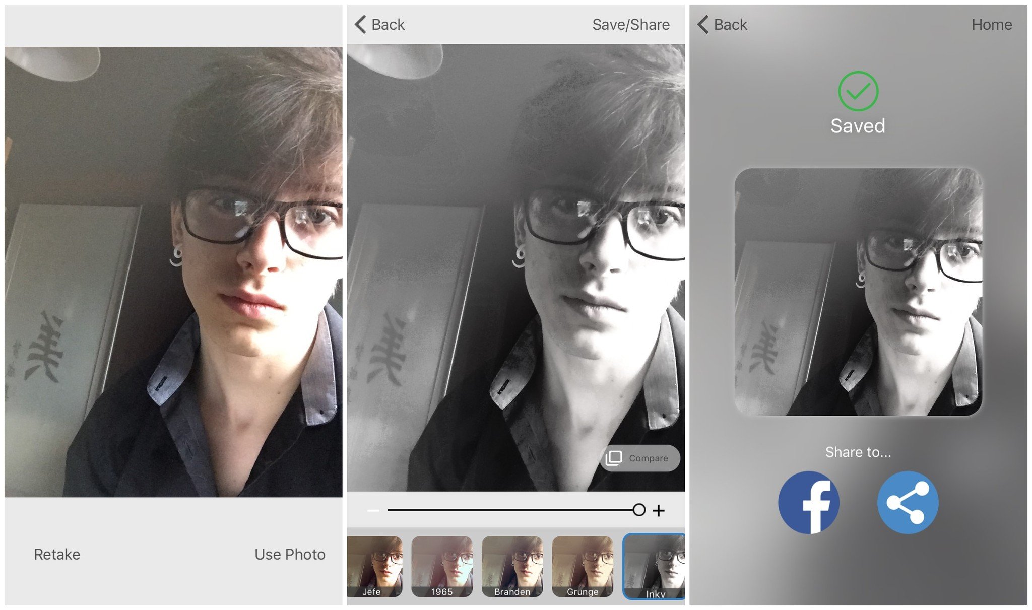
The app features many different filters, unlike its Windows sibling, where you can select one preset then adjust the intensity of it if you want the filter to be lighter or stronger. However, most filter apps nowadays allow you to adjust the intensity of the filter to suit your preferences.

A few annoyances
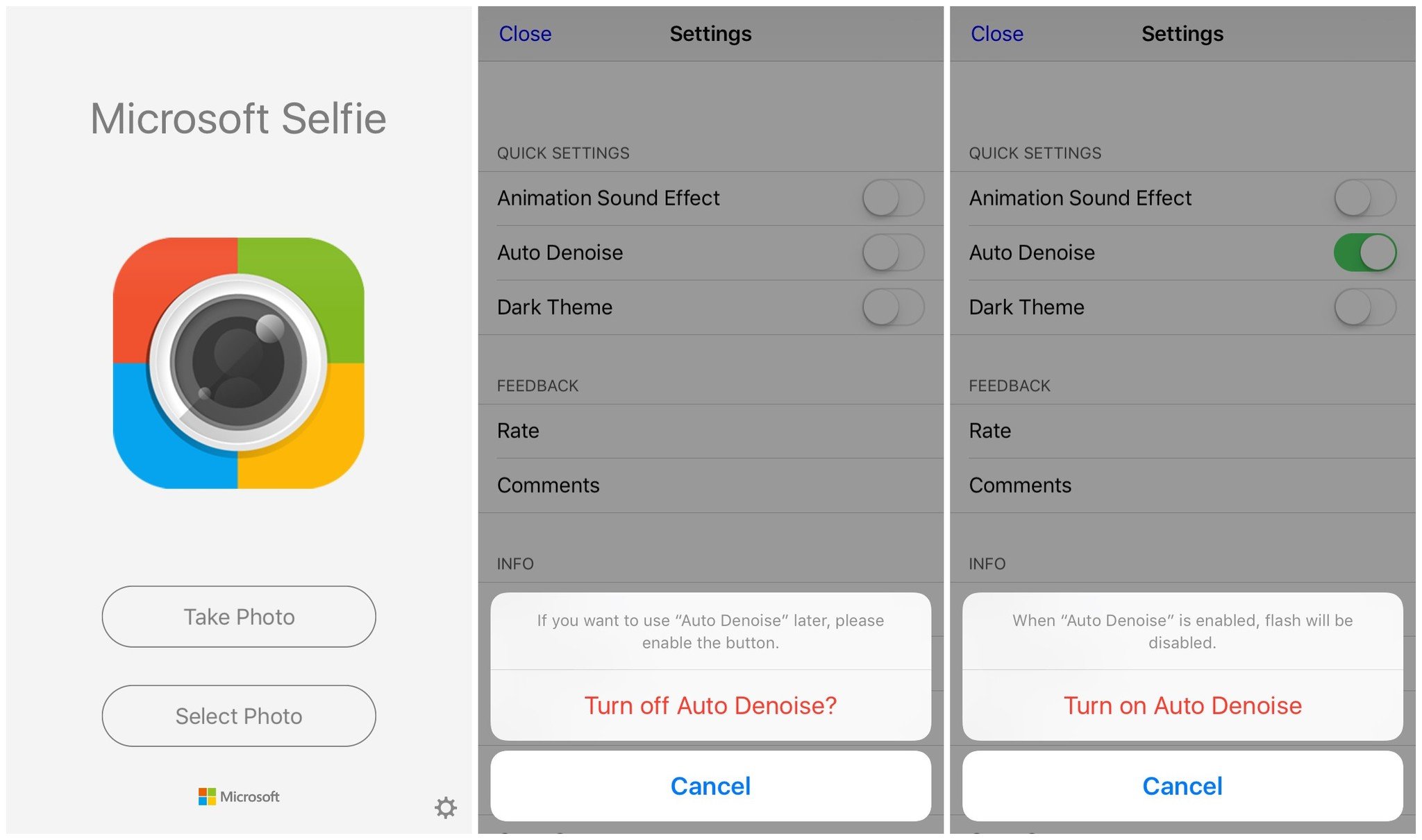
After I got into the app and started using it, something was annoying me but I wasn't sure what. Then it suddenly hit me what was getting on my nerves: The annoying sounds the app has turned on by default. The annoying "whoosh" and "boing" remind me of Samsung's horrible TouchWiz UI from 2013. While I understand that Microsoft is trying to market this application to teenagers, this definitely isn't the right way to do it. I have a feeling that Microsoft was trying to mimic the feel of Snapchat, but it failed horribly. Thankfully these sounds can easily be disabled in the settings section of the app.
The camera doesn't allow for any other aspect ratio other than 1x1, or a simple square, which is often considered a standard on social media sites like Instagram, Facebook and Twitter. But begin a standard doesn't mean Microsoft couldn't have implemented a wider angle for more casual selfies and for those who dislike this aspect ratio.
The app also crashes. A lot. While using it for longer periods of time, the app simply freezes up and closes. Sometimes it goes back to a working state after the freeze up, but then it usually performs very slowly, which indicates a memory leak, proof that the app is not only poorly designed but also poorly coded. Unfortunately, the frustrations do not end there.
Get the Windows Central Newsletter
All the latest news, reviews, and guides for Windows and Xbox diehards.
The "auto denoise" disables your flash. This wouldn't have been an issue if it wasn't for the fact that there's no clear indication of why the flash button is gone. My initial thought was that the app simply doesn't support taking pictures with the flash, but I was wrong. After digging through the settings of the app I finally figured it out: When turning off the auto denoise feature, a small notification appears explaining that flipping the toggle on again will enable the flash again. I don't know why this needs explaining but when toggling it back on the notification says that enabling the "Auto Denoise" feature will disable flash which enlightened me why the flash button was gone.

The technology behind it
Filters simply are very interesting. Almost every selfie app includes filters, so what makes Microsoft Selfie stand out from the crowd? According to Microsoft, Microsoft Selfie was a project developed in order to further develop artificial intelligence (AI) and face recognition. This AI tries to determine where the face is present in the photo so the app can process that part and "denoise" it, removing small imperfections like acne or wrinkles. This sounds cool, but in reality, it's not all that great.
Based on my testing, the Microsoft Selfie app resulted in worse pictures than the default camera app, [Snapchat](https://itunes.apple.com/us/app/snapchat/id447188370?mt=8&at=10l3Vy&ct=UUwpUdUnU46620's built-in camera, as well as Microsoft's other camera, Microsoft Pix. This is not a result I would expect from Microsoft, especially since its other camera offering manages to capture very good photographs by using the same technology behind it.
This results in a very poor experience. What is the point of a camera app that can't take good pictures?
It's not ALL bad ...
The app does have some positive aspects. It may not take good photos, but it does support using existing pictures and applying filters to them, which is where it might shine. The filters offered are not jaw-dropping, but they definitely are pretty and have a cool feeling to them. Using existing pictures and applying filters to these was actually pretty fun.
The Microsoft Selfie app has some cool filters@DennisBednarz pic.twitter.com/NnAmyBqN8dThe Microsoft Selfie app has some cool filters@DennisBednarz pic.twitter.com/NnAmyBqN8d— Dennis Bednarz (@DennisBednarz) 21 January 201721 January 2017
I like the BlueDawn filter (see the above image) especially because it has a nice black and white, cold look to it. It really feels "crisp" in some way to me, while other filters don't speak to me in the same way as this one. There are no abstract filters like in Vinci, which features way more advanced filters, but for anyone that likes subtle or less-intrusive filters, Microsoft Selfie should be more than enough.
Conclusion
Microsoft Selfie is definitely not something to write home about. It's poorly designed, takes bad pictures, has annoying settings turned on by default and offers a generally bad experience. There are some positive parts of it, like the inclusion of a dark theme and nice filters, but comparing it to the competition, there is nothing outstanding and even the filters feel like a quickly put together weekend project.
While the app is a Microsoft Research product, it's also a failure. As such, it's a waste of storage on your phone or tablet. Don't even waste your time with it.
Dennis Bednarz is a former writer for Windows Central and the guy behind ModMy. He has been a recognised member of the Microsoft community for years and owns everything from Lumia phones to Surface PCs. He occasionally likes to rant about Windows Phone and drink tea. You can go ahead and follow him on Twitter at @DennisBednarz

