Microsoft : Re-branded - Student breathes new life into old designs

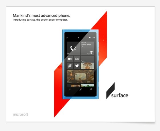
Andrew Kim, currently attending the Art Centre College of Design has completed what I can only describe as one of the most compelling Microsoft rebranding exercises I have ever seen. Andrew explains clearly, not only what he thinks is wrong with the current Microsoft picture but goes on to design it. And what a job he does.
Whilst Microsoft is on the tipping point of bringing together its whole eco system there remains a problem, image. Those that remember the launch of Windows 7 should know to what I’m referring. Microsoft has an often-confusing marketing message, that video, um, where they had the party to celebrate the Windows 7 launch says all. I am certainly not looking for a repeat of that! Now that Microsoft has some amazing products and the Metro UI to shout about, it is time they had a good think about a serious ‘reimagining’ of their company-wide image.
Whilst the name Windows is strong with consumers, the branding simply does not match. Andrew shows how they might be able to re-assert themselves as ‘bringers of tomorrow, a company that seeks to push our world forward though progress through technology. I see branding & marketing message as Microsoft’s next major hurdle. I feel that whilst the new Windows Logo is nice, it is not without problems, I personally also find it a little uncomfortable visually.

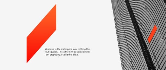
Andrew has deconstructed the very notion of a Windows logo by looking at how real windows look on something like a tower block in a big city, no they don’t look like windows. His ultra-minimal, logo the “slate” is born and is fully compliant with the story of Metro. Bravo!
Interesting just how good this new logo looks, both as a window showing a glimpse of a space age future, and for how smart it looks on both Windows Phone and brand new Surface Tablet/Slate. The level of thoughtfulness and attention to detail in his exploration is inspiring. The Office rebrand is actually just two ‘slate’ logos together. I like this too, symbolic of the software and hardware working together to form a whole functional unit. Whatever, I love it.
Andrew doesn’t forget Microsoft’s most accomplished design, Windows Phone, it already has the design chops to compete on its own, Andrew simply embellishes it with some snazzy alternative colour schemes and how that could look with his ‘Slate’ logo. I think the overall effect is stunning.
I would like to hear what you think of this Microsoft rebrand. Is it just crazy or is this guy onto something?
Get the Windows Central Newsletter
All the latest news, reviews, and guides for Windows and Xbox diehards.
Source: Andrew Kim

