Microsoft Pix for iOS is a solid camera app hobbled by sad sacrifices
The Microsoft Pix app is often compared to Microsoft's Selfie app, for obvious reasons. The two apps may share some of the same technologies because they're self-portrait siblings, but the pictures Pix takes, as well as the design and the execution, are completely different.

I recently reviewed the Microsoft Selfie app for iOS and, to put it lightly, I wasn't happy with the experience. Microsoft promised better photos with the Selfie camera app but failed to deliver. This and the never-ending complaints about the Windows 10 camera leave me with doubts. So how does Pix compare to the native camera app in iOS, on Windows 10 and Microsoft Selfie? Keep reading.
Getting started with Microsoft Pix
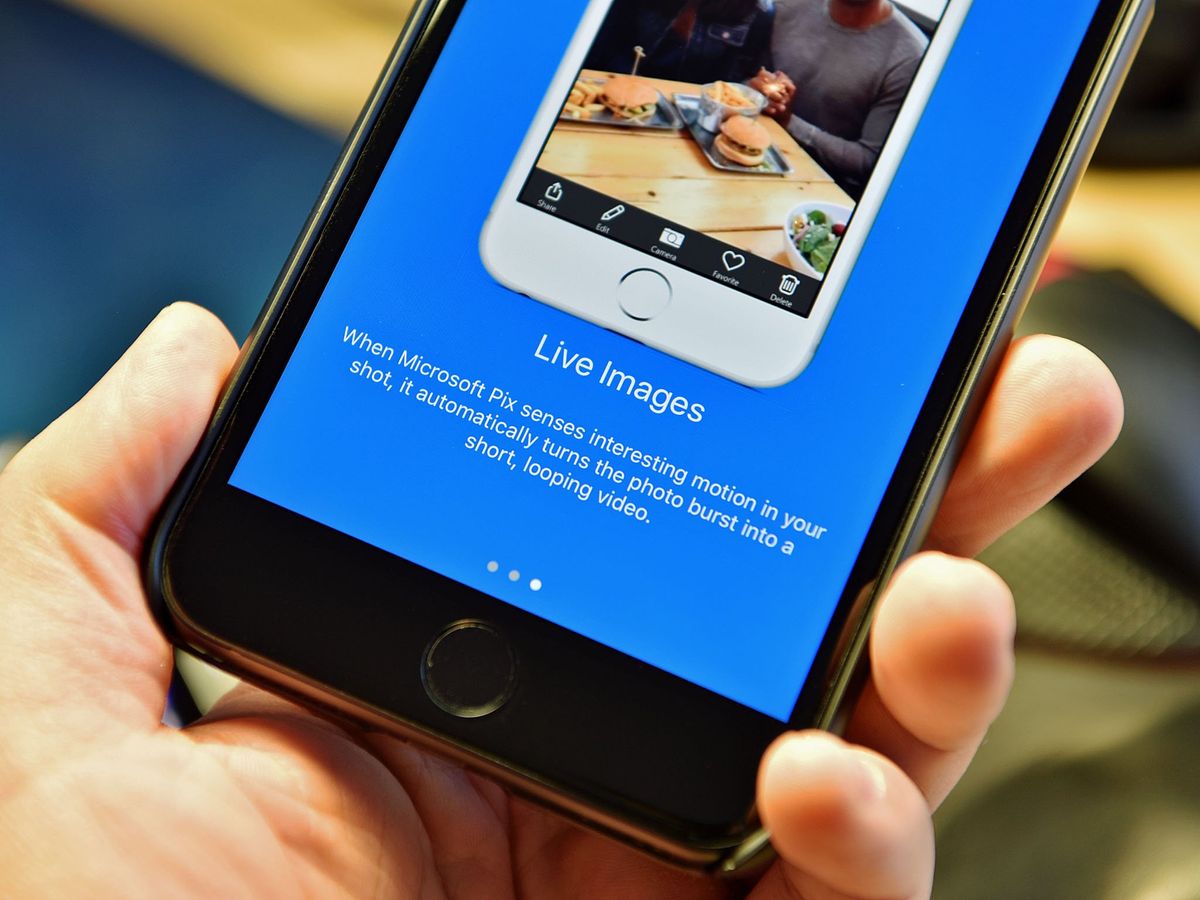
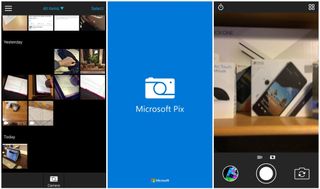
The first launch of the app shows a splash screen with Microsoft written two times on it. After getting past this screen and a quick tutorial, it takes you to the camera screen allowing you to go ahead and start taking pictures, which is obviously what you would want to use a camera app for. The interface you are greeted with is simple yet functional, but you might miss a few options found in the default camera app. (I'll get to that later on.)
After wandering around the app, I started to understand how it works. For whatever reason, the app has gallery buttons to the top right, even though there is a recent photos button on the bottom-left corner that usually doubles as a gallery button in other apps. That is also the case here, as the recent photos button works as a gallery button too, making it two buttons for basically the same task.

So how does it work?
Microsoft claims that Pix uses advanced Artificial Intelligence (AI) to improve the results of your photography. However, does it have any significant differences compared to the default camera? Yes, it definitely does.
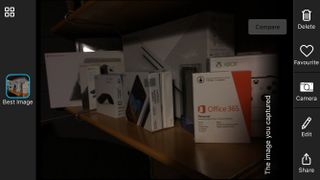
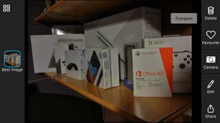
While using my iPhone 6 and the Pix camera together, the results were stunning at best, and good at worst. Photos were much more eye-popping, thanks to the saturation balancing, had much better lighting and were generally sharper. The Microsoft Pix camera has an option to compare the original image to the processed one, but I suspect Microsoft intentionally sabotages the original picture to make it look like its AI technology really improved the photo. Here's why.
Comparing the "original" image to a picture taken using the default camera, Snapchat, Instagram or virtually any other camera from the App Store reveals that it's much worse than photos taken with other camera apps using the exact Application Programing Interface (API). Also, comparing it to the real-time camera preview you see when taking the picture supports my claim, as the preview is marginally better than the unprocessed outcome. It's hard to believe that Microsoft's AI technology is so quick that it can display the result in real-time on my three-year-old phone. This is obviously just speculation, and it could be a technical difference, but it is something to keep in mind, and you shouldn't believe everything you see.

The image above shows the unprocessed image. The lighting was intentionally poor to see how the camera performs. The picture is pretty dark, details are hard to see, it's not very sharp, and the overall quality is nothing to be proud of. In comparison, the iSight camera app on all iOS devices does a slightly better job at focusing, has better exposure settings and produces a slightly better result in the end.
Get the Windows Central Newsletter
All the latest news, reviews, and guides for Windows and Xbox diehards.

However, the AI processing in Microsoft Pix really shows the full capabilities of the app. The outcome is marginally better, with better exposure, reducing the shadows, leading to brighter colors, sharper images and prettier results. I have been very satisfied with Pix as my daily quick camera. It's easy to use and has a built-in editor. It's a very interesting concept that could be the future of digital photography, and it's a solid all-around package. Unfortunately, being so easy to use comes at a price.
It's not all fun and games
The camera may be very simple, but that can make it a little underpowered. The camera lacks advanced settings, such as manual exposure, manual saturation, and manual anything, actually. Everything is automated and decided for you, and you cannot change anything until after the picture is taken. The app even lacks manual resolution settings, which brings me to another issue.
Pix has two big ugly bars on the top and the bottom of its screen. That's understandable because the aspect ratio the pictures are taken in is 4:3, utilizing every pixel the camera sensor offers. I prefer a fullscreen picture in a 16:9 aspect ratio, so this is very annoying. It not only ruins the aesthetics but mimics Apple's way of doing things, which is deciding what's best for its users instead of letting them choose for themselves. This works for a fair amount of people, but the chances of Microsoft Pix going mainstream and reaching non-enthusiasts is fairly low, making this a bad design choice.
The app also uses some kind of in-house gallery for viewing images instead of using Apple's built-in viewer, which is also annoying because it brings inconsistency to the system. It reminds me of the Windows 10 gallery, which is rad, but Microsoft has proved, in the past, that consistency isn't its focus. Comparing Pix to any other Microsoft app for iOS leaves you with a bad aftertaste because they all have their own designs and don't feel unified at all.
Microsoft Pix for iOS review: Conclusion
Microsoft Pix is a great camera app that has unfortunately been slightly underpowered by its creators. It features an ugly but easy-to-use interface, bundled with a gallery section and simple editor that should cover most people's basic needs. It's updated often enough to say it's still supported and hasn't been abandoned. It features very interesting AI technology that tries to improve your pictures. But the situation is a little sketchy, and I have my doubts as to whether the process works as Microsoft wants you to believe.
The general experience is good, but if you're a professional photographer you may not agree. It's miles ahead of Microsoft Selfie, in both front and back camera picture taking, and it offers many more editing options. It lacks a few features available in the default camera apps on both iOS and Windows 10, but in exchange for that, it takes better pictures in automatic mode.
Dennis Bednarz is a former writer for Windows Central and the guy behind ModMy. He has been a recognised member of the Microsoft community for years and owns everything from Lumia phones to Surface PCs. He occasionally likes to rant about Windows Phone and drink tea. You can go ahead and follow him on Twitter at @DennisBednarz
