Microsoft offers another look at upcoming OneDrive design refresh
OneDrive is set to get an updated look on the web and mobile in the coming weeks. Here's a look at what to expect.

During its Ignite 2017 conference in September, Microsoft announced a design refresh and several improvements are coming to OneDrive. At the time, we got a peek at what Microsoft is cooking up, but the company has offered a closer look at what's coming down the pike in a new Tech Community post (via OnMSFT).
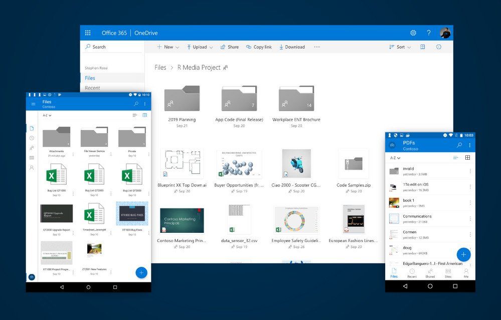
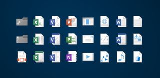
The biggest highlight of the revamp is an updated design that Microsoft says will use your screen space more efficiently thanks to a new layout. The cleaner look is rounded out by new icons, and Microsoft promises a "more cohesive theme" across apps and devices. You'll also be able to quickly preview files in a thumbnail before opening them, and Microsoft says it has done quite a bit of work to better highlight new files.
New files jump out at you. Shared files are now easier to spot, and we've made thumbnails larger and more detailed. Why? Because OneDrive and SharePoint are alive, active and ever-changing. New files come in, others change, some get shared out. We heard from you that these changes needed to be more apparent, and we combined that knowledge with research about how the human eye parses items. The human eye is attuned to recognize familiar shapes and colors instantly. To take advantage of this, we modified the look of the files and folders in the list and tile views so it's easier to find what you're looking for.

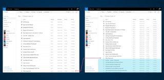
If you find yourself needing to parse a large collection of documents and files, Microsoft is also introducing a compact list view that should really come in handy. Essentially, this view shrinks the space between file names in folder views, allowing you to see more files at a glance. You'll also be able to adjust column widths as needed.

Other bits include new icons that indicate trending and recently created files. Appearing next to the file names, these icons will let you quickly spot files that are popular in your organization or those that have recently been added to OneDrive.
Microsoft says that these new features and design tweaks will start rolling out across OneDrive on the web, Windows, iOS and Android "in the coming weeks."
Get the Windows Central Newsletter
All the latest news, reviews, and guides for Windows and Xbox diehards.
Dan Thorp-Lancaster is the former Editor-in-Chief of Windows Central. He began working with Windows Central, Android Central, and iMore as a news writer in 2014 and is obsessed with tech of all sorts. You can follow Dan on Twitter @DthorpL and Instagram @heyitsdtl.
