Microsoft launches new Outlook.com beta with new design and features
Microsoft has launched a new beta experience for Outlook.com that introduces a new design, features and more!

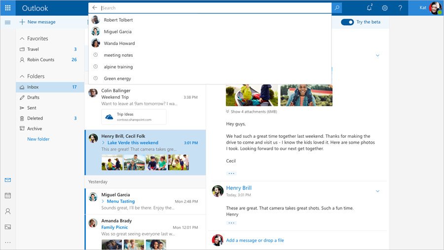
Microsoft is today launching a brand new, opt-in beta for its web-based Outlook website that introduces a new, faster user experience and several new features worthy of note. The new experience includes a faster website, an overhauled design, and a new conversation style view.
What's more, Microsoft is making improvements to the technology behind your inbox, and will show you quick suggestions as you type. This allows you to easily add information about certain things such as restaurants, flights and more. You can also easily pull in photos too.
There are also new personalization improvements, which include the ability to favorite contacts and folders which makes it easier to find the things you love most. You can also insert expressions in the form of emoji, gifs and more easily!
The beta is opt-in, and is rolling out in waves starting today. If you're eligible for the beta, you will see a toggle at the top right of the website that says "try the beta." Switching that on will bring you to the new beta experience. If you can't see that toggle, you should hopefully start seeing it soon.
Get the Windows Central Newsletter
All the latest news, reviews, and guides for Windows and Xbox diehards.

