Microsoft Launcher on Surface Duo really sucks
I'm getting tired of the disjointed, feature-poor launcher experience on Surface Duo 1 and 2.

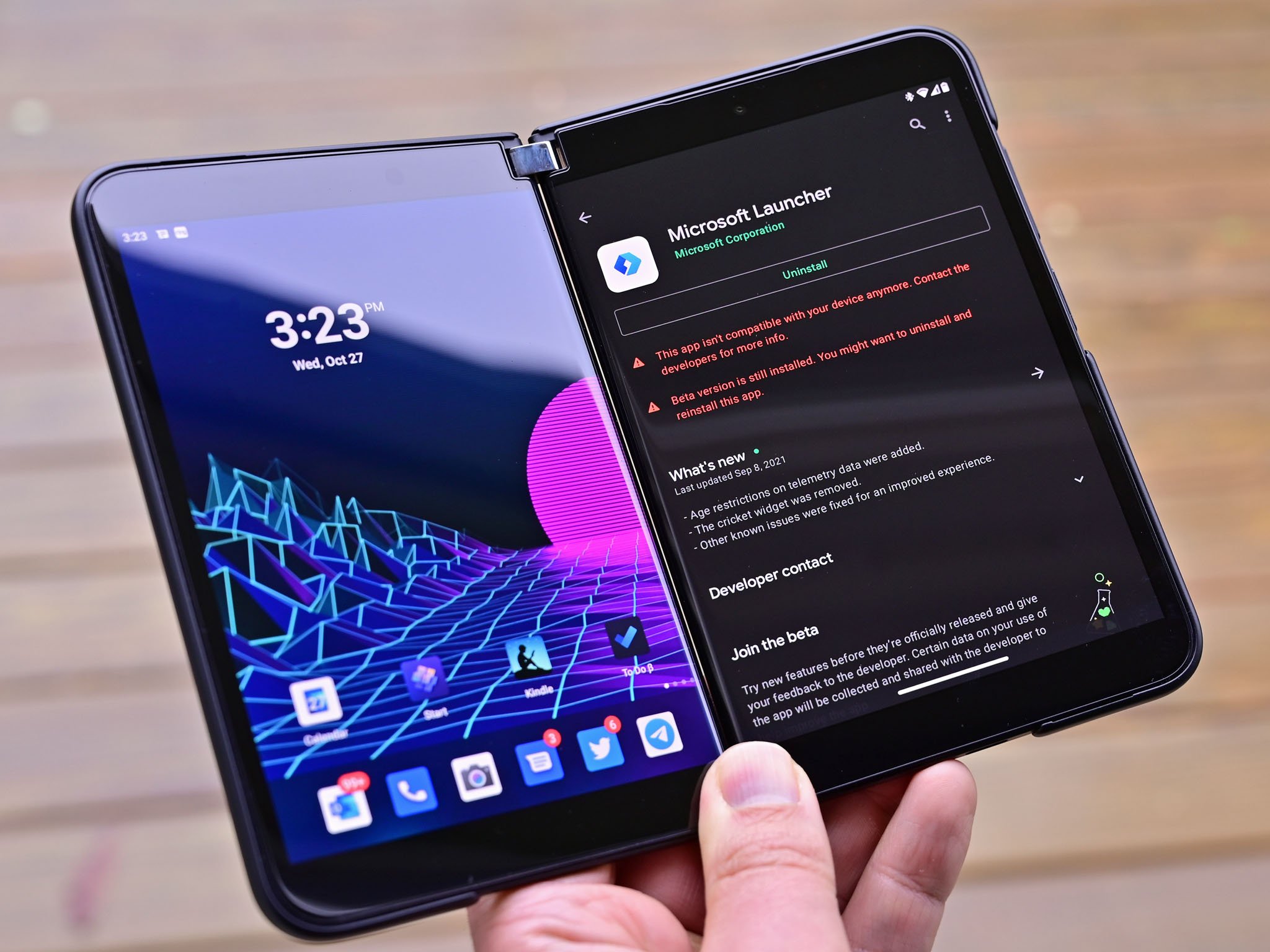
It's been well over a year since the first Surface Duo hit the market, yet its built-in launcher experience still pales in comparison to the version of Microsoft Launcher you can get on other smartphones. Heck, it pales in comparison to Pixel and Samsung launchers too regarding fit and finish. For some reason, Microsoft has opted to leave the Microsoft Launcher on Surface Duo incredibly barebones, much to the disappointment of users.
This hasn't improved with Surface Duo 2, though Microsoft did update the UI with a minor design refresh, and that just recently rolled out to the Surface Duo 1. We still have no new features, no enhanced customization tweaks, and the launcher itself is just bad at integrating itself with the Surface Duo as its native default launcher experience. As someone with a keen eye for UX design, the Microsoft Launcher is doing a terrible job on Surface Duo in a lot of areas.
For example, on most smartphones these days, the launcher and the gesture system go hand-in-hand. They complement each other. If you swipe up to go home when in an app, that app usually zooms out and back into the icon in which you tapped to open it. That's not so on Surface Duo. The launcher acts like it's an entirely separate entity, with zero ties to the rest of the OS.

Additionally, for some inexplicable reason, the Microsoft Launcher on Surface Duo appears to unload itself when it's not on display. This makes it so the launcher "pops" back on screen when you swipe up to go home, creating a super disjointed experience. On Pixel or Samsung, the launcher is always running, and the integration with gestures makes going between app and home screen feel fluid and thought out. This is the kind of thing that's missing with Launcher on Surface Duo.
Admittedly, this issue is a little hard to spot if you're not looking for it, but it is there, and it's more noticable if you're using light theme for some reason. When light mode is enabled, the display will sometimes flash black when closing an app to go home when in single-screen mode. This happens because the Launcher has unloaded, and quickly needs to reload as you're swiping up. It's been a real pet peeve for me, and I really hope Microsoft fixes it soon.
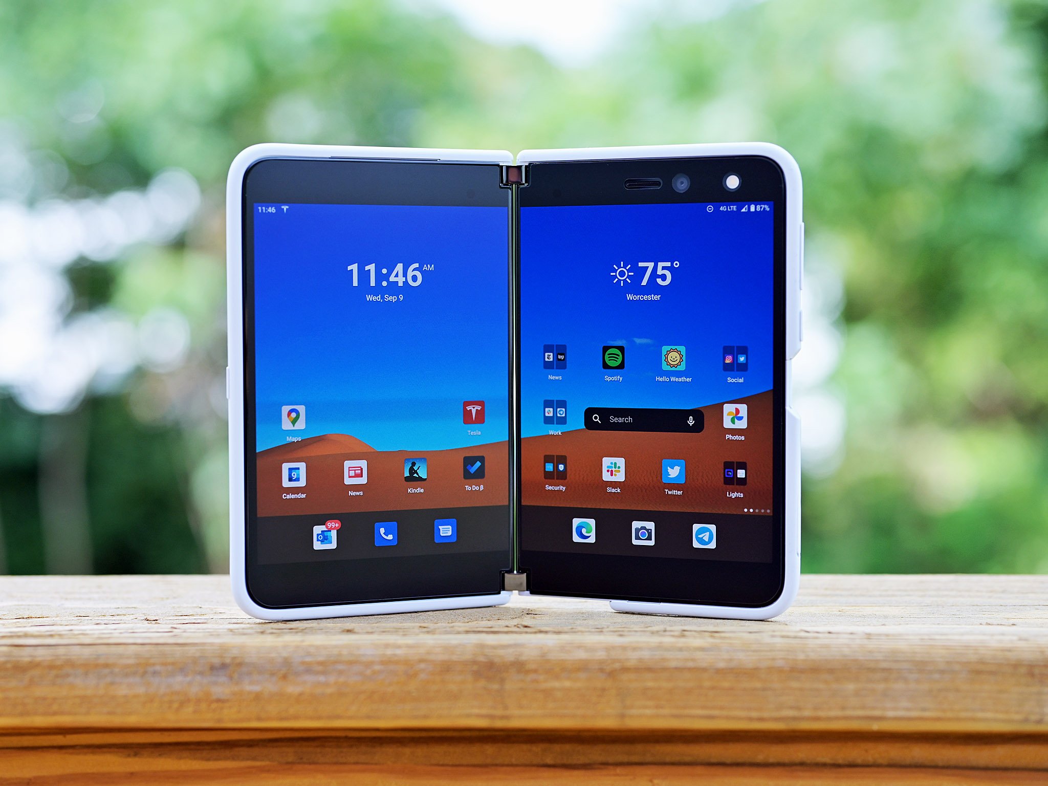
Then there's the feature drought. On Surface Duo, Microsoft Launcher is a barebones launcher experience. It supports folders, an app drawer, and the Microsoft Launcher activity feed, and that's about it. This is a real shame, as the Microsoft Launcher on other smartphones is so much more in-depth, with hundreds of customization options to choose from such as custom icons, grid sizes, gestures, theming controls, and much, much more.
Why is the Microsoft Launcher on Surface Duo devices still missing out on these customization options, well over a year into its existence on the market? It's almost as if Microsoft is purposefully limiting the Microsoft Launcher experience on this form factor. If that's true, please stop. It's good to have rich customization options in your launcher experience.
Get the Windows Central Newsletter
All the latest news, reviews, and guides for Windows and Xbox diehards.

Regardless of the feature drought, the issues with Microsoft Launcher not feeling integrated with the rest of the Surface Duo OS is a serious sticking point for me. The launcher unloads and reloads itself whenever you go into and out of an app, and it makes no effort to tie itself to gestures to create a more fluid experience. It's just a poor UX all around, and I wish Microsoft would fix it.
Better yet, I wish the Surface Duo team would dump Microsoft Launcher and go its own route. Surface should create a special Surface Duo launcher that's designed for the dual-screen form factor from the ground up. Integrate it deep with the gesture system and the rest of the OS, and allow it to feel like a component of the OS rather than a third-party launcher that isn't really integrated at all.
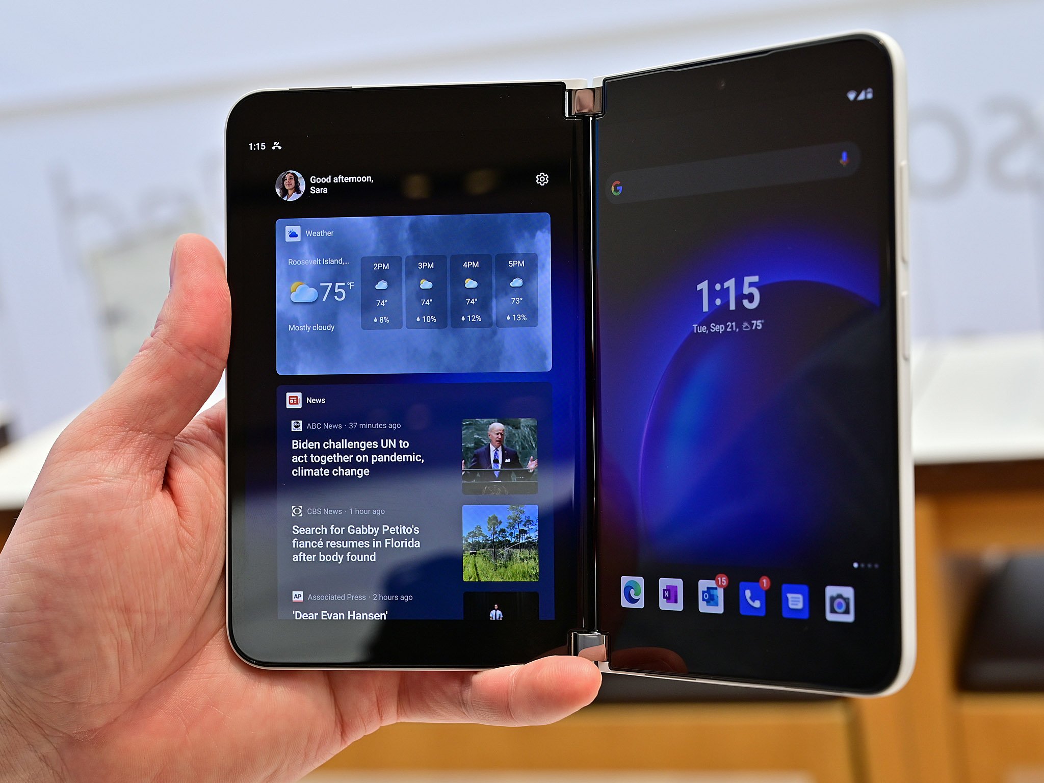
I will say I like the new Microsoft Launcher UI. It's clean and consistent with the rest of Microsoft's current design language. I also like the fluid dock that moves icons depending on what screen you're using, and the blur effects look great too. I just wish everything else I mentioned above would be addressed, then it would be great.
I love my Surface Duo 2, and I just want the OS to be perfect. I want the UX to feel polished and fluid, and I want the overall user experience to feel seamless as if it were all built by the same team. The disjointed experience between the Microsoft Launcher and the rest of the OS on Surface Duo is becoming extremely tiresome.

