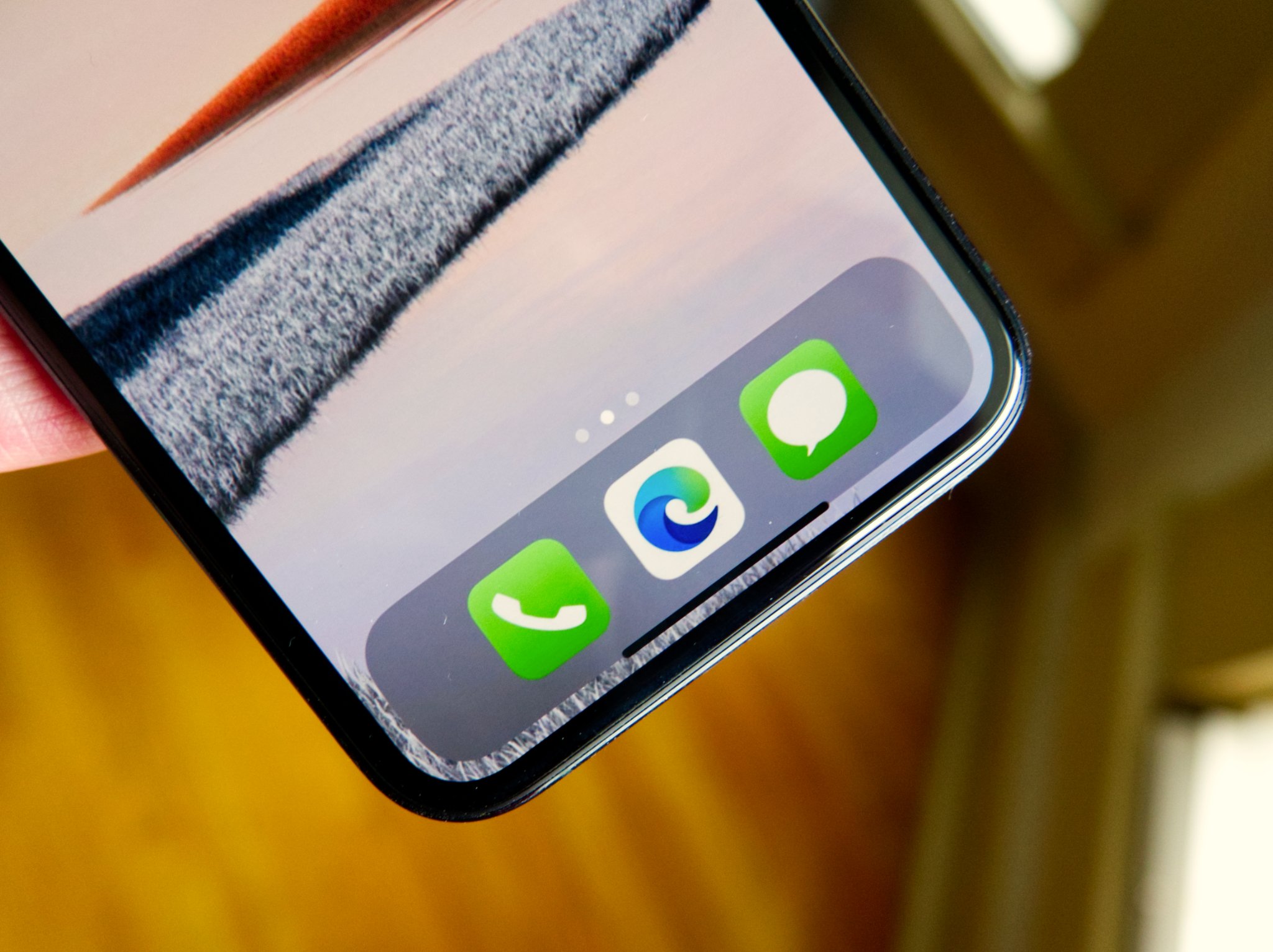
Microsoft Edge for iOS gets new design that improves one-handed use
Microsoft Edge on iOS now has a new look to match Edge on Android.

What you need to know
- Microsoft Edge on iOS has a new look and logo.
- The redesign makes it easier to access features like search, favorites, and history.
- The new design brings the iOS version of Edge in line with the Android version of Edge.
Microsoft Edge for iOS has a new look and logo via MSPU. The redesign makes it easier to access features like search, history, and favorites. The redesign brings Microsoft Edge for iOS in line with Microsoft Edge for Android.
The app's new design brings more options to the bottom of the browser, which makes it easier to access things one-handed. The menu button in the middle pops up with several options that you can customize. Here's the app's complete changelog.
- A new look and feel, plus an updated navigation for easier access to features like search, favorites, and more
- We've also made some general bug fixes and performance improvements.
The new logo for Microsoft Edge continues to roll out across platforms. At least some users from Android, iOS, and Windows 10 now see the app's new logo.

Microsoft's browser brings 'Continue on PC,' synced passwords, and a familiar look for regular Edge users.
Get the Windows Central Newsletter
All the latest news, reviews, and guides for Windows and Xbox diehards.

Sean Endicott is a tech journalist at Windows Central, specializing in Windows, Microsoft software, AI, and PCs. He's covered major launches, from Windows 10 and 11 to the rise of AI tools like ChatGPT. Sean's journey began with the Lumia 740, leading to strong ties with app developers. Outside writing, he coaches American football, utilizing Microsoft services to manage his team. He studied broadcast journalism at Nottingham Trent University and is active on X @SeanEndicott_ and Threads @sean_endicott_.
