Microsoft To-Do picks up Fluent Design flourishes and more
Now with more Fluent Design.

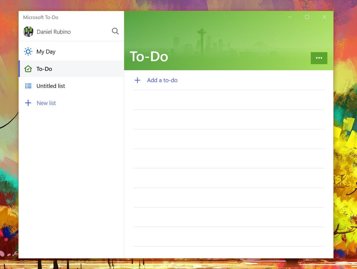
Microsoft To-Do is the latest app in Microsoft's stable to pick up some additional Fluent Design flourishes. A fresh update began rolling out this week to To-Do for Windows 10, adding not only a dash of new design tweaks, but also some improvements to the app's animations.
The most notable change in this update is to the top bar, which is now gone. The main app interface now extends to the top of the window, making things look a little sleeker. In its release notes, Microsoft also points out the new steps function, which initially began rolling out in April across the various To-Do apps. Here's a full look at what's new:
- Have you tried out our brand-new feature Steps? Found in the Detail View after clicking on a to-do, Steps help you divide larger tasks into bite-sized pieces.
- New: We're making our first Fluent design changes to To-Do. Take a peek at your minimize and maximize buttons and you'll notice we've removed the top bar. Stay tuned as we've for more Fluent updates on the way!
- Improved: Switching themes now looks even better with new animations, plus a bunch more UI fixes.
All of the new features and tweaks are available with the latest update on the Microsoft Store with To-Do version 1.30.11204.0 now.
Get the Windows Central Newsletter
All the latest news, reviews, and guides for Windows and Xbox diehards.
Dan Thorp-Lancaster is the former Editor-in-Chief of Windows Central. He began working with Windows Central, Android Central, and iMore as a news writer in 2014 and is obsessed with tech of all sorts. You can follow Dan on Twitter @DthorpL and Instagram @heyitsdtl.
