Microsoft To-Do is getting a dark mode on Windows 10
Go ahead and switch off the light.

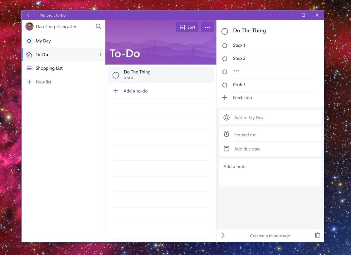
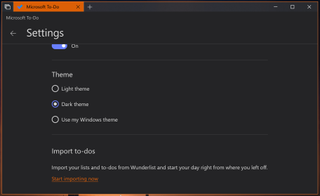
Microsoft has slowly been adding dark modes to a number of its apps on Windows 10, and it looks like To-Do is next up on the list. As spotted by OnMSFT, a new dark theme option appears to be in testing with Windows Insiders and should be coming to everyone soon.
Like the dark mode in other Microsoft apps, turning the theme on in To-Do will switch the interface over to a theme that's much easier to look at when working in a dark room. Unlike other implementations, however, To-Do's appears to use more of a dark grey color rather than a stark black.

Microsoft has put a lot of work into To-Do in recent months as it seeks to make it a viable replacement for Wunderlist, which the company acquired in 2015. Some backend technical issues have slowed the transition from Wunderlsit to To-Do so far, but the app has recently rolled out list sharing, steps for tasks, and even some Fluent Design flourishes. Cortana integration of some sort is also expected to hit the app in a future version.
It appears that the dark theme option is only rolling out to Insiders on the Skip Ahead ring at the moment, but it's possible the Fast ring Insiders will see the option appear soon. There's now estimate on when it will make its way to the release version, but it's a welcome addition nonetheless.
Get the Windows Central Newsletter
All the latest news, reviews, and guides for Windows and Xbox diehards.
Dan Thorp-Lancaster is the former Editor-in-Chief of Windows Central. He began working with Windows Central, Android Central, and iMore as a news writer in 2014 and is obsessed with tech of all sorts. You can follow Dan on Twitter @DthorpL and Instagram @heyitsdtl.
