Microsoft To-Do debuts new look on the web, 'Planned' smart list feature
To-Do now has a new design on the web, and it's looking pretty fresh.

All the latest news, reviews, and guides for Windows and Xbox diehards.
You are now subscribed
Your newsletter sign-up was successful
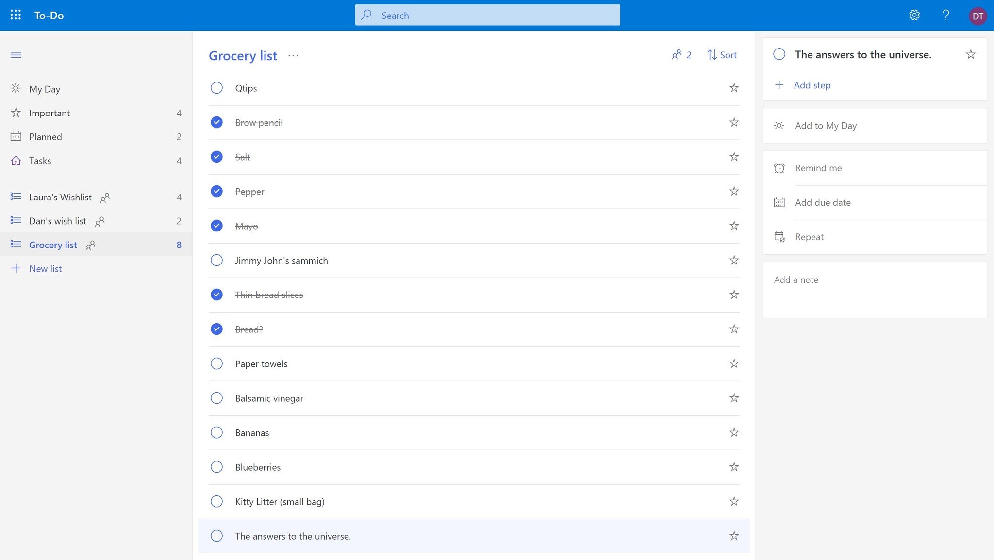
Microsoft's To-Do apps on mobile aren't the only ones getting some love this week. The company debuted a new look for its web app, sporting a simplified design and a new feature: "Planned" smart lists.
The most notable change is that new design, which eschews some of the design elements found in the other To-Do apps in favor of a more simplified look. Overall, it's quite a bit cleaner, but also blander than its prior iteration. But for an app that's meant to help you focus on your tasks for the day, that's probably not a bad thing.
In addition to the new look, you'll also find a new "Planned" section grouped alongside your "My Day," "Important," and "Tasks" smart lists in the left-hand menu. The new section is meant to give you a quick overview of your upcoming tasks for the next five days, along with a further look at thing coming later down the line.
Article continues belowOur web app has a new look! With our new design, it's easier to visually organize your lists by color. And our new Planned smart list gives you an organized overview from My Day to the next 5 days and even later. pic.twitter.com/zpgpsYfljIOur web app has a new look! With our new design, it's easier to visually organize your lists by color. And our new Planned smart list gives you an organized overview from My Day to the next 5 days and even later. pic.twitter.com/zpgpsYfljI— Microsoft To-Do Help (@MicrosoftToDo) September 11, 2018September 11, 2018
The new "Planned" section isn't yet available in the other To-Do apps, but it's likely not far off.
To check out all of what's new, you can head to To-Do on the web. Today's refresh also comes alongside updates to the Android and iOS apps, which bring a much smaller set of features to the table, like faster syncing and UI tweaks.
All the latest news, reviews, and guides for Windows and Xbox diehards.

Dan Thorp-Lancaster is the former Editor-in-Chief of Windows Central. He began working with Windows Central, Android Central, and iMore as a news writer in 2014 and is obsessed with tech of all sorts. You can follow Dan on Twitter @DthorpL and Instagram @heyitsdtl.
