Microsoft details new improvements coming to its Fluent Design System on Windows 10
Microsoft is making some key updates to the Fluent Design System for developers who want to implement more Fluent UI into their apps.
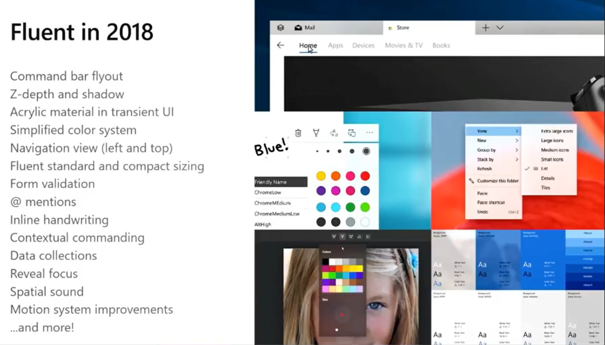
This week at Build 2018, Microsoft unveiled several improvements and iterations that the company is making to its Fluent Design System that was first introduced back in 2017. Microsoft has always said that the Fluent Design System is a journey, and that it will continue to evolve over the many products and services Microsoft releases.
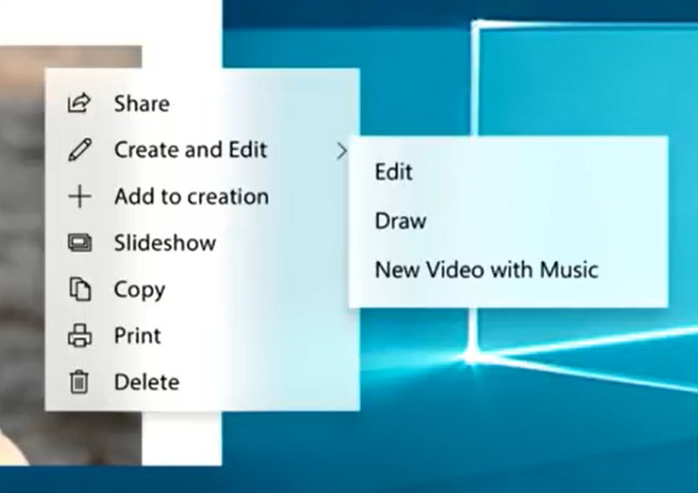
Things such as command bar flyouts, updates to navigation view, compact sizing, shadows, and more, are all part of the Fluent Design improvements for 2018. Many of these changes are on the subtle side, with things like shadows now able to be gently applied to certain elements like context menus. Microsoft actually showcased what context menus with Fluent Design will look like, which is something many people have been waiting for Microsoft to get around to updating.
Microsoft is also making changes to how the back button works on Windows 10. No longer should developers use the back button found in the titlebar of apps; Microsoft is phasing that out in favour of building back buttons into the apps themselves. Microsoft says this should provide a consistent back button experience across its first party apps, and that developers will be able to follow templates to match if they wish.
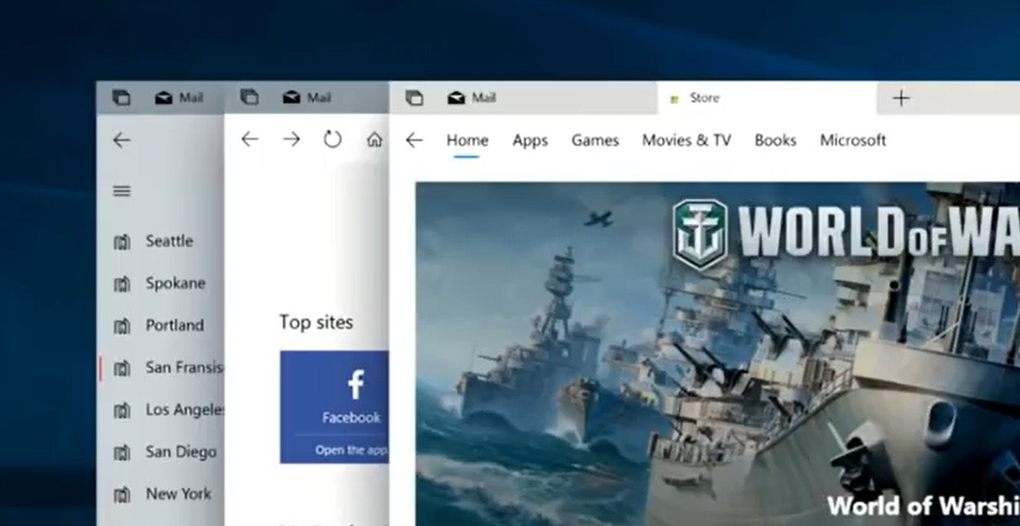
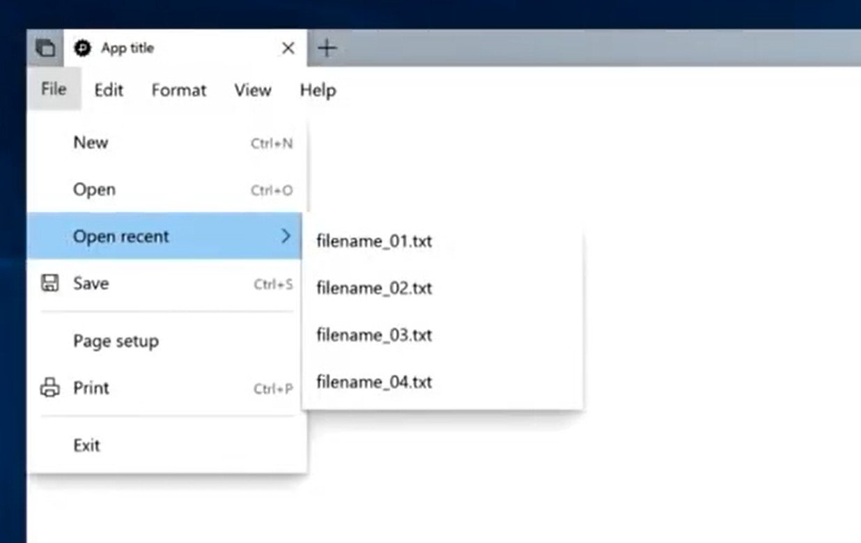
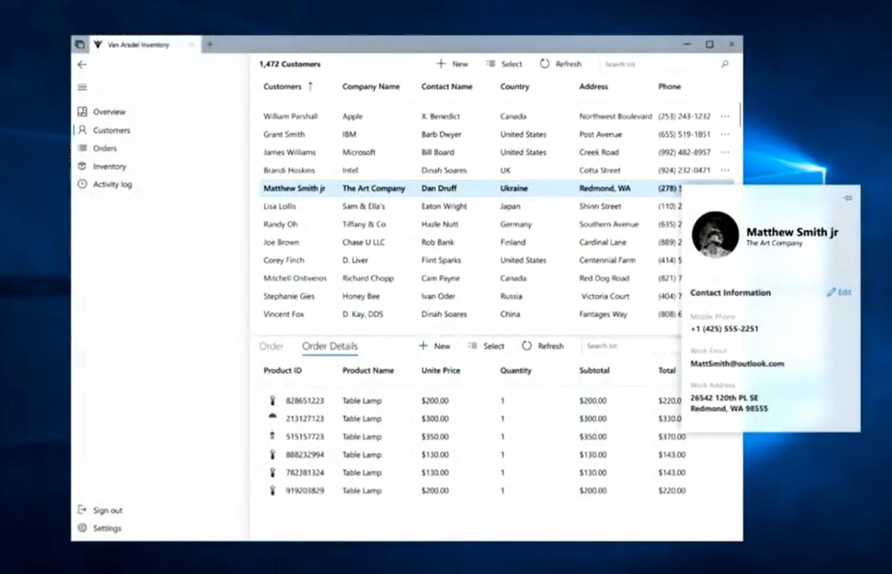
There are several updates coming to navigation view, including an updated horizontal navigation view that will be able to house groups, dropdown menus, and more. Microsoft is toying with implementing these new navigation views into the Microsoft Store at some point, and it showcased early concept ideas for this in one of the sessions on Fluent Design.
One of the most notable changes coming to Fluent Design is a new sizing standard that moves away from the "large hit points" theme Microsoft started with Windows 8. Now that Windows 10 Mobile is no longer something Microsoft nor developers have to target, the company can begin building UI with desktop in mind. As such, elements like buttons, icons, and more are now smaller by default, which makes much more sense when using a mouse and keyboard. There's also a new "compact size" which is even smaller than the new default size.
Microsoft is really committed to bringing Fluent Design to every part of the Windows 10 OS. It's an evolving system that will take time to implement everywhere, and in 2018 Microsoft is taking some big steps in pushing that boat along. While we likely won't see several of these improvements show up in the OS at first, we know that Microsoft will get around to adding them over the next couple of Windows 10 version updates, just like it did when Fluent Design was first announced.
Get the Windows Central Newsletter
All the latest news, reviews, and guides for Windows and Xbox diehards.

