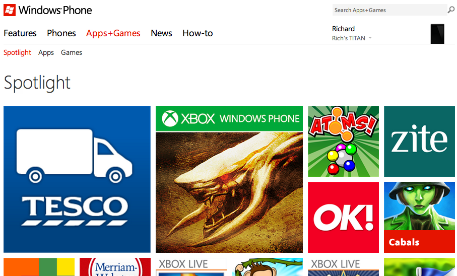
Microsoft continuing to roll out new Windows Phone Marketplace design and improvements

Say hello to semi-Live Tiles
Yesterday we covered new changes being applied to the Windows Phone web Marketplace Store, which started rolling out in Australia and New Zealand. Microsoft has dived right in and the end result is fairly impressive with the use of tiles that show details on hover as a useful example of what improvements are being implemented.
We've just noticed the UK Windows Phone Store has been refreshed with the changes, and we'll join everyone in agreement that it looks a whole lot better. The branding has indeed been altered to Windows Phone Store (URL, titles, references, etc.), and we're seeing more filters for sorting through the 100,000 plus apps and games. We were unable to spot the much needed option for reporting content though.
Text and buttons have also been altered to make navigation throughout the website more user friendly. We also noticed the addition of the new Microsoft logo in the footer to accompany the copyright notice. Subtle but a much needed change.
Are you seeing said changes? If so, what do you make of them?
All the latest news, reviews, and guides for Windows and Xbox diehards.

Rich Edmonds was formerly a Senior Editor of PC hardware at Windows Central, covering everything related to PC components and NAS. He's been involved in technology for more than a decade and knows a thing or two about the magic inside a PC chassis. You can follow him on Twitter at @RichEdmonds.

