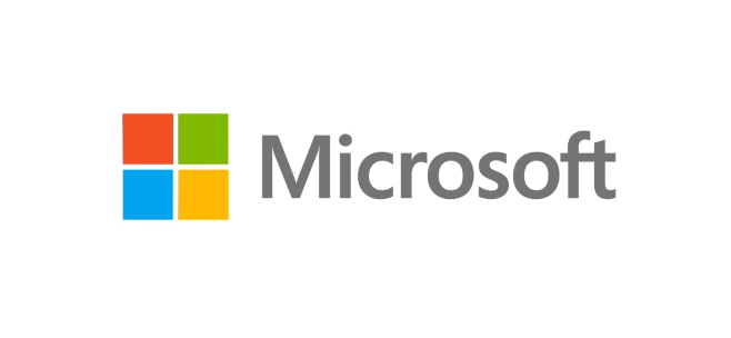
Microsoft changes their company logo after 25 years, intended to ‘signal the future’

The new official logo of Microsoft, revealed this morning
Microsoft this morning has unveiled their new company logo featuring the Segoe font and new multi-colored Windows symbol. It’s the first change to the logo in over 25 years and is intended to "signal the heritage but also signal the future — a newness and freshness" according to Jeff Hansen, Microsoft's general manager of brand strategy.

Previous Microsoft Logos
The design makes sense as the new Windows logo is flattened to match the more Metro/Modern UI design language that Microsoft has been using in Windows Phone, Windows 8 and their Xbox 360 devices. The new logo is expected to be officially unveiled this Thursday when Microsoft opens its Store in Boston—something that we revealed a few weeks ago. Presumably other Stores will follow suit with the news design being updated on storefronts and interior.
According to the Seattle Times, who broke the story, Microsoft will also be using the new logo is a wave of new TV commercials meant to announce and highlight their new products that are coming this fall, presumably including Windows 8, Windows Phone 8, Internet Explorer 10 and more.
Source: Official Microsoft Blog, Seattle Times
Get the Windows Central Newsletter
All the latest news, reviews, and guides for Windows and Xbox diehards.

Daniel Rubino is the Editor-in-chief of Windows Central. He is also the head reviewer, podcast co-host, and analyst. He has been covering Microsoft since 2007 when this site was called WMExperts (and later Windows Phone Central). His interests include Windows, laptops, next-gen computing, and wearable tech. He has reviewed laptops for over 10 years and is particularly fond of 2-in-1 convertibles, Arm64 processors, new form factors, and thin-and-light PCs. Before all this tech stuff, he worked on a Ph.D. in linguistics, performed polysomnographs in NYC, and was a motion-picture operator for 17 years.
