Microsoft Band 2 vs. Apple Watch

All the latest news, reviews, and guides for Windows and Xbox diehards.
You are now subscribed
Your newsletter sign-up was successful
Join the club
Get full access to premium articles, exclusive features and a growing list of member rewards.
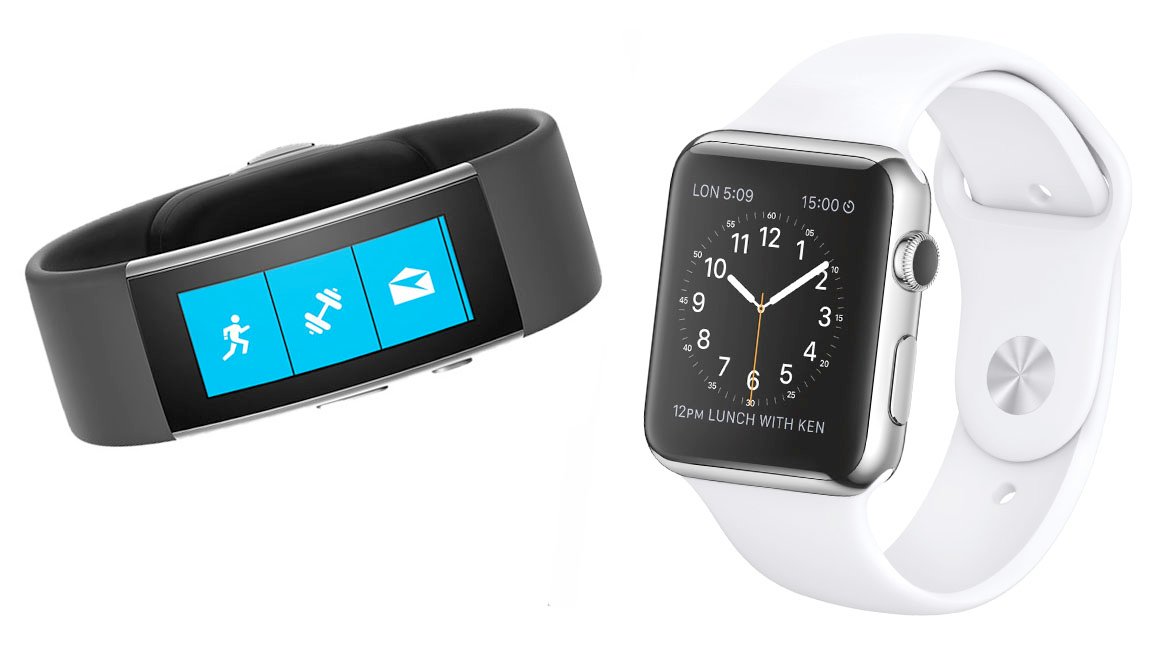
Smartphone versus smartphone is boring — wearables are where the real interesting action is happening, and there's no more interesting comparison in that rapidly-expanding category than of the Microsoft Band 2 versus the Apple Watch.
| Category | Microsoft Band 2 | Apple Watch |
|---|---|---|
| OS | Microsoft Wearable Architecture | watchOS |
| Material | Thermal plastic elastomer silicone vulcanate | Aluminum / Stainless Steel / 18kt gold |
| Screen Size | 32mm | 38mm / 42mm |
| Screen Resolution | 320x128 | 272x340 / 312x390 |
| Screen Type | Curved AMOLED | OLED |
| Sensors | Optical heart rate, accelerometer, gyroscope, GPS, ambient light, UV, galvanic skin response, barometer | Optical heart rate, accelerometer, gyroscope, ambient light |
| Connectivity | Bluetooth | Wi-Fi, Bluetooth |
| Compatibility | Windows Phone 8.1 or greater iPhone 5 or greater running iOS 8.1.2 or greater Android 4.4 or greater | iPhone 5 or greater running iOS 8.2 or greater |
These two devices take radically different approaches to the wearable computer, even more so than the prominent differences between the approaches of Windows 10 Mobile and iPhone. Where the Apple Watch aspires to be a fashion device, Microsoft's first crack at the Band was so utilitarian that it was remarked during version 2's unveiling that they literally rounded the corners. The Apple Watch tries to be a mobile computer on your wrist, complete with a growing selection of apps, while the Band is an advanced fitness tracker first and brings notifications and a bit of interactivity to your wrist second.
They're very different visions of the wearable computing. Apple's approach seeks to make the wearable as independent from the phone as is reasonable, while Microsoft ties the wearable into an inextricable relationship with your phone — which itself could be the center of your digital universe with the Continuum-powered Display Dock.
Article continues belowHeck, the designs of the two are wholly different. Apple crammed every bit of tech they needed into the casing of the watch, enabling owners to swap out bands at will, but also making a watch body that's somewhat large and thick. Microsoft opted to spread the components out across the entire circumference of your wrist, wrapping the display into a curve and distributing the battery, sensors, radios, and connections all around.
The Apple Watch stands as a more generally-capable device, but it tends more towards the jack of all trades than master of any. The Microsoft Band 2, however, focuses first and foremost on fitness and health, with a multitude of biometric sensors to keep tabs on your exercise and wellbeing, all enhanced by Microsoft's partnerships with more than 20 fitness and health institutions.
Smartphones and smartphone software have mostly converged onto one accepted basic design and we're simply seeing iteration of that theme. Wearables, that's where all the real action is.
For the rest of our NYC #Windows10Devices coverage head here:
- Lumia 950
- Lumia 950 XL
- Surface Pro 4
- Surface Book
- Microsoft Band 2
All the latest news, reviews, and guides for Windows and Xbox diehards.

Derek Kessler is a Former Special Projects Manager for Mobile Nations. He's been writing about tech since 2009, has far more phones than is considered humane, still carries a torch for Palm, and got a Tesla because it was the biggest gadget he could find. You can follow him on Twitter at @derekakessler.
 Join The Club


