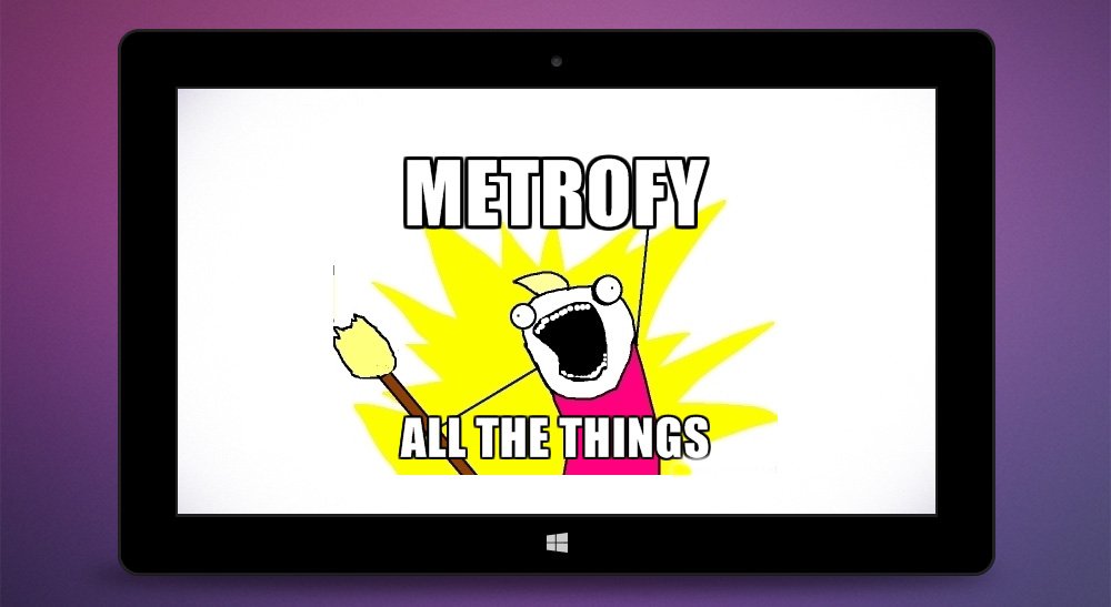
File under fun. Like most of you, we spend a lot of time staring at some screens throughout the day. Typically our Windows Phone device and computer are the ones that get the most action. You love the look and feel of Windows Phone and get that same familiarity in Windows 8. But what about in the wild web? You don’t have much control over how a site looks. Or do you?
If you want to make your web browsing experience on the desktop a little more like Windows Phone check out the following extensions for Chrome. Yes, Chrome, mostly because Internet Explorer doesn’t support add-ons/extensions at the moment like Chrome does. We’ll be making Reddit and the general web a little more “Metro”.
It’s super easy to get going with making the world a little more “Metro”. To start you’ll be installing an extension which is available for either Chrome or Firefox. It’s called Stylish. Go install the Chrome version or the Firefox version.
Once you’ve installed Stylish you’ll be installing a user style. There’s two we’re looking at today. What’s a user style? Little pieces of code that make changes to style changes to websites. For example they might change the font, remove sections, tweak the display, or completely redesign the site. They’re a nice way to change up the look of an ugly site or customize something to your liking. You can browse and find a ton of them available for free to the community. Here’s the two we’ll be looking at.
Reddit – Metro
First up is a user style called Reddit – Metro. It adds some Windows Phone design to Reddit. It should work with the Reddit Enhancement Suite (highly recommended), but you might have trouble using it with “night mode”. Below is a before (left) and after (right). While it might not be for everyone, it’s fun to play around with and you can always disable it with a click of a button. Grab Reddit – Metro.
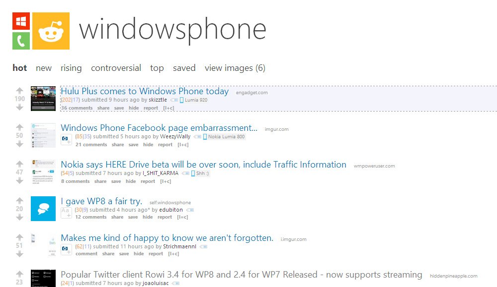
Before
Get the Windows Central Newsletter
All the latest news, reviews, and guides for Windows and Xbox diehards.
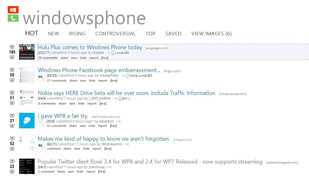
After
Metro Everything!
This user style does one thing and one thing well. It changes the font of every website to Segoe UI – the same font used throughout Windows Phone. Below is what it looks like before (left) and after (right). Again, not for everyone, but the Windows Phone Central crew has been playing around with them this afternoon and just wanted to share with you guys. Grab Metro Everything!
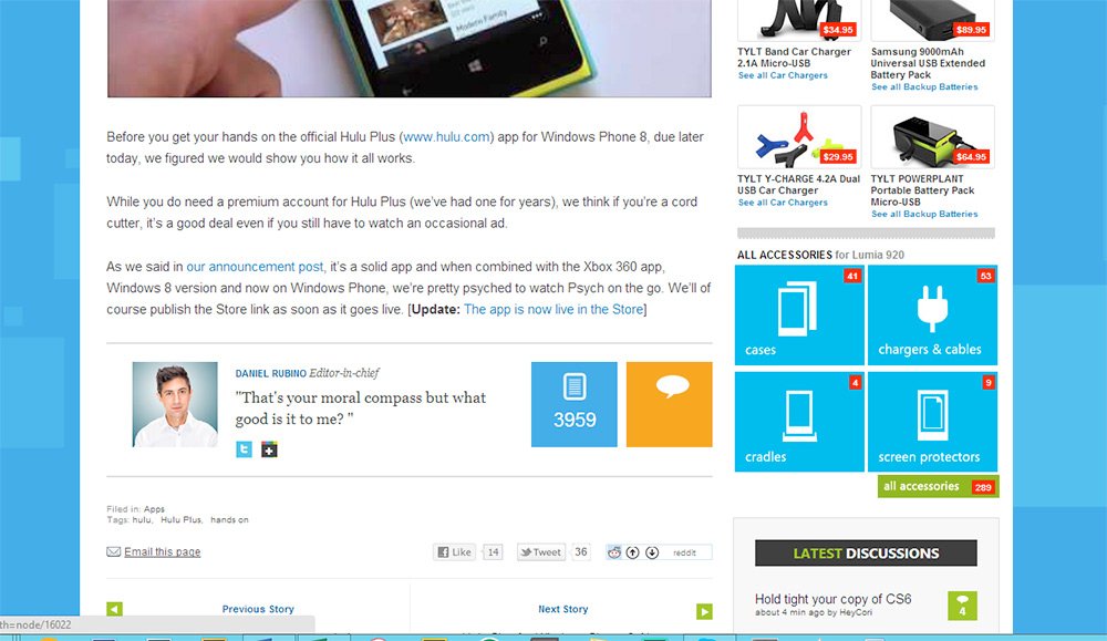
Before
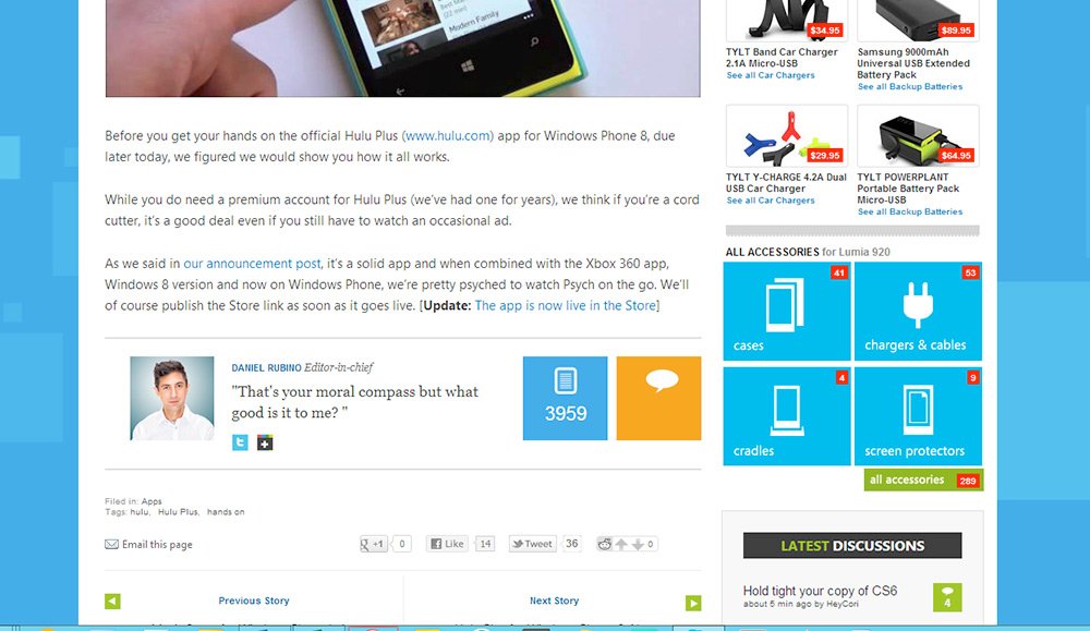
After
Be sure to click on the images if you're on your PC and want a closer view. Or just install the extensions yourself and give it a whirl. Have any other user styles we should check out? Share below!
Thanks Daniel R. for the tip! ;)
P.S. If you want the PSD of that awesome lead image, go here.

