Why Microsoft needs to unify the many faces of Cortana
Microsoft's Cortana is now in more places than ever, but it needs to start looking the part of a future-driven A.I. personal assistant.

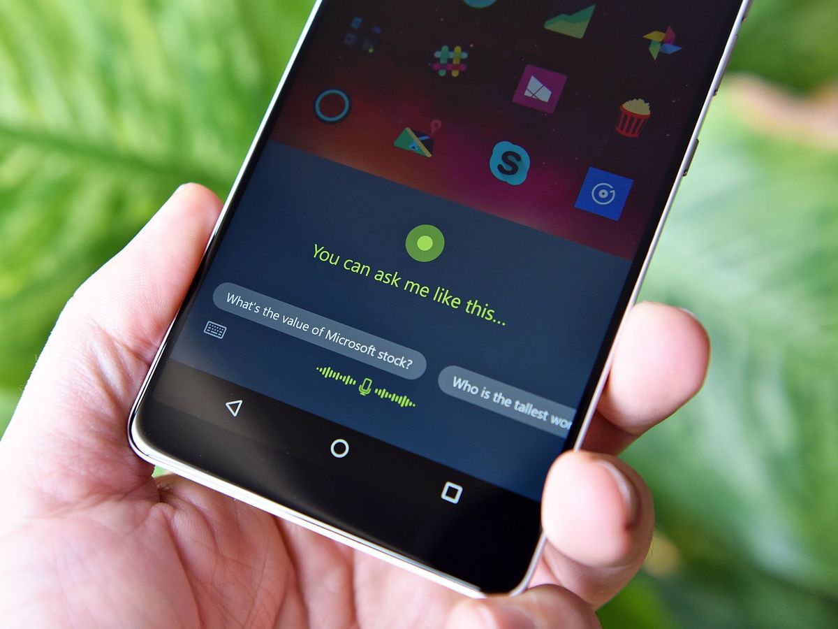
Microsoft's personal assistant Cortana is getting a new home this week on Android. The Microsoft Launcher for Android (beta) now has Cortana built in, and it got a design revamp. Of course, being Microsoft and Cortana, the feature is region-restricted to just a handful of countries including the U.S., UK, Canada, Australia, and China.
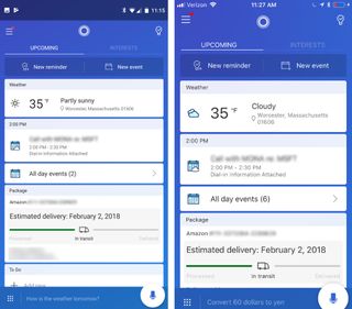
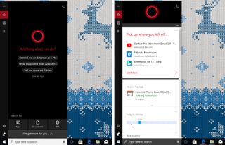
One of the more exciting aspects of the Cortana integration – which is very well done – is the updated UI, which is now cleaner. This design contrasts with the existing Cortana app for Android and iOS, which is more reliant on the old "card" interface. Both contrast even more with the current version for Windows 10.
While platform variation is to be expected – even encouraged – Microsoft needs to unify its Cortana user experience across devices better if it expects broader user adoption.
Embracing platform diversity ... but not too much

Microsoft has waxed and waned in the past between a single, unified UI design for its apps and services to more tailored ones that better fit into specific platforms. This shift in design philosophy was expressed profoundly in Skype, which for many years looked like the PC desktop version, then shifted countless times with various changes in design.
To be fair, the approach of tailoring something like Cortana for Android is welcome. While Microsoft idealists believe the company should turn Android into a pseudo-Windows Phone with Live tiles, cooler heads have prevailed. Instead, Microsoft's apps for Android embrace Google's design choices to blend in better.
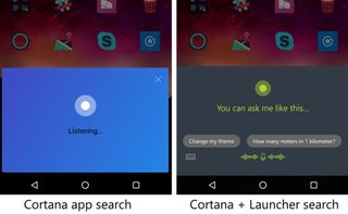
The problem right now, however, is the different looks of Cortana within Android. The Cortana app and Cortana voice recognition screen look very different from the new Microsoft Launcher version (the new one seems way better).

Perhaps this is part of a grand scheme where Microsoft will align its Cortana, Bing, and Launcher apps with the same Cortana experience – and maybe that will even look like Windows 10 – but knowing the company's past gives me pause.
Get the Windows Central Newsletter
All the latest news, reviews, and guides for Windows and Xbox diehards.
Other issues like region restrictions, or the inability to wire deeper into Android. like "Hey, Cortana." is more reflective of the difficulties in making an assistant for a competing platform. Amazon's Alexa will face similar problems on Windows 10 whenever that app rolls out on select PCs.
Cortana's look needs to wow users

Finally, while Cortana is growing in functionality, the version for Windows 10 needs a design makeover. Microsoft is expected to shift Cortana out of search into the Action Center and create a more chat-driven user experience, giving the company a significant opportunity to just that.
What should Cortana look like? Opinions vary, but I'd argue the digital assistant had its heyday in design back when it debuted on Windows Phone in 2014.
Cortana is far from dead as Microsoft plans to make an 'Intelligent OS'
Microsoft later shifted its design to a more dynamic card system with Windows 10 for PC. That move also let Cortana's cloud results "live" on other non-native devices by dynamically scaling to all resolutions. The result, however, is quite dull and unattractive with the Android and iOS versions, which at least look similar, appearing very outdated and frankly ugly.
All of this is a bit ironic, as Microsoft last year made a big push about its Fluent Design System, which is now steadily creeping into Windows 10. Even the Microsoft Launcher for Android has acrylic (blur) elements, marking the first instance of the company's new design language headed to a competing platform.
But what about Cortana?
Surely a futuristic, A.I. driven personal assistant could at least look the part. For all the gruff Apple's Siri gets it is at least pleasant to look at.
Designing an assistant that is both easy to navigate but also flexible enough to work on rival OSes is not easy. But this is the lot Microsoft is embracing. Let's hope it can refocus, realign, and reimagine Cortana for 2018 and beyond. Functionality and ambition will always outpace what digital assistants can do, but at the very least the company can wow us with some eye candy in the meantime.

Daniel Rubino is the Editor-in-chief of Windows Central. He is also the head reviewer, podcast co-host, and analyst. He has been covering Microsoft since 2007 when this site was called WMExperts (and later Windows Phone Central). His interests include Windows, laptops, next-gen computing, and wearable tech. He has reviewed laptops for over 10 years and is particularly fond of 2-in-1 convertibles, Arm64 processors, new form factors, and thin-and-light PCs. Before all this tech stuff, he worked on a Ph.D. in linguistics, performed polysomnographs in NYC, and was a motion-picture operator for 17 years.