The MacBook Pro's notch is fine for macOS but would be terrible on Windows
The memes are funny, but I don't hate the notch on the new MacBook Pro.

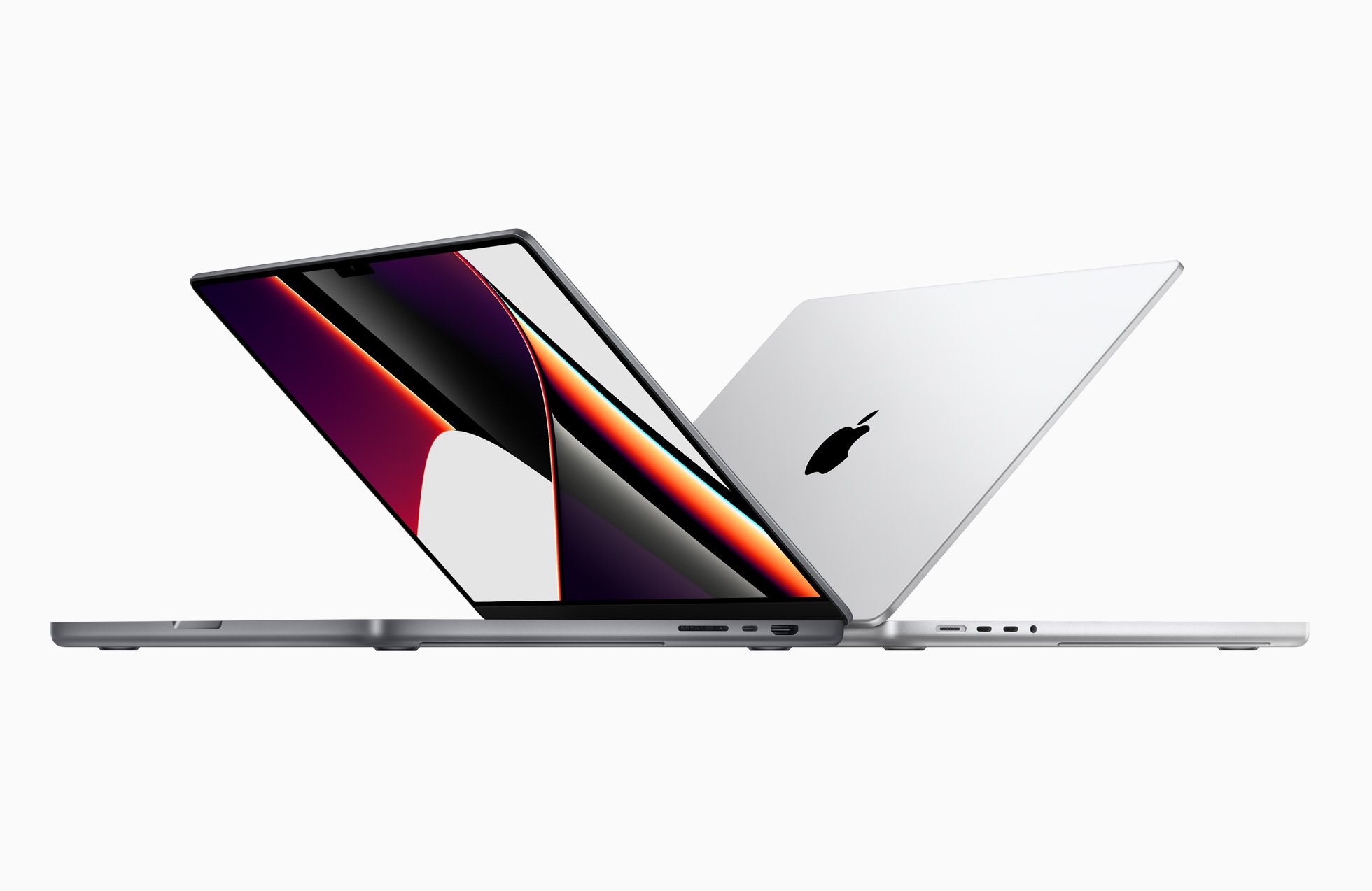
Apple announced the new MacBook Pro yesterday. Inside, the laptop will run powerful processors that some Windows users are envious of, but on the outside, the MacBook Pro has a notch that's drawn criticism and jokes. While I agree that at first glance the notch on the MacBook Pro looks silly, it doesn't really eat up space that you'd otherwise have. In fact, it actually gives you more screen real estate in some cases.
Windows 11 and macOS are also different enough that a notch can work better on one than the other. While I hope that Windows laptops remain notchless, I think the notch works fine on macOS.
Comparing apples to apples
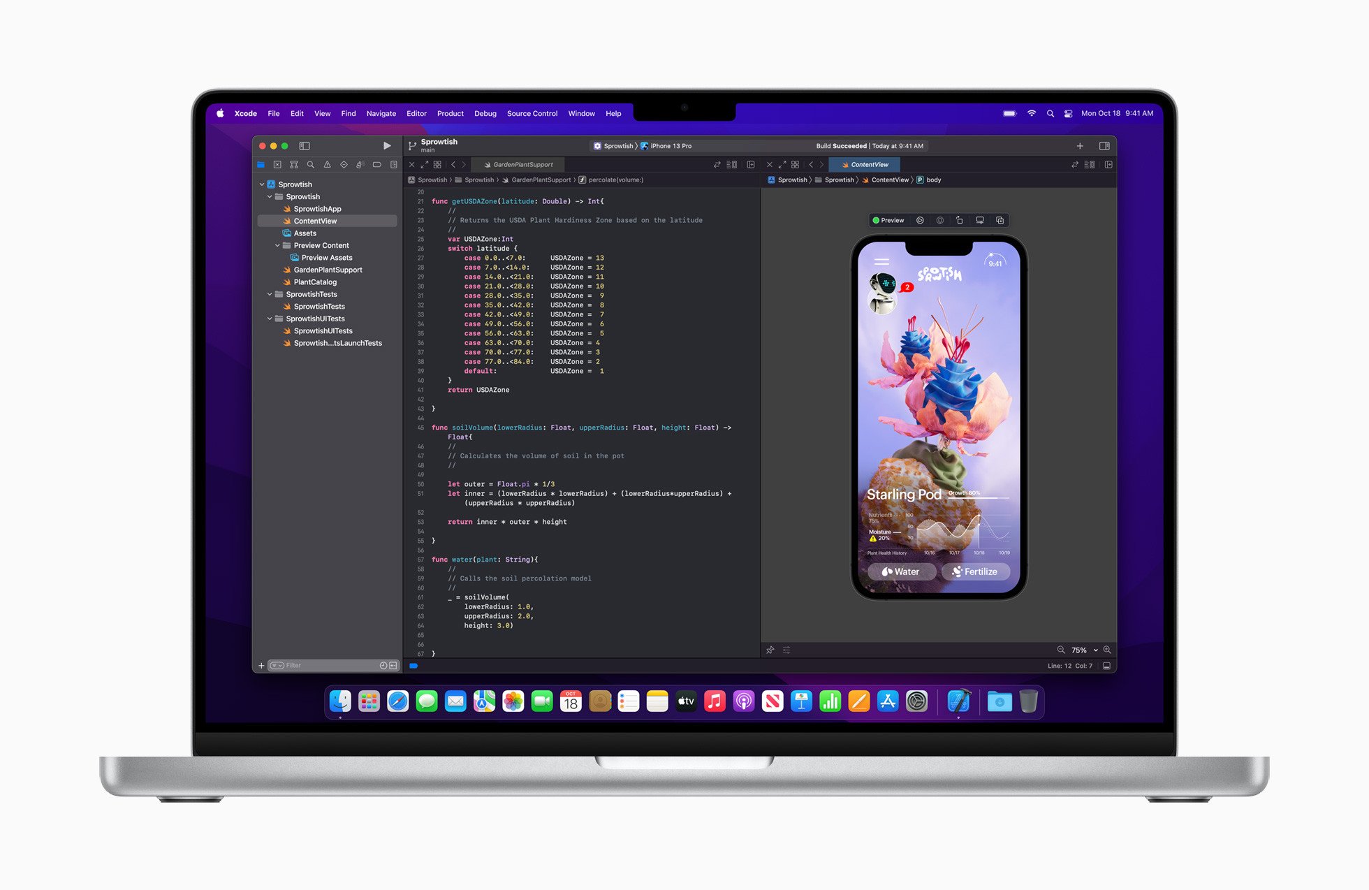
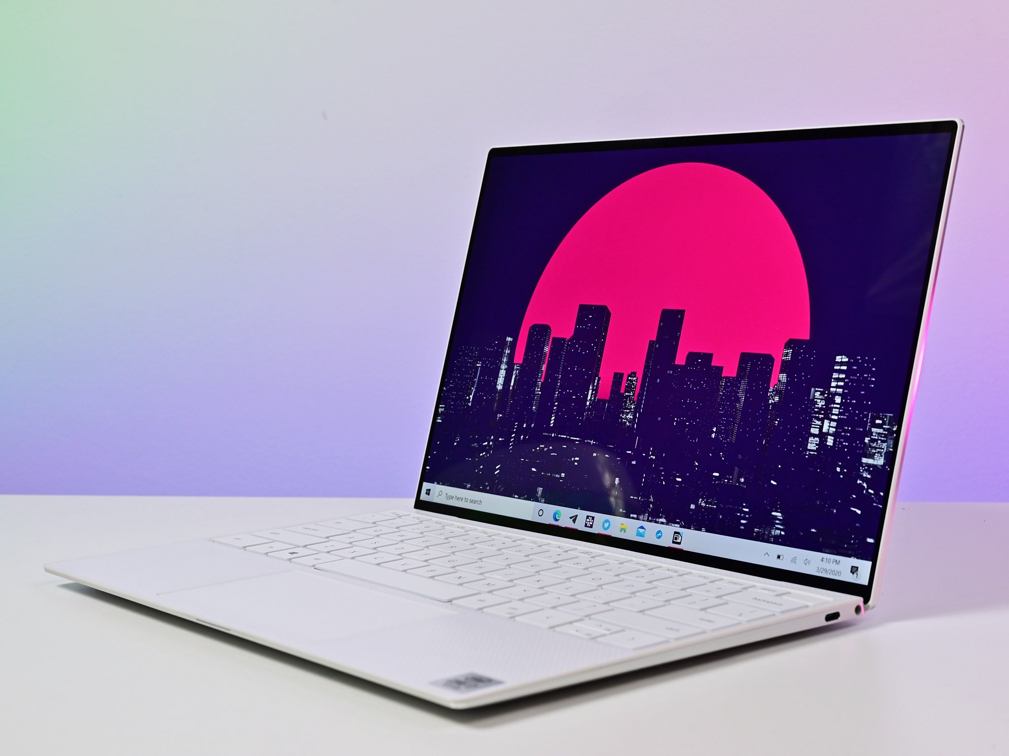
Many of the best Windows laptops manage to have thin bezels and cameras without requiring a notch. Our Richard Devine highlights that many laptops running Windows fit cameras that support facial recognition into bezels that are skinny. That is true, but some of those bezels are thicker than what's seen on the new MacBook Pro.
I'll have to break out a caliper to measure notches, but the Dell XPS 13 and Razer Book 13 have incredibly thin bezels that house cameras.
In contrast, the Surface Laptop 4, Lenovo ThinkPad X1 Nano, and Surface Pro X have slightly thicker top bezels. If they ran macOS, some of these laptops would gain a bit in the display department.
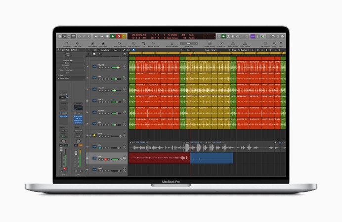
2021 MacBook Pro 16 vs. 2020 MacBook Pro 16
More importantly for people who buy MacBooks, the new MacBook Pro has a thinner top bezel than the model from 2020. Sure, you could criticize the 2020 MacBook Pro for having a chunky top bezel, but Apple addressed that with the 2021 MacBook Pro. Some people just don't like how Apple fixed it.
Get the Windows Central Newsletter
All the latest news, reviews, and guides for Windows and Xbox diehards.
Windows vs. macOS
Of course, the best Windows laptops don't run macOS (duh). That's a key distinction, as macOS handles the top of its display differently. When navigating around the desktop on macOS or using apps that aren't in fullscreen mode, the operating system has a menu bar at the top of the screen. Unless you have a ton of menu bar icons, the notch isn't going to get in the way.
As pointed out by our sister site iMore, Apple's new MacBook Pro can use the full screen around its notch. The menu bar will wrap around the notch and bump up everything else a few millimeters. It's a bit like if a camera notch sat in an unused part of the Windows Taskbar. Microsoft won't let us move the Taskbar to the top of Windows 11, so maybe that point is moot.
I still think the notch looks ridiculous, but there's an argument to be made that getting more space on your screen is worth it. Moving the menu bar up means you have more room for your apps.
Missing FaceID
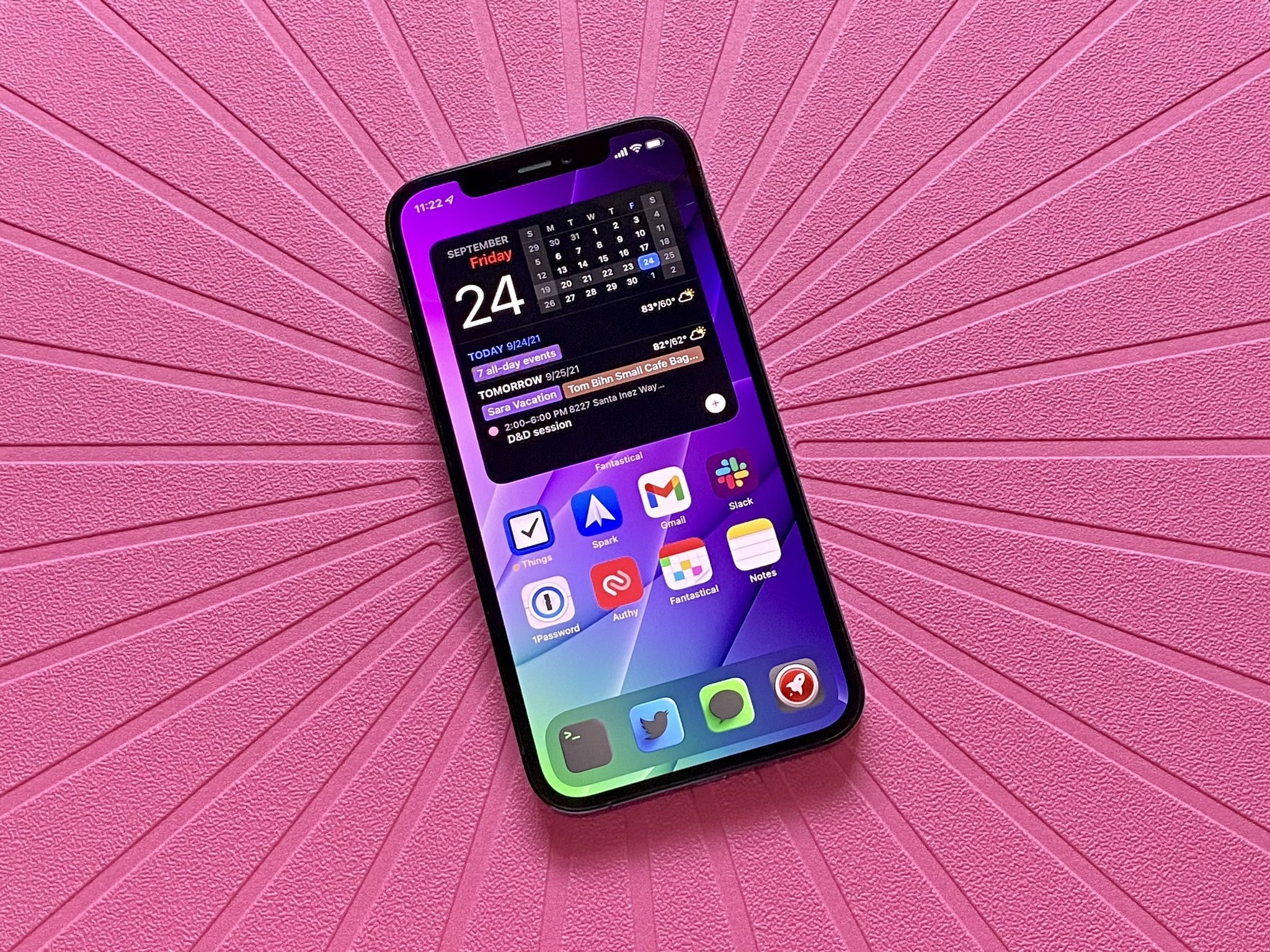
There are arguments to defend the notch, but its lack of FaceID is indefensible. The camera is just so ... prominent. It's just odd that a piece of hardware that stares at you in the face can't look at you with an IR camera to unlock the MacBook Pro. Not having Center Stage is also a frustrating omission. If Apple is repurposing R&D efforts from its other devices to make the MacBook Pro camera better, why aren't the best features from other Apple cameras in the laptop?
Apple moves at its own pace. It doesn't roll out tech until the company feels it's ready, but I think people would swallow the notch more if it added functionality.

Sean Endicott is a tech journalist at Windows Central, specializing in Windows, Microsoft software, AI, and PCs. He's covered major launches, from Windows 10 and 11 to the rise of AI tools like ChatGPT. Sean's journey began with the Lumia 740, leading to strong ties with app developers. Outside writing, he coaches American football, utilizing Microsoft services to manage his team. He studied broadcast journalism at Nottingham Trent University and is active on X @SeanEndicott_ and Threads @sean_endicott_.
