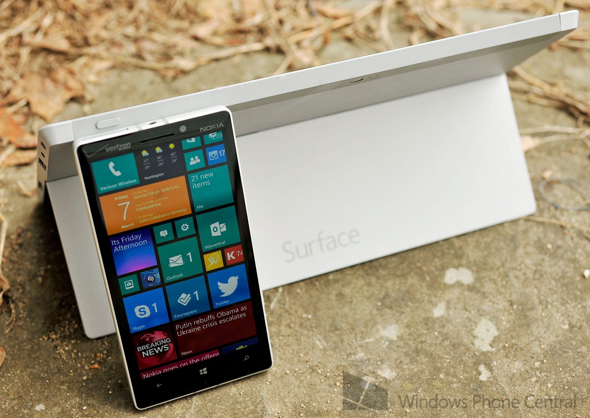
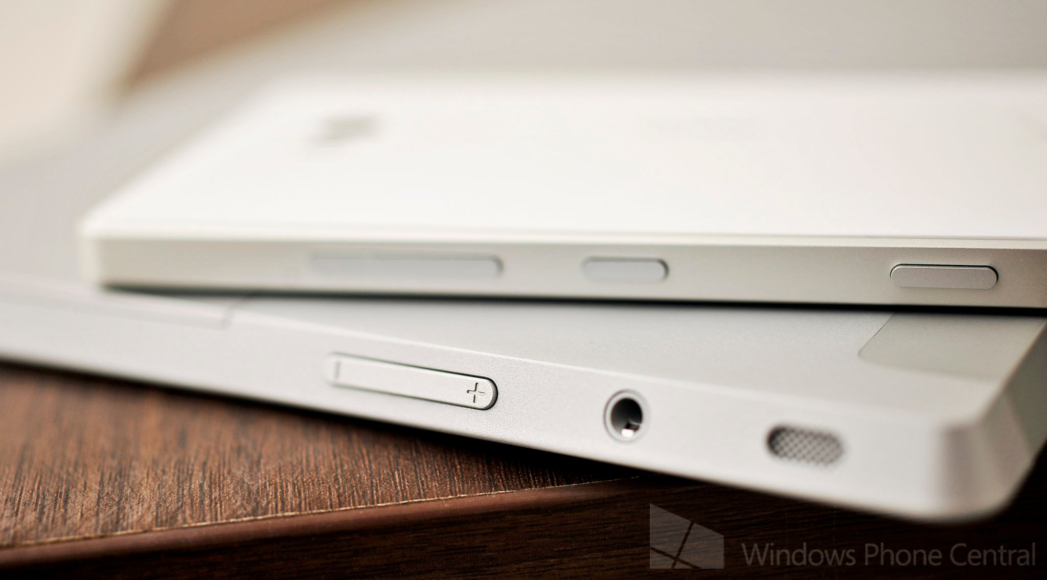
Nokia Lumia Icon versus Microsoft Surface 2 – born of the same design language?
Yesterday, I finally picked up my matte white/silver Lumia Icon from Verizon. Nokia wanted back the review device, so I had to decide if I wanted the Icon on my Verizon account. Of course I did, it’s a great phone.
In playing with the white/silver version, which in my opinion looks much better than the all black one, I can’t help but notice how much it borrows from the Surface 2 design language. Let me be clear here: I’m not saying this is the oft rumored ‘Surface Phone’ from Microsoft. Or that Nokia worked with Microsoft in any way on this device. That’s not true at all.
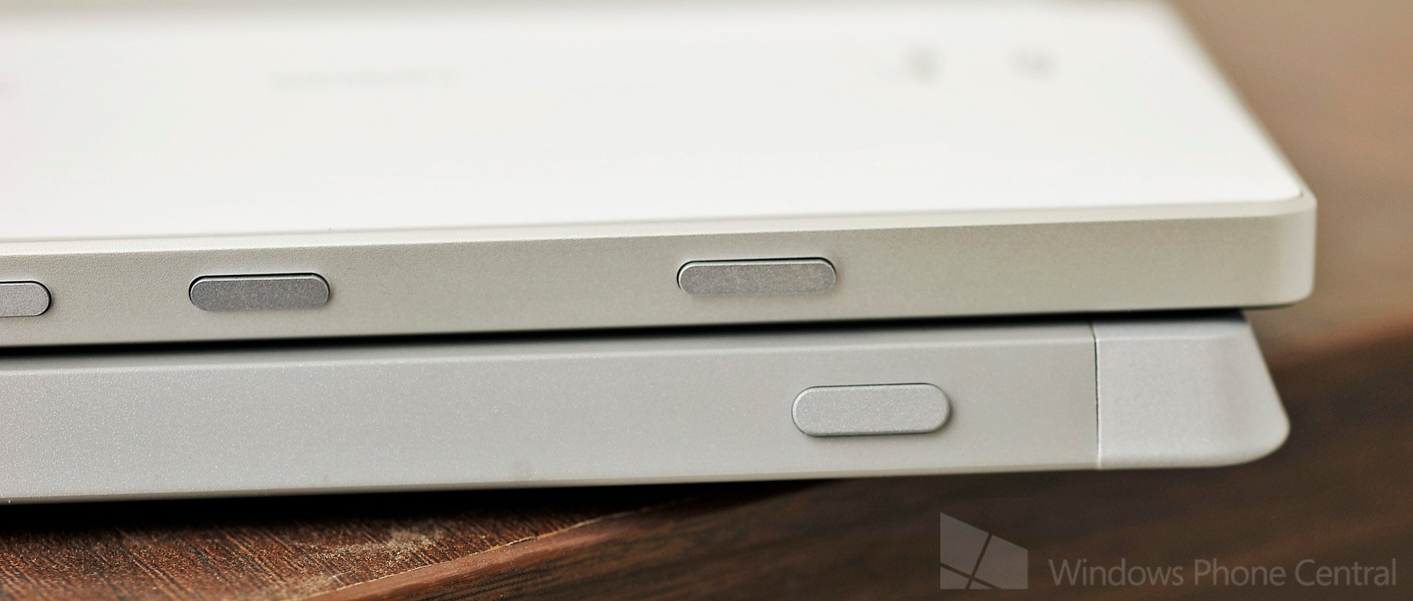
But you have to wonder if Verizon and Nokia didn’t want to appropriate at least some of the look from Microsoft’s iconic Surface design. Truth be told, it's probably more coincidence than anything. But it's an interesting one, nonetheless. From the angles of the device’s edge, to the near identical button design and yes, that metal band on the Icon looks a lot like the white VaporMG of the Surface 2. Putting both devices next to each other and you would think they’re part of the same product line.
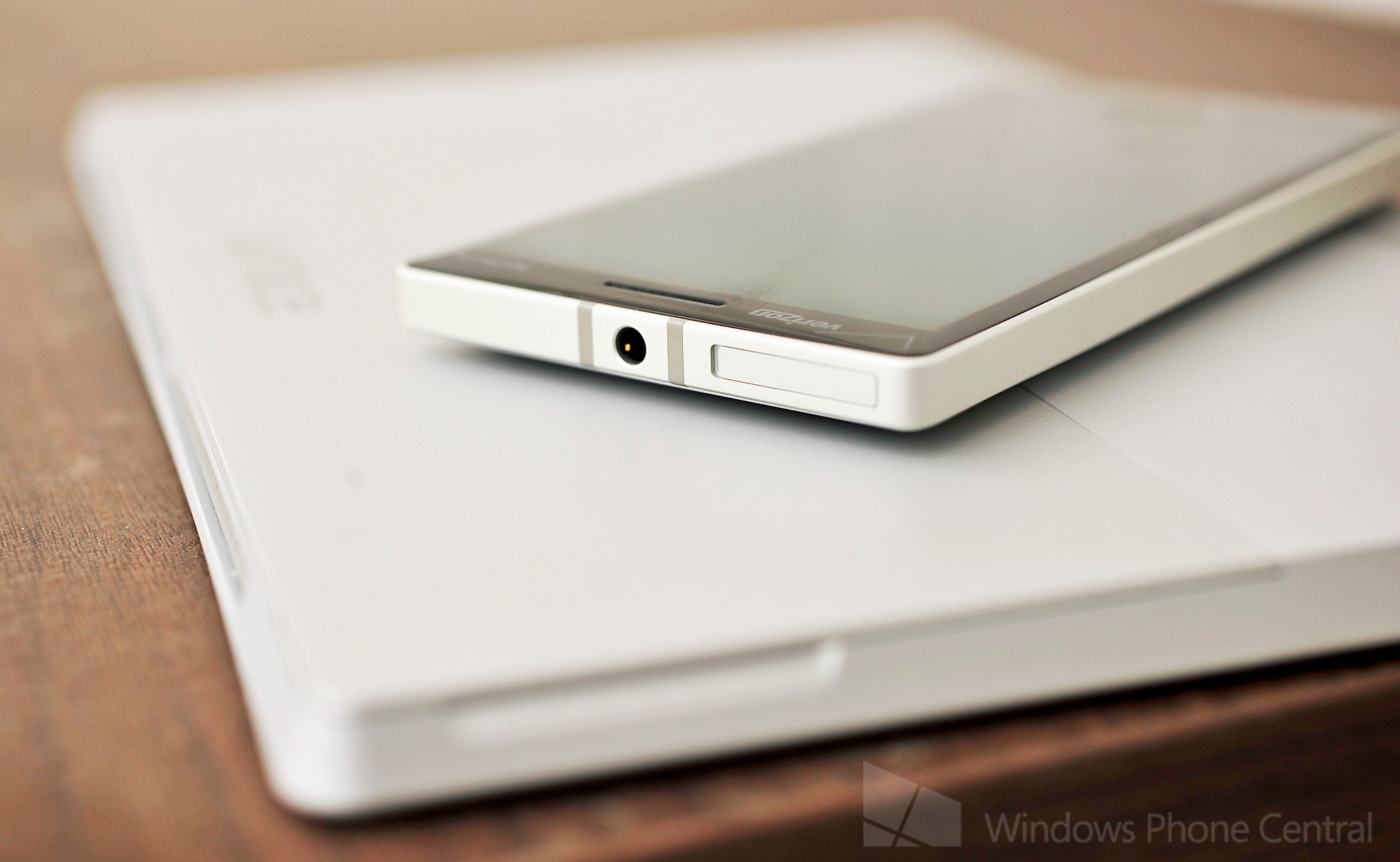
This of course this raises some interesting questions, especially once Microsoft seals the deal on Nokia’s hardware division. We’re already familiar with Nokia’s standard Lumia design with polycarbonate and bright colors, something that’s carrying over into the first 8.1 phone, ‘Moneypenny’. But will Microsoft and their new hardware division churn out a ‘Surface phone’? I personally don’t expect them to, but with a device like the Lumia Icon on the market, in many ways, they’re already half way there.
I’ll ask you what you think, though I’m 99% sure I know the answer. It seems like a no-brainer, but product lines can be complicated and Microsoft may not want to dilute the brand (even more so since ‘Surface’ implies a tablet, not a phone). Still, they could call them whatever they want and still use the same design language.
Whatever they do, I have to admit that the Surface 2 and white Lumia Icon look great together.
Get the Windows Central Newsletter
All the latest news, reviews, and guides for Windows and Xbox diehards.

Daniel Rubino is the Editor-in-chief of Windows Central. He is also the head reviewer, podcast co-host, and analyst. He has been covering Microsoft since 2007 when this site was called WMExperts (and later Windows Phone Central). His interests include Windows, laptops, next-gen computing, and wearable tech. He has reviewed laptops for over 10 years and is particularly fond of 2-in-1 convertibles, Arm64 processors, new form factors, and thin-and-light PCs. Before all this tech stuff, he worked on a Ph.D. in linguistics, performed polysomnographs in NYC, and was a motion-picture operator for 17 years.
