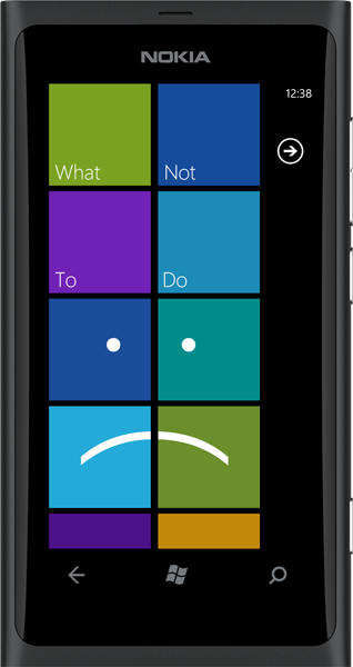
The Lumia 800 guide on What Not To Do


Most people like starting things off on a positive note, but I’m of the belief that you should get the horrid stuff out of the way first, and go uphill from there.
Since I got my Windows Phone 7 I have taken it upon myself to bring as many people as I can over to our side. You can think of me as one of the Microsoft WP7 Evangelists – but without the, you know, money. So I was rather pleased when I found out a family member was getting the Nokia Lumia 800. Nokia took their sweet time to finally get a phone to market so it could only be assumed that it would be a really rockin’ device, right?
After playing with the phone I immediately realized that was only half true. As a developer I pride myself in knowing that I have developed great stuff. It isn’t perfect (else I would be Popcap), but I avoid the obvious pitfalls as much as I can, and for the most part, do lots of QA before publishing. Sadly, it looks like Nokia (and Microsoft), who must have approved it all, didn’t focus too much on the software side. Here’s why…
App Highlights
This app is definitely one of the most decent preloaded apps. It has various sections (weber’s picks, starter kit, turn it up!!!, addictive, health+, and foodies) and within each there are about 10 apps listed.
I actually quite like the idea and premise behind it – people can turn their phone on for the first time and be given a whole bunch of suggestions based on what they’re looking for. This would definitely be useful for first-time Windows Phone users, and even more so for first-time smartphone users.
My only real complaint here is the performance – although maybe I’m biased because one of my apps is in the music section ;-). Until every item has loaded (which comprises an Icon, a name and publisher) it is totally unresponsive. On a fast connection, this might not be too noticeable, but for the other half of us, it just seems like they should have hired someone like Jeff Wilcox.
Contacts Transfer
Just about the quickest way to see that a developer has done a rush-job on an application is to look at the icon and splash screen. The icon is the first thing the user will see, so make it good – or at the very least, acceptable. Back when WP was first released I can recall a few applications in the Marketplace having the default icon (grey background with a white star in the center) – I don’t know if those slipped through or if the following certification requirement was only added after that:
Get the Windows Central Newsletter
All the latest news, reviews, and guides for Windows and Xbox diehards.
“[4.5] Verify that the icons are representative of the application, and match the icons that are present on the device after the XAP package is installed.”
Either way, it has been a long time since I have seen this.
The very next thing the user sees is the splash screen. This is a static image that shows for a few seconds while the app loads and usually has the title, or sometimes an image that is very close to what the main menu looks like to give the user the impression that it loaded faster.
Unfortunately, there is no rule stating that you need to have one representative of your application or even different from the default. Most, if not all of you have seen the following splash screen:

That is the default one that Microsoft gives you – and tells you that the developer was too lazy to spend 10 minutes making a custom one. Hell, even removing it completely shows that you at least thought about it.
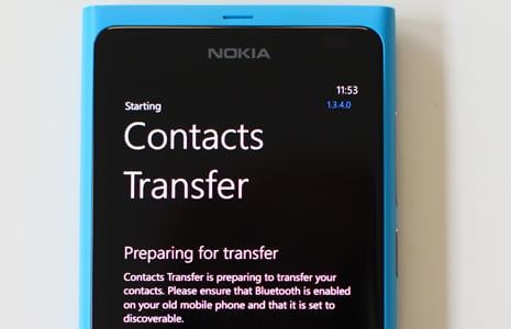
This brings me to the main problem with Contacts Transfer…they didn’t change the default splash screen!
Nokia Drive
Microsoft has clearly laid out guidelines to designing a “Metro” interface – and they have provided really great tools that make it pretty simple to make an application that fit’s nicely into the UI of the rest of the phone.
So what have Nokia done wrong? They didn’t change the design of Nokia Drive (from the N9) – they just ported it. OK, to be fair, they did add three little dots on the button at the lower right, plus they made the + and - buttons have square corners.
I can’t for the life of me understand why they could not replace that bottom bar with the “App Bar” from the Windows Phone SDK. Now I know that there is no requirement regarding this in the certification guide, but the whole app just feels like a fish out of water. They managed to pull off Nokia Maps really nicely, so why not this?
There is a great article regarding this, and Metro design in general here: When Metro Design Falls Off the Tracks
You can look a quarter way down for the app bar specifically.
The following is a screenshot of Nokia Drive on the N9 – but virtually the only way you can tell is because I just told you…

For another great example of how important using the tools that the SDK provides, look no further than xMaps.
For some reason they decided that they would design their own app bar to try mimic the real one. I can’t figure out why they would do this, and besides looking shoddy, it’s just clunky to use.
UPDATE:
Various comments have pointed out that Nokia Drive is designed this way purely for ease-of-use on the go.
I had overlooked that as I had not used it "in the field", and in this light is perfectly valid reasoning.
Trip Advisor
This has to be the worst excuse for an application that I’ve seen. How Microsoft didn’t stop them from pre-loading this is beyond me.
There are typically a few ways to make an application for Windows Phone. First there is XNA and Silverlight (or a combination thereof). Let’s call ‘em the Light Side. Then there are sorry excuses for apps that are just HTML (or should I say HTML5, because that seems to be the buzzword that the general populous deems to be cool). These are most definitely the Dark Side.
Now before the HTML-devotees amongst you start looking up where I live, try understand that I am not saying HTML isn’t great. I’m just saying it’s a useless replacement for a native app (OK, XNA and SL aren’t exactly native, but you get my drift).
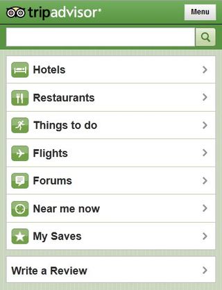
There are far too many reasons and not enough space here to explain why I believe the above statement – maybe that’s a topic for another day. For now, let’s just focus on the UI. Below is a screenshot of the app:

I know some of you will say “but it’s kind of metroey!” – because from what I have seen, a large proportion of people think that Metro == square edges. It doesn’t. Square things just happen to be very clean. In reality I’m giving them more credit [with the screenshot] than they deserve because that is actually a screenshot from Firefox on PC. On the actual app the boxes are rounded. You know, like the iPhone UI. And that right there is half the problem, because everyone who gets a Lumia 800 will be introduced to the lovely world of metro, and then as soon as they find this app they will get slammed back into the world of Apple. You may love or hate the iPhone UI, but regardless, that UI should stay on their devices, and our UI should stay on our devices.
The other half of the problem is that you can really feel that it isn’t a real app. It’s sluggish and unfriendly. At least with PhoneGap they attempt to throw in a few real Silverlight controls here and there, but this is just a Silverlight app with a WebBrowser control navigated to their website. You can try the app out yourself by opening your mobile browser (make sure that it’s set to mobile view in settings) and navigating to TripAdvisor.
In summary, I feel that Nokia has really rushed the software side of things – and should rather have left these apps off entirely. I know with a bunch of these things it sounds like I am nitpicking, but Nokia is Microsoft’s most important partner. People will judge WP7 based on their devices purely because it looks like Nokia may start dominating the market in terms of sheer numbers. On the plus side though, Nokia have provided us with a good What Not To Do guide – and I hope it helps some of you overlooking some obvious things while developing.
Oh, and is the actual device good? No - it's great.
Home to the most invested and passionate Microsoft fans, Windows Central is the next generation destination for news, reviews, advice and buying recommendations on the Windows, PC and Xbox ecosystems, following all products, apps, software, AI advancements, and accessories. We've been around for more than decade, and we take our jobs seriously. Windows Central writers and editors value accuracy and editorial independence in everything we do, never receiving compensation for coverage and never pulling punches.
