Nokia Lumia 2520 Review
Nokia is bringing their first Windows RT 8.1 tablet to market, but is it the right choice?
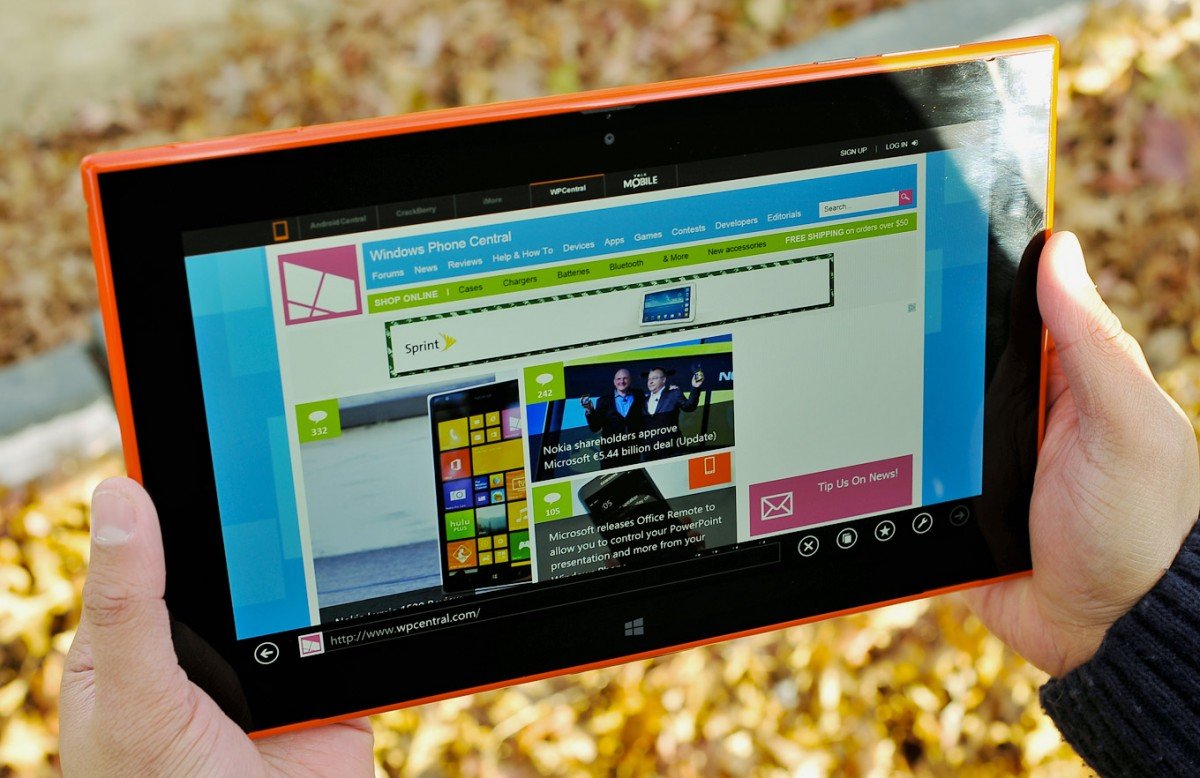
In a few hours, Nokia’s first Windows RT 8.1 tablet goes on sale in the US on Verizon (AT&T gets it just 24 hours later). It’s a momentous step both for Nokia and Microsoft, who so far have had a tough sell with the RT. In fact, Microsoft and Nokia are the last two manufactures to offer the stripped down version of Windows, with other OEMs opting for the more powerful 32-bit version on an Intel Atom or i5 processor.
So does Nokia have what it takes to spark some life back into the Windows tablet market? And what about Microsoft’s own Surface 2? Read on for our full review of the Nokia Lumia 2520 tablet.
| Outstanding 1080P HD Display, fast processor, excellent battery life and build quality make the Lumia 2520 an noteworthy tablet. LTE connectivity gives you an always-on internet device, built in Office and HERE Maps makes it compelling. | No full USB port, the lack of a kickstand and Microsoft's Surface 2 make it hard for the Lumia 2520 to stand out. Carrier branding limits its availability and the lack of storage may limit the device for power users. Odd button placement and uninspiring power adapter. |
| The Lumia 2520 is a solid, first attempt from Nokia to make a Windows RT 8.1 tablet. While the device has excellent specs, inspiring design, button placement and a phenomenal display, its not clear if many users will see the advantage of this tablet over others. |
Specifications
- Windows RT 8.1
- 10.1” full 1080p HD AH-IPS, High Brightness with Low Reflectance, Gorilla Glass 2
- 6.7MP Auto Focus ZEISS optics, Secondary: 2MP HD wide-angle
- Video 1080p@60fps
- 4G LTE
- Nokia Music for unlimited streaming of ad-free music
- Free global HERE Maps
- Microsoft Office built-in
- Qualcomm Snapdragon 800 (2.2GHz Quad Core)
- 8000 mAh (integrated) battery
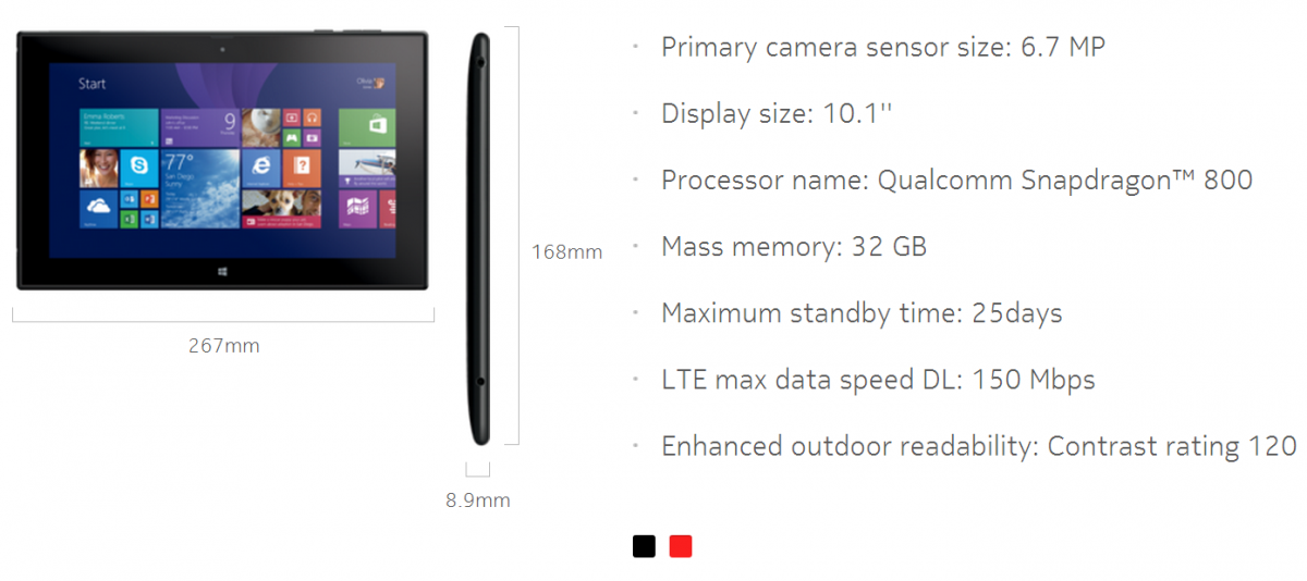
The Lumia 2520 tablet has a lot going for it in terms of raw specs but the big differentiator is the integrated 4G LTE for Verizon and AT&T. Currently, the Surface 2 is Wi-Fi only, though Microsoft has a planned LTE version due next year. But for now, Nokia is the only game in town for an RT powered tablet with 4G on board.
With 32 GB of internal storage (but only around 17.5 GB available) and micro SD expansion, users should have plenty of room for Windows Store Apps and Games. It’s not ideal, as a 64 GB version would be nice too, but for this range of tablet it’s not terrible.
The other benefit for Nokia is their double punch ZEISS camera and ClearBlack 1080P display. It has a 60 Hz refresh rate and so-called “enhanced outdoor readability”. Combined with the claimed 10 hour battery life and Nokia’s penchant for design, the Lumia 2520 seems like the ideal tablet for work and pleasure.
Layout
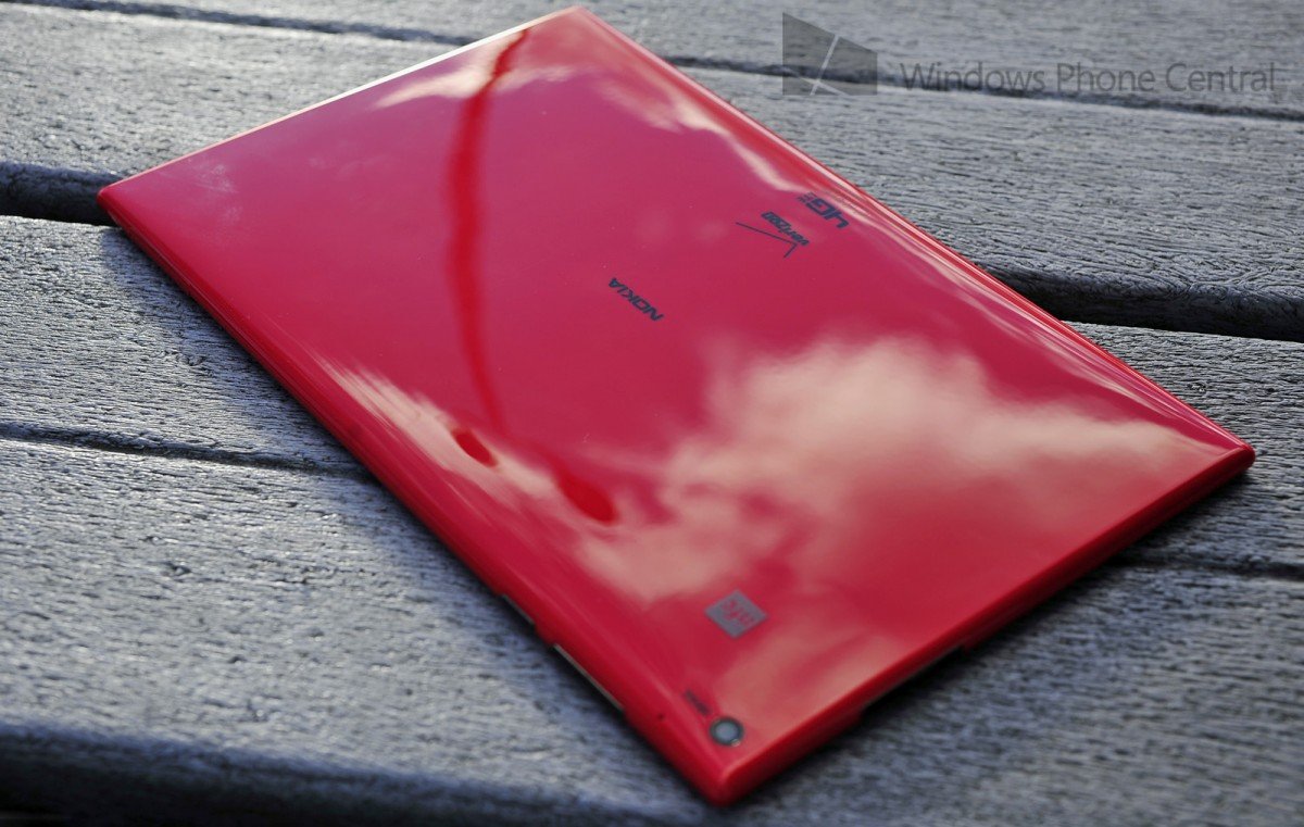
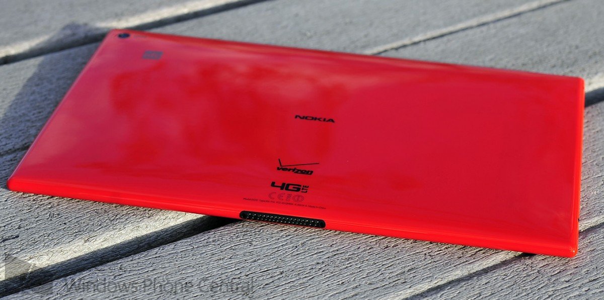
The Lumia 2520 is fairly clean when it comes to design and arrangement. It weighs in 615 grams, which is not light but it’s not heavy either. It’s somewhere in between. In many ways, it’s what you expect a Nokia Lumia tablet to feel like—solid and high quality. Still, there is a contrasting difference between the plastic polycarbonate and the VaporMG that Microsoft uses. It’s not better (or worse), just a different feel to it. There is no creaking or rattling, not that we would expect that from a Nokia device. No, this tablet reeks of quality.
The Lumia 2520 has agreeable, rounded corners like their Lumia phones (save for the Lumia 928 and Lumia 929). Because of that it feels nice to hold for extended periods. The edges are thinner than the middle, which pushes out slightly and evenly. When lying flat on a tablet, there is no wobble or rocking.
Get the Windows Central Newsletter
All the latest news, reviews, and guides for Windows and Xbox diehards.
Button layout is interesting. Volume and power buttons are on the top right corner, making them somewhat odd to access. This contrasts with the Surface 2, which has the power button in the upper right corner, but volume rockers to the left side. I’m not a big fan of the button layout as I basically had to look each time I wanted to turn the device on or adjust the volume (you never really knew which button you were pressing, blindly).
Also on the top left is the micro SD and micro SIM door. It pops up slightly and is not completely flush with the device. It’s not a bad solution, heck, Nokia had little choice, but it is more noticeable than I would like.
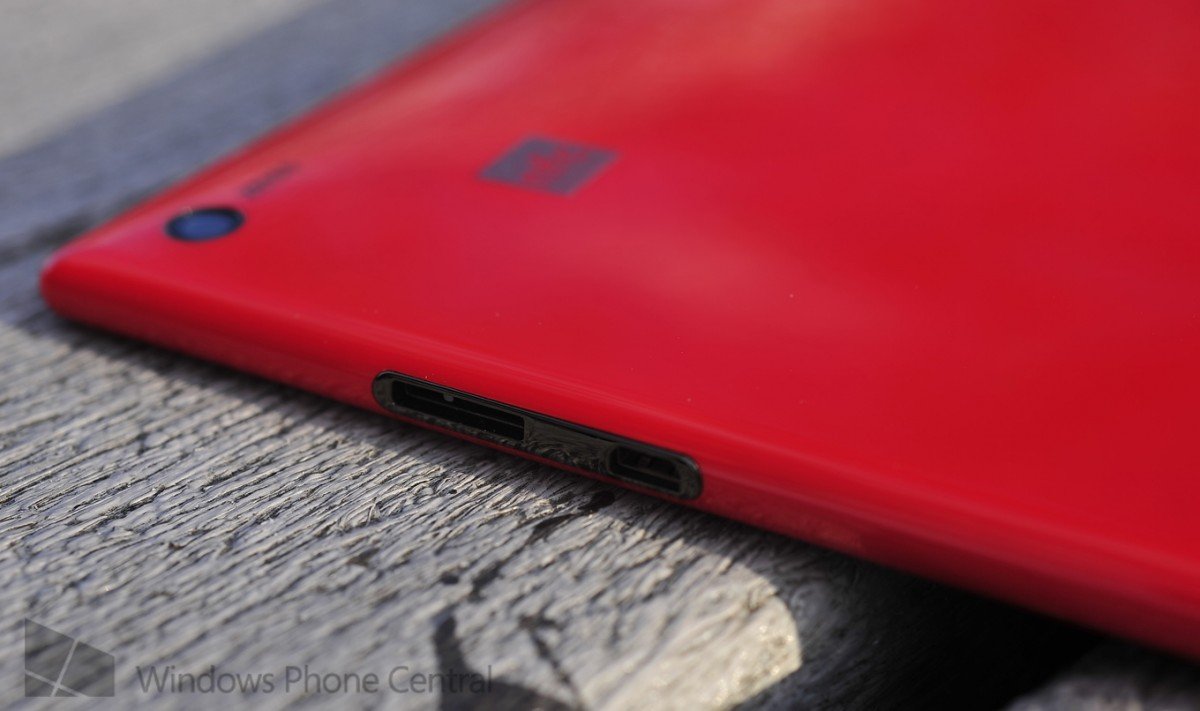
On the left side of the Lumia 2520 you have the headphone jack and 2.5 mm power adapter. The power adapter is the familiar “pin” type found on laptop and other tablets. That means no charging via USB. This is one area where I would have enjoyed seeing some Nokia innovation as the tried and true pin power adapter, while familiar, has never been very comforting. You have to press in rather hard and it’s just not a slick solution to what is a common function. The charger does have a nice green light to notify you that it is charging. You also have to be a bit careful. On first blush, both “holes” look exactly the same, so you’ll have to remember “power on the bottom, headphones on top”.
To the right of the tablet you have a micro USB (3.0) and micro HDMI-D ports. The micro HDMI Port should keep people happy while the micro USB is a tad frustrating. One trade off with those slick, curved edges on the Lumia 2520 is not having enough room for a full USB port. Clearly an engineering obstacle. That’s a downside if you frequently use the USB port for thumb drives or accessories, as you’ll have to use an adapter (not included) to get that to work.
The front of the device has the 2 MP front-facing camera and Windows key. No complaints on either, though I would like to see manufactures start to make the Windows key glow a bit—nothing bright, but just a slight illumination. That’s because if it’s a dark room, it becomes difficult to orient yourself to find that key, especially on the Lumia 2520.
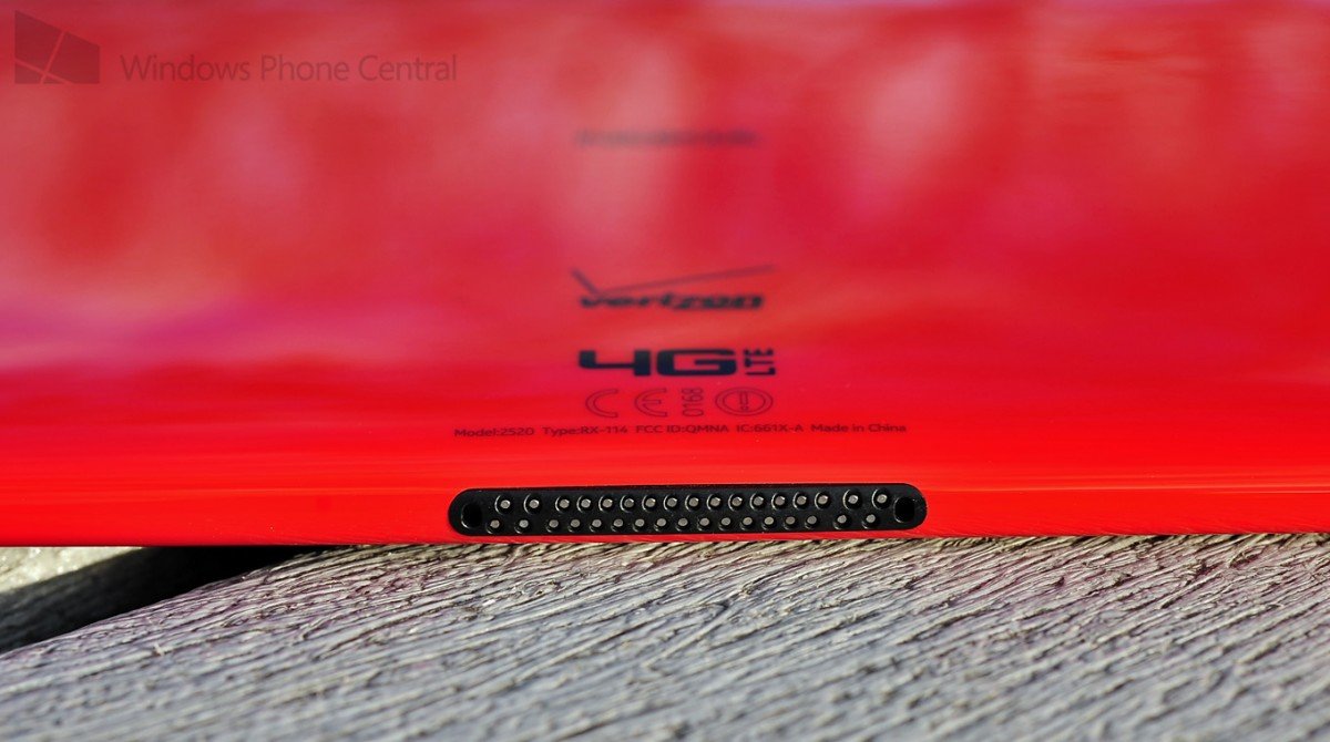
Two speakers are cleverly hidden on the lower screen bezel, much like the microphones on Nokia’s phones. This is one of the rare cases where a manufacturer has created front-facing dual speakers on a tablet. They are fantastic. Bass is not very strong, but they are very crisp. For a tablet they are surprisingly powerful, even at 50% strength and because of their placement, you won’t block them when playing games.
Finally, on the bottom of the device is the open connector the optional keyboard accessory. It’s actually done nicely, considering there aren't many options to keep such a port “clean”.
Processor
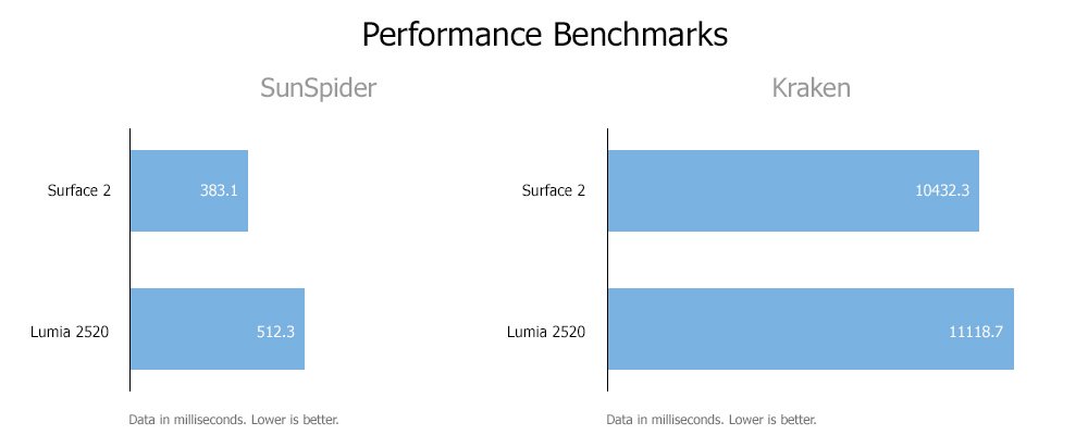
Qualcomm claimed that the Snapdragon 800 will perform better than the Nvidia Tegra 4 that’s found in the Surface 2 from Microsoft. Forgetting benchmarks for a moment and going by “real world” feel, I would tend to agree with their claim. Animations are buttery smooth and overall, it’s a joy to use (although on occasion I did see the camera ‘get stuck’ on processing).
Interestingly, when it comes to benchmarks, like SunSpider and Kraken for JavaScript, it was the Surface 2 that was ahead of the game.
Still, as I said above, in many instances the Snapdragon 800 did feel very fluid to us on general animations and performance. Take for instance launching a game like Jetpack Joyride, for all intents and purposes, it performs the same on both tablets.
When it comes to keeping up with Windows RT 8.1, the Snapdragon 800 holds its own and dare I say, I prefer it.
Display
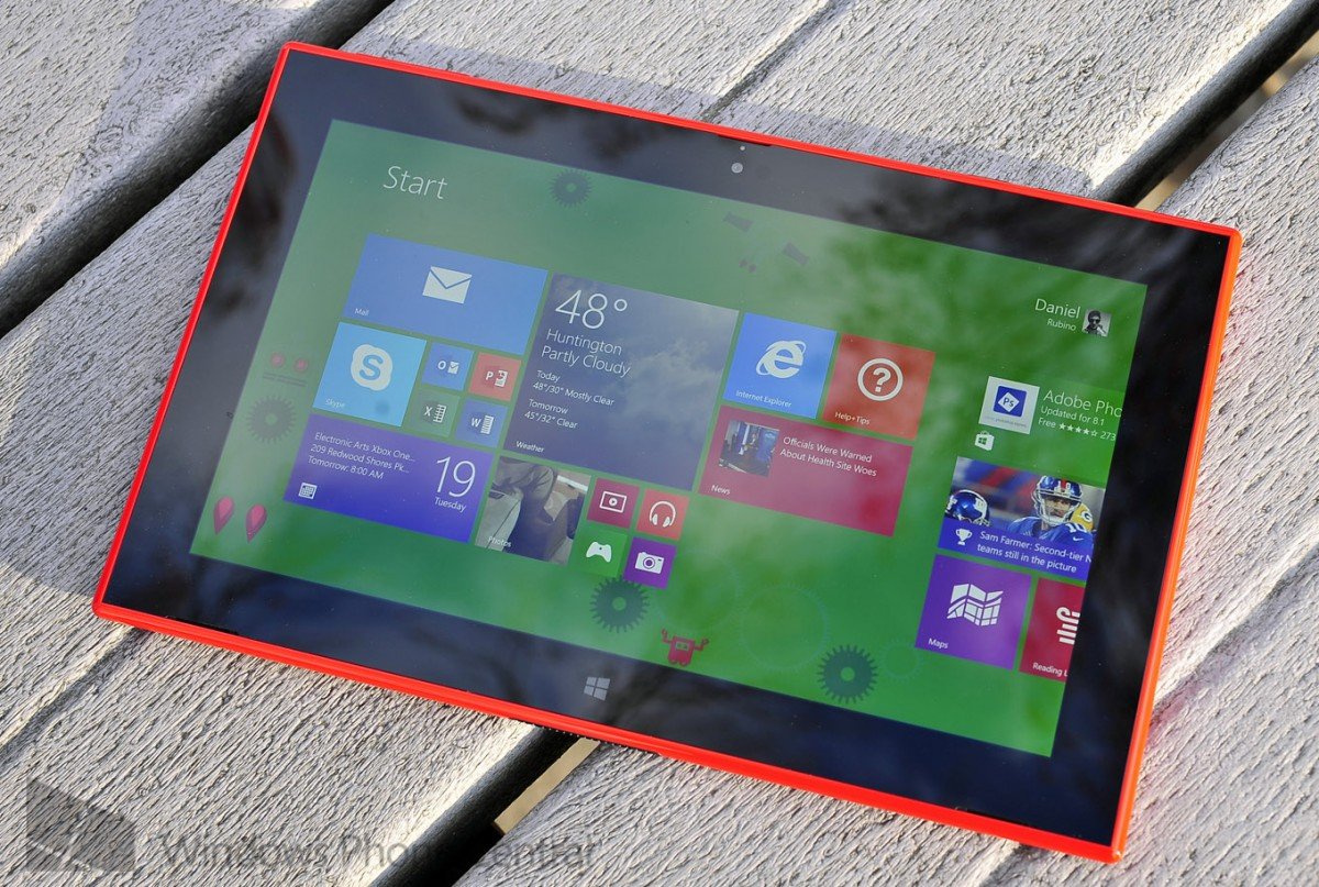
Let’s just get this out of the way. The 1080P ClearBlack display is hands down the best on any Windows Tablet and probably any other tablet out there. Yes, it runs loops around the Surface 2’s display and that is one of our favorites to begin with.
Color and contrast are exceptional as are the viewing angles. Being a 10.1-inch device, the 218 PPI is slightly higher than the Surface 2 at 207 PPI. Slight, yes, but it counts.
When it comes to outdoor use, as you can see in our hands on video and accompanying photos, there was no issues with glare or readability. Nokia’s claims on being the best tablet to use in the sun appear to hold true. Due to the ClearBlack dual-layer polarizer, reflectivity on the display was super low. I could easily read under a bright fluorescent light and not be distracted by the (almost non-existent) glare. Truly, phenomenal.
Nokia really nailed the display on the Lumia 2520, although at this point, I expect it. I don’t want to downplay this fact—when you’re using a tablet, you are staring at a screen in your hands. It matters to have a good display and the Lumia 2520 shines in this regard.
Camera
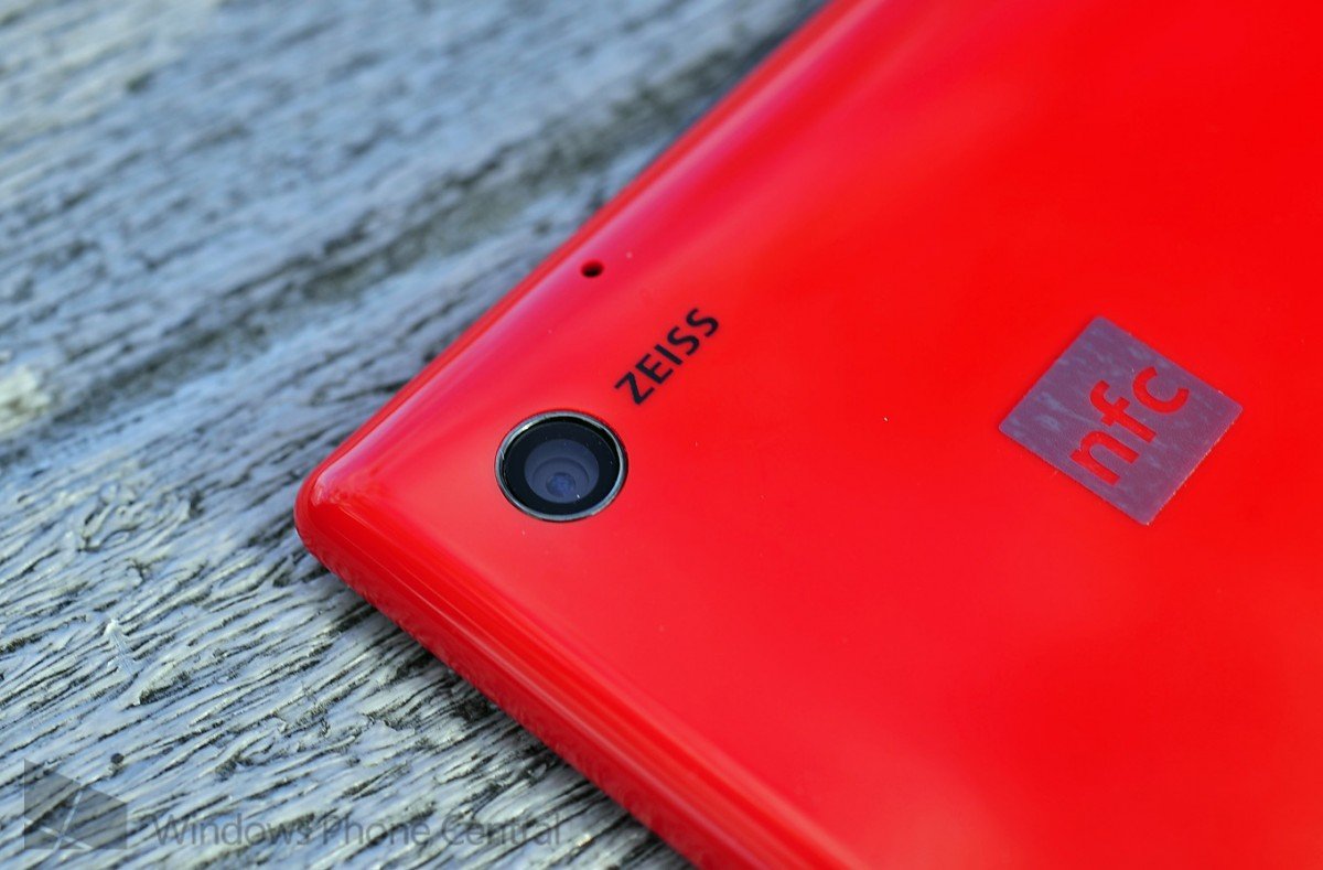
The Lumia 2520 comes with a 6.7 MP ZEISS rear camera. It’s the same camera module as found in the Lumia 720, one of our favorite Windows Phones. That particular camera is known for its sharpness and that’s true here as well.
It’s rather small sensor at 1/3.4 inch, but it does pack a respectable f/1.9 aperture for low-light performance. It’s topped off with a 26 mm focal length, making it quite wide.

Performance of the camera is commendable, but it does tend to be very noisy in lower light conditions. Images could be hazy at times and color rendition was accurate while the contrast was conservative.
It’s a good camera and it should perform well for most functions, but unlike Nokia’s other Lumia phones, I am not particularly blown away by it either. Of course, when compared to the competition, it certainly holds its own and I would easily rate it above-average. When compared to the Surface 2 though, it’s slightly behind, believe it not.

The same holds true for the front-facing camera. It’s sharp but it tends to be noisy and the color rendition is so-so.
Both cameras on the Lumia 2520 are decent but not awe-inspiring, at least not what we’ve come to expect from Nokia. When compared to standard tablets, they’re good but we’re not convinced Nokia has set the bar with this tablet. Perhaps in the future, a higher-end PureView branded camera will adorn a different Nokia tablet, raising the stakes.
Software
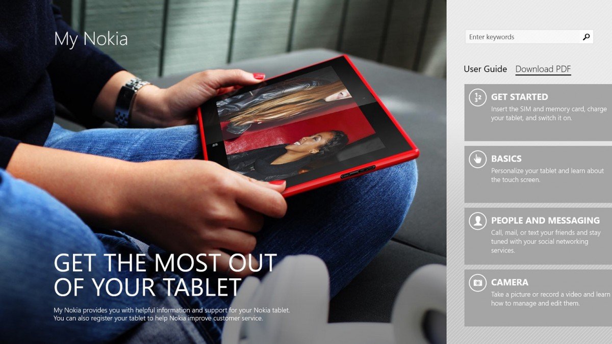
Nokia is not only in the hardware business, but they are increasingly doing more with software. On Windows Phone, this trend started off as a mild differentiator but quickly swelled within a year to a tidal wave of apps. Those apps were not simple throw away ones either, but they tended to fill in “gaps” on the Windows Phone platform.
We can expect the same from Nokia when it comes to Windows as the Lumia 2520 launches with a few solid, exclusive titles:
- HERE Maps – Login into your account, directions, places, map layers and more
- Nokia Music – Now called Nokia Mix Radio, it allows streaming and downloading of music mixes
- Nokia Video Director – Edit videos taken with the tablet or imported
- Nokia Storyteller – Found on the Lumia 1520, Storyteller organizes your photos based on time, date and location
- My Nokia – Tips, FAQ and explanations on Windows 8.1 and the Lumia 2520, including basic operations
- Connection Manager + My Verizon Mobile – Two apps to manage your Verizon (or AT&T) accounts
- Dragons Adventure – Based off of the movie ‘How to Train your Dragon’, this game comes from Dreamworks and Nokia
All the apps are top notch. HERE Maps is particularly useful since this device connects up to a cellular network and it has GPS on board. That makes the Lumia 2520 tremendously more useful, including as a navigation app for your car, or if you need to look something up while out and about. Figuring out some of the controls took a little bit of practice, but being able to sync your favorite locations and Collections is certainly welcomed.
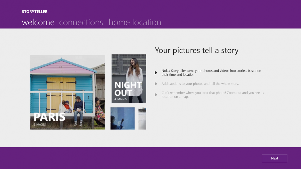
Storyteller works well by organizing your photos to tell a virtual “story”. It’s a clever app that uses info from your geo-tagged photos to build a logical collection, instead just a haphazard mishmash of randomly taken photos based on the date or size. It’s similar to Apple’s Collections/Moments in iOS, though this is more full featured due to the detail and tie into HERE Maps.
Video Director finally brings a quality video editing app to Windows 8.1 and My Nokia helps those new to tablets or Windows 8. Both apps are well done and certainly don’t feel filler content, but rather doing what they do best: offer a solid customer experience.
Are these Nokia-exclusive apps a reason to buy the Lumia 2520? Certainly not. Or rather, not yet. But they are highly regarded and they offer a peek into the future of Nokia’s strategy on Windows 8.1 going forward. Of course, with Microsoft taking over the Devices & Services business from Nokia, it’s not clear if these apps will remain exclusive or be folded into Microsoft’s own portfolio. But for now, they are leaps and bounds better than anything Microsoft’s other OEMs are offering on Windows tablets.
Lumia 2520 – Yay, or Nay?
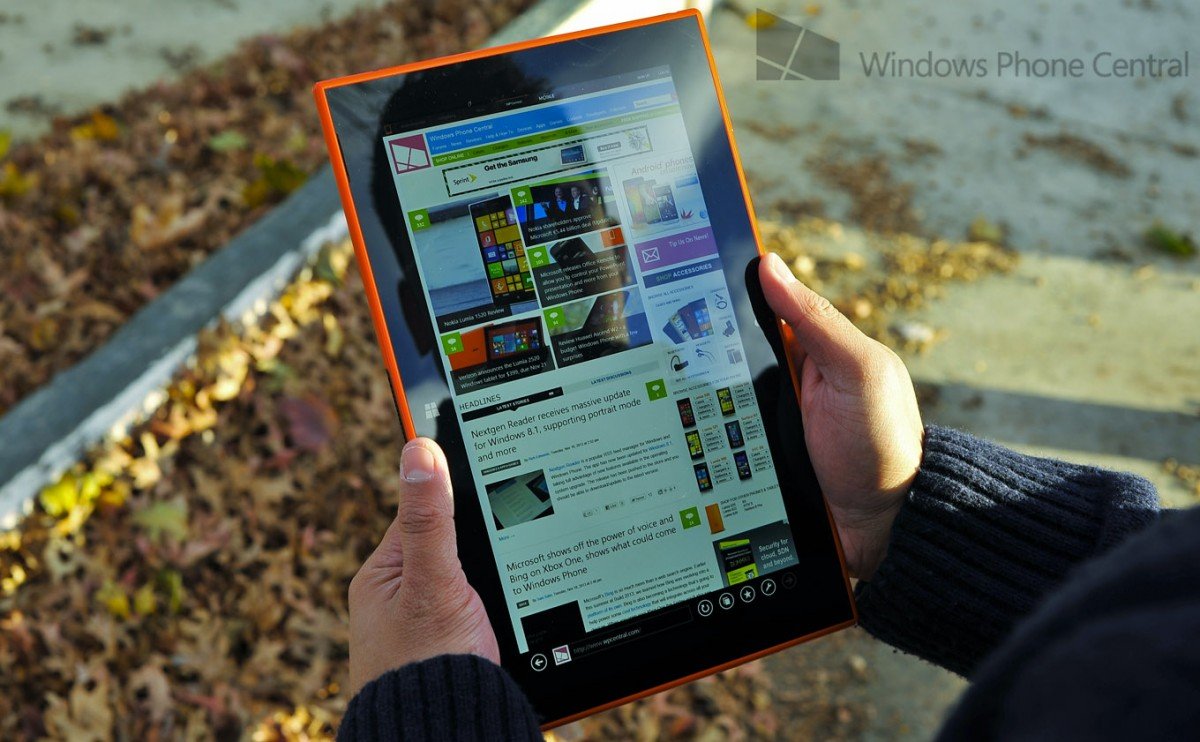
The Lumia 2520 is a very solid, first attempt for Nokia. Let’s not forget that their experience with full tablets and computing devices is more limited compared to their work on phones. But the company has a lot of talent behind it and it shines through on this device. Let’s break it down:
Pros
- Quality – Nothing feels cheap about it and Lumia phone owners will appreciate the Nokia design
- Display – Arguably one of the best on any device, it really shines here
- Speakers – Loud, crisp and not blocked by your hands when holding the tablet, they making gaming, movies and media a treat
- 4G LTE – Tablets are awesome but when they are Wi-Fi only, you can at times be carrying around a paper weight. Having the device fall back to LTE when out of Wi-Fi range (it prefers Wi-Fi over 4G, saving data charges) brings a whole new experience to Windows 8.1
- Design – The overall look of the device is stellar, especially the Verizon Red (shame on AT&T and Verizon though for not getting Cyan or White versions)
- Processor – On paper, the Nvidia Tegra 4 looks to be faster, but in real world usage I prefer the Snapdragon, mostly due to its superior video performance
- Keyboard + Battery – Although I was unable to test it out, the optional keyboard accessory with 5 hours of extra battery life is a nice addition
- Cameras – Solid, above average performance, they won’t raise the bar but they will get the job done
- Battery life – It lasts days and days, easily the 10 hours claimed by Nokia
- NFC – Useful for transferring files from one device to another, NFC is always nice to have
Cons
- Kickstand – There is none. This is strictly a hold-it tablet (or use the optional keyboard accessory)
- Power adapter – Uninspiring, it uses the old 2.5 mm pin adapter
- Button placement – The power and volume controls are cumbersome to use; Windows key is hard to see
- Not full USB – Users have to use a not-included adapter to get full USB 3.0, making accessories difficult
- Limited storage – With only 32 GB of internal (17.5 GB actually available) and limited expansion with a 32 GB micro SD card, users can only have a 64 GB device (less than 50 GB actually available)
The fact Windows RT is left off of the list is because it’s a personal preference. I happen to really enjoy using Windows RT 8.1 over the x86 full version for tablets. Quite simply, RT gets better battery life and is “lighter” on the processor. In regards to apps, I’m a big fan of Windows Store Apps and avoid using a traditional x86 app on devices with screens smaller than 13-inches. Part of me can’t wait until x86 desktop dies.
The choice to go for an RT device may be bucking the trend, but I do believe in Microsoft’s model (while admitting to its limitations and confusing branding issues). But if you were looking for me tear down this device based on that alone, sorry. Only you can decide if you need to Photoshop on a tablet or do other high-end, non-Office productivity on a 10-inch screen. For me, tablets are not about that.
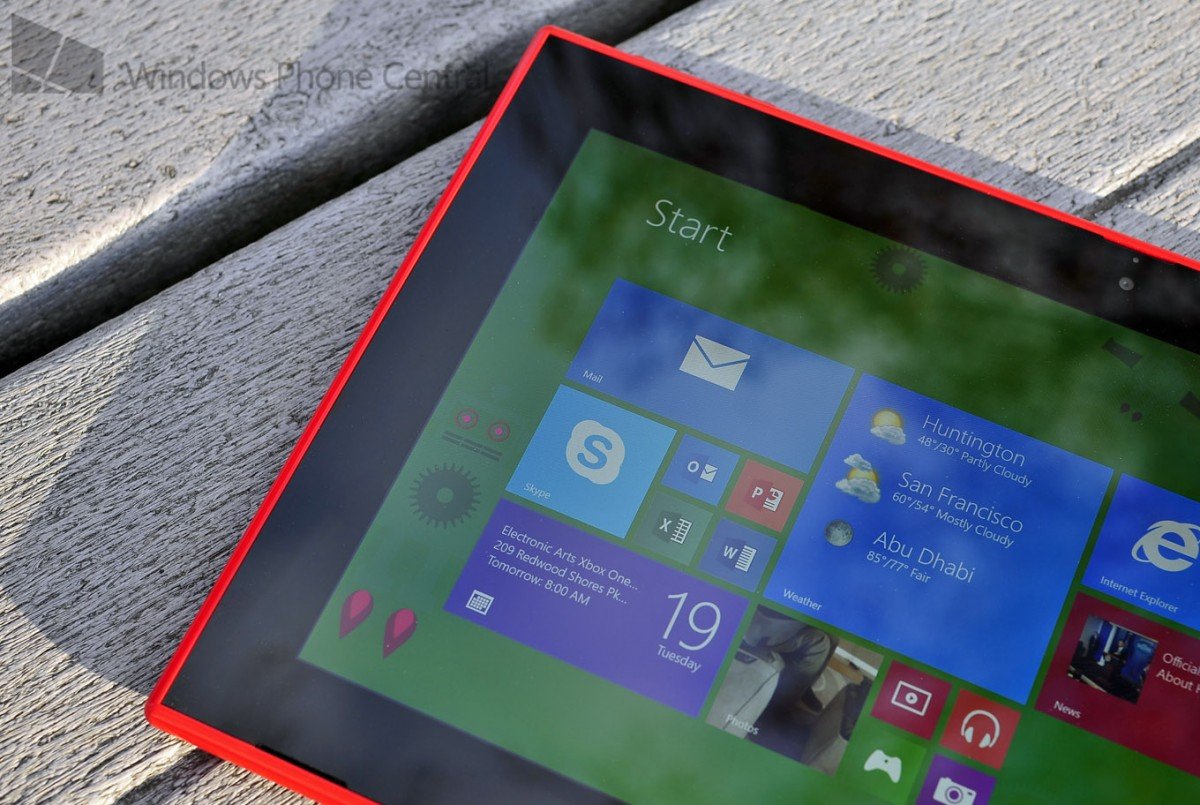
The Lumia 2520 tablet on its own is a quality device. Battery life is excellent, device performance is top notch, it looks great and it has a drool worthy display. Toss in some permanent LTE connectivity and you have the makings for an impressive device that you can take everywhere, anytime. We’ve seen some always-connected devices in the past, but not this good.
Still, some little things bother me and if you’ve noticed the constant references to the Surface 2 in this review, you’ll know why. The Surface 2, in my mind, sets the bar for RT tablets. I think it’s a phenomenal device. Between the two-stage kickstand, performance improvements, new HD display and excellent cameras, it’s one of my favorite pieces of technology, ever. Seriously. Give me my cyan Touch Cover with backlit keyboard and I’m in heaven. That may be unfair, because perhaps I should judge the 2520 in a vacuum and pretend the Surface 2 just doesn’t exist. But that’s the truth.
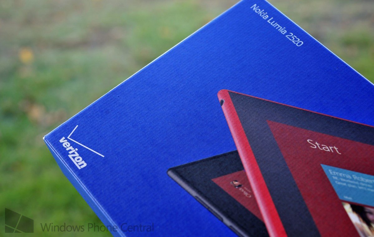
The Lumia 2520 is slightly less productive. It seemingly falls into a “consumption” device mode familiar to tablets. That’s not a bad thing per se as clearly the iPad and Galaxy Tabs have been doing well in that field. You can also always buy the combo keyboard and battery, which price wise is nearly the same as the Surface plus keyboard. Having said that, I still prefer a Surface 2 + kickstand + backlit keyboard.
But when you take away my USB, put the volume buttons on top of the device (unless you hold it vertically) and you have a pin power plug, well, it takes away some of the magic I’ve grown to love about the Surface.
And while I boast about the always-on LTE (when not in the range of Wi-Fi), not everyone wants to pay for a data plan. Carrier-branded tablets with contracts just have not taken off, despite their usefulness. Because of that, you have to be willing to pony up some extra money for data (or use an add on feature for Verizon billing). If you don’t want LTE data, you have to buy the $499 Lumia 2520 without a contract and not use the 4G. If that’s the case, I think you’re better off getting a Surface 2.
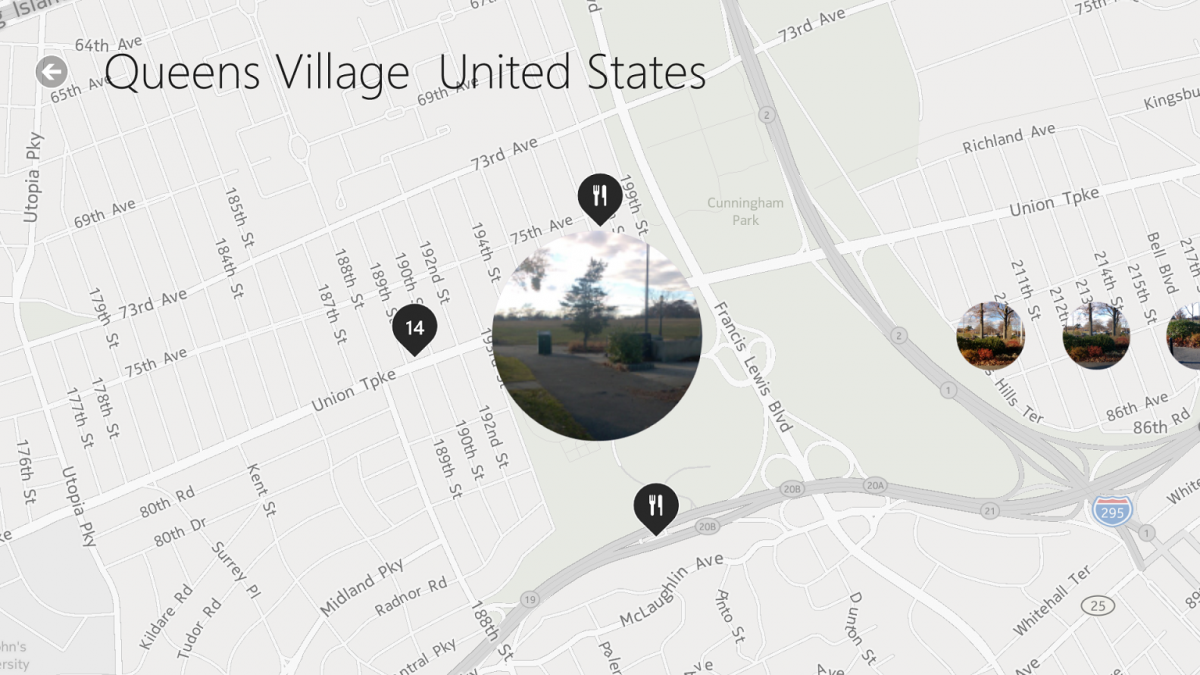
If on the other hand you need (or really want) an LTE Windows RT 8.1 tablet, then the Lumia 2520 is a good choice. There’s no killer flaw with it and quite a few stellar perks, including that display. I won’t lie, the glossy lipstick red Lumia 2520 for Verizon turned heads when I was using it in public. It’s a gorgeous piece of hardware. The slightly smaller display is a good choice by Nokia, the speakers are great and it’s fun to use.
The issue for me though is what happens when Microsoft releases the Surface 2 “early next year” with LTE and GPS on board? For me, that’s a killer device.
Another way to sum up this review is not that the Lumia 2520 is a bad choice, far from it, it’s great. Nokia has brought their charm and sylphlike design to Windows RT tablets, just like I expected. Right now, people who want a Windows RT 8.1 device have two really good choices on the market. That’s actually a good problem to have, as either selection will reward its buyer with many hours of media, gaming, Office productivity and just fun. But Nokia, surprisingly, has not outdone Microsoft and their Surface. At least not yet.
The Nokia Lumia 2520 tablet will be on sale for $399 on AT&T (Nov 22) and Verizon (Nov 21) on a two-year contract or $499 off.
[From November 22 through December 2, 2013, if you pick up the Lumia 2520, you are eligible to claim a free Power Keyboard. For more info: www.nokia.com/us-en/phones/tablet/lumia2520]
Video Credit: Mark Guim, Windows Phone Central

Daniel Rubino is the Editor-in-chief of Windows Central. He is also the head reviewer, podcast co-host, and analyst. He has been covering Microsoft since 2007 when this site was called WMExperts (and later Windows Phone Central). His interests include Windows, laptops, next-gen computing, and wearable tech. He has reviewed laptops for over 10 years and is particularly fond of 2-in-1 convertibles, Arm64 processors, new form factors, and thin-and-light PCs. Before all this tech stuff, he worked on a Ph.D. in linguistics, performed polysomnographs in NYC, and was a motion-picture operator for 17 years.
