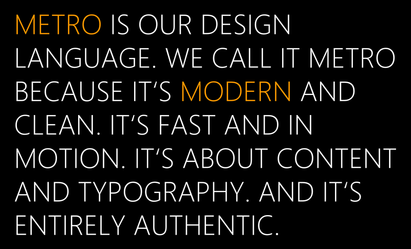
Lockergnome takes on Microsoft's Metro UI

Continuing the ongoing change in tech-media attitudes (see here, here and here) comes a good read from the folks at Lockergnome, run by Chris Pirillo. Pirillo is one of those guys you either find fascinating or extremely annoying--we're actually in the former camp as we appreciate his geeky observations and dedication to the field, but we digress.
The post, written by Robert Glen Fogarty, deals with a novice's experience with Metro UI specifically on the new Xbox 360 dashboard update. While many of us take Metro for granted, reading the perspective of someone new to it can be quite informative. Fogarty's take on it is from using the new Netflix app and he seems impressed:
"At long last, the little status bar filled and I was surprised at the very different-from-expected interface that greeted me. At first I was puzzled, and hoped that learning to navigate wasn’t going to be a counter-intuitive experience...As it turned out, everything was just as easy to find as it was with the last design; in fact, I think the new interface utilizes space with better efficiency so that features are more easily accessible than they were before. (In my experience so far, it seems that there’s much less aimless scrolling necessary)."
Pirillo takes on the question “What do you think of Microsoft taking Metro to PCs and Xbox? I would love to know how Metro works with a keyboard and a mouse.” and moves on to the benefit of Microsoft bringing over Kinetcimals, Bing and My Xbox Live to iOS--a controversial move that has left many of you furious at Microsoft. For the record and setting ourselves up for some, ahem, negative feedback, we totally agree with Chris here because lets face it, porting over Kinetimals to iOS is not going to damage Windows Phone.
More importantly, spreading the gospel Metro UI seems to be a much more wise endeavor for Microsoft in the long run. With Xbox 360, Windows 8 and Windows Phone, Metro UI really is more than the sum of its parts. Either way, positive tech-media coverage for Metro UI is a great thing for Microsoft and seems to be a growing trend these days.
Source: Lockergnome
Get the Windows Central Newsletter
All the latest news, reviews, and guides for Windows and Xbox diehards.

Daniel Rubino is the Editor-in-chief of Windows Central. He is also the head reviewer, podcast co-host, and analyst. He has been covering Microsoft since 2007 when this site was called WMExperts (and later Windows Phone Central). His interests include Windows, laptops, next-gen computing, and wearable tech. He has reviewed laptops for over 10 years and is particularly fond of 2-in-1 convertibles, Arm64 processors, new form factors, and thin-and-light PCs. Before all this tech stuff, he worked on a Ph.D. in linguistics, performed polysomnographs in NYC, and was a motion-picture operator for 17 years.